
Brands Reborn: Lessons from Major Makeovers
Rebranding is more than a logo change; it's a strategic pivot that can redefine a company's future. Done well, it revitalizes perception and drives growth. This article dives into compelling rebranding case studies from major players like Airbnb, Burberry, Old Spice, and McDonald's. By examining these real-world transformations, you'll uncover the strategies, successes, and potential pitfalls involved. Gain actionable insights from these rebranding case studies to inform your own brand evolution, whether you're refreshing an established identity or starting anew. Learn how strategic shifts transformed these businesses.
1. Airbnb Rebrand (2014)
The 2014 Airbnb rebrand stands as one of the most discussed and impactful rebranding case studies in recent history. It marked a pivotal moment when the company consciously evolved its identity from a transactional platform for booking spare rooms into a global brand centered on community, travel, and the profound idea of "belonging anywhere." This wasn't merely a cosmetic update; it was a strategic realignment of the company's core purpose with its visual and verbal expression.
At the heart of this transformation was the introduction of a new symbol, the 'Bélo,' designed in collaboration with the creative agency DesignStudio. This abstract mark was conceived to represent multiple facets of the Airbnb experience: people, places, love, and the 'A' for Airbnb, all coalescing into a universal symbol of belonging. This shift required a complete overhaul of Airbnb's visual identity, encompassing a new, warmer color palette (featuring a distinctive pink dubbed 'Rausch'), custom typography ('Circular'), and a human-centric photographic style. The goal was to create an identity that felt welcoming, trustworthy, and reflective of the diverse, global community it served.
The transformation wasn't just philosophical; it yielded tangible results, as illustrated by the data chart below which visualizes key growth metrics following the rebrand.
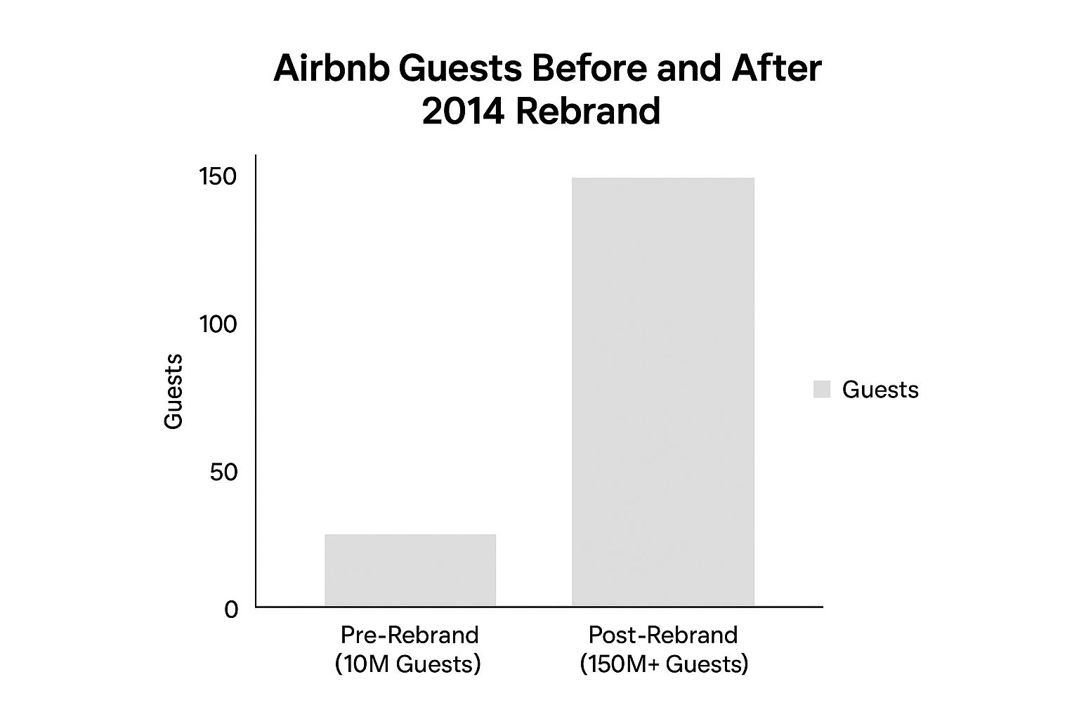
This chart clearly shows a significant upward trend in key areas, such as the dramatic increase in guest arrivals, highlighting the positive impact of the new brand strategy on business performance and user adoption post-rebrand.
How it Worked & Key Features:
Complete Visual Identity Overhaul: Beyond the logo, Airbnb refreshed its entire visual system, including colors, fonts, and imagery guidelines.
Introduction of the 'Bélo' Symbol: A unique, meaningful mark designed to encapsulate the brand's essence of belonging.
Community-Focused Brand Positioning: Shifting the narrative from accommodation logistics to the human experience of travel and connection.
Redesigned Website and Mobile App Interface: Updating digital platforms to reflect the new visual identity and improve user experience, making it more intuitive and visually engaging.
Cohesive Storytelling: Implementing the new brand voice and visuals consistently across all marketing channels, from global campaigns to host communications.
Why This Rebrand Matters & Examples of Success:
Airbnb's rebrand is a prime example of aligning brand identity with an evolved business vision. It successfully:
Unified Brand Purpose and Visuals: The 'Belong Anywhere' concept provided a strong anchor for the entire brand experience.
Strengthened Emotional Connection: The focus on community and belonging resonated deeply with users, fostering loyalty beyond mere transactional value.
Facilitated Expansion: The broader positioning enabled Airbnb to successfully launch 'Airbnb Experiences,' moving beyond just accommodation.
Created a Distinctive, Recognizable Symbol: The Bélo, despite initial controversy, became a globally recognized icon for the brand.
Fueled Growth: The company saw exponential growth following the rebrand, expanding from approximately 10 million guests pre-rebrand to well over 150 million within a few years. This trajectory makes it a vital case study for businesses considering their own brand evolution.
When and Why to Consider a Similar Approach:
A comprehensive, purpose-driven rebrand like Airbnb's is often necessary when:
A company's mission or business model has significantly evolved.
The existing brand identity no longer reflects the company's values or resonates with its target audience.
There's a need to differentiate in a crowded market by building a stronger emotional connection.
The company is preparing for significant global expansion or diversification into new service areas.
Pros and Cons:
Pros: Successfully unified brand purpose and visual identity, strengthened emotional connection with users, facilitated expansion into new offerings like Experiences, created a distinctive and globally recognized symbol, positioned the company for significant long-term growth.
Cons: Faced initial social media backlash and parody over the logo's perceived resemblance to various anatomical shapes, incurred high implementation costs across its global operations, and caused some temporary customer confusion during the transition phase.
Actionable Tips for Your Rebrand (Inspired by Airbnb):
Involve Your Community (If Applicable): Airbnb engaged hosts and guests. Consider how user feedback can inform your process, fostering buy-in. (Airbnb even allowed users to create their own versions of the Bélo).
Ensure Deep Alignment with Core Values: The rebrand must genuinely reflect what your business stands for. 'Belong Anywhere' was authentic to Airbnb's mission.
Prepare Robust Communication Strategies: Clearly articulate the reasons why you are rebranding and what the changes mean for your audience to manage perceptions and minimize confusion.
Develop a Comprehensive Style Guide: Ensure consistent implementation across all touchpoints, internally and externally. This was crucial for Airbnb's global scale.
Led by CEO Brian Chesky and then-CMO Jonathan Mildenhall, and executed with DesignStudio, the 2014 Airbnb rebrand remains a benchmark in modern rebranding case studies for its ambition, strategic depth, and transformative impact.
2. Burberry's Digital Transformation Rebrand (2006-2018)
Burberry's journey from 2006 to 2018 stands as one of the most cited and impactful rebranding case studies in modern business history. It showcases how a legacy brand, facing challenges of dilution and an aging image, can strategically pivot to become a relevant, cutting-edge leader in its sector, particularly within the traditionally conservative luxury market.
What Was the Rebrand & How It Worked:
At its core, the Burberry rebrand was a comprehensive overhaul centered on digital transformation and a reconnection with its core British heritage. Facing issues where its iconic check pattern was overused, often counterfeited, and associated more with "chav culture" than luxury, the brand needed a radical change.
Under the visionary leadership of CEO Angela Ahrendts and Chief Creative Officer Christopher Bailey, Burberry embarked on a multi-pronged strategy:
Centralizing Brand Control: They significantly reduced licensing agreements that had diluted the brand's image, bringing design and messaging back in-house.
Elevating Heritage Elements: Instead of abandoning icons like the trench coat and the check pattern, they re-contextualized them. The trench coat became a storytelling centerpiece ("Art of the Trench"), and the check was used more sparingly and strategically within refined product lines.
Embracing a Digital-First Mindset: This was perhaps the most revolutionary aspect for a luxury brand at the time. Burberry invested heavily in its digital presence, treating its website like a flagship store. They pioneered initiatives often seen in tech companies, not fashion houses.
Integrating Online and Offline: The rebrand focused on creating seamless "omnichannel" experiences. Digital innovations weren't separate from the physical stores; they enhanced them.
Targeting Younger Consumers: While respecting its history, the brand actively courted younger, digitally-savvy luxury consumers through relevant platforms and content.
Why This Rebrand Deserves its Place:
Burberry's transformation is a crucial rebranding case study because it demonstrated that digital innovation and luxury exclusivity weren't mutually exclusive. They proved that a heritage brand could become a digital pioneer without sacrificing its soul. It provided a blueprint for other established brands, particularly in fashion and luxury, on how to navigate the digital age and reconnect with consumers.
Features & Benefits:
Digital-First Luxury: Pioneered live-streamed fashion shows (often with "click-to-buy" features), engaging social media campaigns, and a highly functional, content-rich e-commerce platform. This established them as digital leaders.
Heritage Storytelling: Campaigns like "Art of the Trench," a user-generated content platform showcasing people in their Burberry trench coats, and "Burberry Acoustic," featuring emerging British musicians, authentically connected the brand back to its roots and culture.
Integrated Experiences: The Regent Street flagship store in London became a physical manifestation of the digital strategy, featuring interactive screens, RFID-tagged items triggering related content, and live-streaming capabilities.
Modernized Icons & Streamlined Products: Successfully refreshed the appeal of the trench coat and check pattern, making them desirable luxury signifiers again. Product lines were refined to focus on higher-margin, core luxury goods.
Measurable Success: The strategy resulted in significant revenue growth (from approx. £743 million in 2006 to over £2.5 billion by the end of the key transformation period) and dramatically increased brand value and appeal, particularly among younger demographics.
Examples of Successful Implementation:
Art of the Trench (Launched 2009): A dedicated microsite and social campaign celebrating the trench coat through user-submitted and professionally shot photos, creating a global community around a core product.
Live-Streamed Fashion Shows: Among the first luxury brands to stream runway shows live, later adding features allowing viewers to immediately purchase items seen on the runway.
Burberry Acoustic: A platform showcasing British musical talent through professionally produced videos, aligning the brand with contemporary British culture.
Regent Street Flagship Store (Opened 2012): Dubbed 'Burberry World Live', this store seamlessly blended physical retail with digital experiences, using technology to tell brand stories and enhance the customer journey.
Pros:
Successfully repositioned the brand from outdated to a modern, digital-savvy luxury leader.
Significant revenue and profit growth during the transformation period.
Attracted a younger, affluent customer base.
Set the standard for digital innovation within the luxury sector.
Strengthened brand equity and global appeal.
Cons:
Required substantial investment in technology and infrastructure.
Navigating the balance between luxury exclusivity and digital accessibility was challenging.
Some initial resistance from traditional luxury consumers accustomed to more conventional approaches.
Maintaining momentum proved challenging after the departure of key leaders like Ahrendts and Bailey.
When and Why to Use This Approach:
Consider a Burberry-style digital transformation rebrand if:
Your established brand feels disconnected from younger, digitally native audiences.
Your brand heritage is undervalued or perceived as outdated.
Your online and offline customer experiences are disjointed.
You operate in an industry slow to adopt digital innovation, presenting an opportunity for leadership.
You have the resources and leadership commitment for a long-term, integrated strategy.
Actionable Tips for Readers:
Balance Innovation and Heritage: Don't discard your history; find authentic ways to make it relevant for today's audience using modern tools.
Invest in a True Omnichannel Experience: Ensure your digital and physical touchpoints work together seamlessly to create a unified brand experience.
Use Digital for Storytelling, Not Just Sales: Build brand affinity and community through engaging content that reflects your brand values and heritage.
Secure Strong Leadership Alignment: A transformation of this scale requires unwavering commitment and a unified vision from the top.
Maintain Quality Consistency: Every touchpoint, digital or physical, must reflect the premium quality and standards of the brand.
This detailed look at Burberry offers invaluable lessons for anyone considering a significant brand overhaul, making it an essential inclusion in any discussion of successful rebranding case studies.
Learn More: Burberry Official Website
3. Old Spice "The Man Your Man Could Smell Like" Rebrand (2010)
Old Spice faced a significant perception challenge: it was widely seen as a brand for older generations, specifically "your grandpa." To survive and thrive, it needed a radical revitalization to connect with younger consumers. The "The Man Your Man Could Smell Like" campaign, launched in 2010, wasn't just an advertising push; it was a comprehensive rebranding effort that masterfully blended humour, digital engagement, and product modernization, making it one of the most studied rebranding case studies in modern marketing.

How It Worked:
The core concept, developed by Wieden+Kennedy, was brilliantly counter-intuitive. Instead of directly targeting men, the campaign addressed women, often the primary purchasers of men's grooming products. It featured actor Isaiah Mustafa as "The Old Spice Guy" in a surreal, fast-paced monologue, directly addressing female viewers and contrasting their partners with the impossibly charming, confident, and adventurous ideal he represented ("Look at your man, now back to me..."). This approach used humour and self-awareness to subvert the existing "old man" perception.
Key features driving its success included:
Viral Video Campaign: The initial commercial was designed for maximum shareability, featuring witty writing, impressive single-take execution (initially), and a charismatic lead.
Humorous, Self-Aware Brand Voice: The tone was confident, absurd, and distinctly different from traditional men's grooming advertising, creating immediate cut-through.
Rapid-Response Social Media Engagement: Old Spice famously followed up the initial success with a real-time video response campaign. "The Old Spice Guy" recorded short, personalized video responses to comments and questions from fans and celebrities on platforms like Twitter and YouTube, demonstrating unprecedented agility and direct engagement.
Modernized Packaging and Product Formulations: The rebrand wasn't just smoke and mirrors; P&G updated Old Spice's product lines and packaging to feel more contemporary and align with the new image.
Cross-Platform Marketing Integration: The campaign seamlessly blended traditional TV advertising with digital and social media efforts, creating a cohesive and amplified brand experience.
Why This Rebranding Case Study Matters:
The Old Spice rebrand deserves its place in this list because it demonstrated the power of bold creative, digital savvy, and audience understanding to completely transform a brand's fortunes. It shifted Old Spice from near-irrelevance with younger demographics to a category leader and cultural phenomenon.
Examples of Success:
The original "The Man Your Man Could Smell Like" video quickly amassed over 55 million views online.
The innovative real-time response campaign generated 186 personalized videos in just 48 hours, addressed directly to fans and influencers.
Within the first month, Old Spice sales increased by a staggering 107%.
The campaign propelled Old Spice to become the #1 selling brand of men's body wash in the US.
Its Facebook page experienced explosive growth, becoming one of the fastest-growing consumer product pages at the time.
Pros:
Massive and rapid sales increase (+107% in month one).
Successfully attracted a younger target audience without completely alienating existing users.
Created a highly distinctive and instantly recognizable brand personality.
Generated enormous earned media value and cultural buzz.
Set a benchmark for social media-driven rebranding and real-time marketing.
Cons:
The challenge of sustaining momentum after initial viral success.
A potential risk that the pervasive humour could overshadow the actual product benefits.
Requires a continuous stream of fresh, innovative creative ideas to stay relevant.
Actionable Tips for Your Rebrand (Inspired by Old Spice):
Identify and Subvert Perceptions: Look for deeply ingrained (even negative) cultural perceptions about your brand or category that you can playfully challenge or turn on their head.
Develop a Distinctive Voice: Don't be afraid to be bold, humorous, or unique. Stand out from the generic noise in your market.
Prepare for Real-Time Engagement: If you aim for viral content, have the infrastructure and team ready to engage quickly and authentically when (or if) it takes off.
Ensure Product Backs the Promise: A brilliant campaign for a subpar product won't work long-term. Make sure your offering lives up to the revitalized brand image.
Integrate Traditional and Digital: Leverage the strengths of different platforms simultaneously for maximum reach and impact.
When and Why to Use This Approach:
This type of humour-driven, digitally-focused rebranding is particularly effective when:
A brand needs to drastically shake off outdated or negative perceptions.
The target audience is younger, digitally native, and receptive to humour and viral content.
The goal is to create significant cultural buzz and earned media.
The brand operates in a category where differentiation through personality is key.
The Old Spice campaign, popularized by Isaiah Mustafa (and later Terry Crews) under the guidance of Wieden+Kennedy and P&G's marketing team, remains a gold standard among rebranding case studies for its creativity, strategic insight, and phenomenal results.
4. McDonald's "I'm Lovin' It" Global Rebrand (2003-2006)
Why this Case Study Matters: The McDonald's "I'm Lovin' It" campaign stands as a landmark example in the world of rebranding case studies, particularly for its sheer scale, ambition, and demonstrable success in revitalizing a global giant. It showcases how a legacy brand, facing significant headwinds, can execute a comprehensive overhaul touching every aspect of its business, from marketing messages to the physical customer experience. For any business, large or small, studying this case provides invaluable insights into coordinating multifaceted rebranding efforts.
The Situation Before the Rebrand: By the early 2000s, McDonald's, despite its ubiquity, was struggling. The brand faced mounting criticism regarding the health implications of its food, particularly highlighted by documentaries like "Super Size Me." Customer experiences varied significantly across its vast network of restaurants, and its overall brand perception felt increasingly dated and out of touch with contemporary consumer desires for quality, health consciousness, and appealing dining environments. Sales were stagnating or declining in key markets, signaling a need for fundamental change.
The Rebranding Strategy: "I'm Lovin' It" Launched in 2003, the "I'm Lovin' It" campaign was far more than just a catchy slogan; it was the anchor for McDonald's first-ever unified global marketing strategy and a comprehensive business overhaul. Spearheaded by CEO Jim Cantalupo and Global CMO Larry Light, the core idea was to reconnect with customers on an emotional level, shifting the focus towards the enjoyment and experience of McDonald's, while simultaneously addressing underlying business issues.
Here’s how it worked:
Unified Global Messaging: For the first time, McDonald's rolled out a single campaign theme and slogan – "I'm Lovin' It" – across 119 countries simultaneously. Developed by Heye & Partner (part of DDB Worldwide), this created unprecedented brand consistency worldwide. The launch featured global pop star Justin Timberlake, adding contemporary appeal.
Memorable Sonic Branding: The distinctive five-note "ba da ba ba ba" jingle became instantly recognizable globally, embedding the brand in popular culture and providing consistent audio identity across all media.
Menu Revitalization: Acknowledging health concerns, McDonald's introduced healthier options like premium salads, apple slices, and grilled chicken sandwiches. While core offerings remained, this diversification aimed to broaden appeal and counter negative health perceptions. The successful McCafé concept also saw significant expansion during this period, tapping into the growing coffee culture.
Restaurant Redesign: Thousands of restaurants underwent significant remodels. Out went the tired plastic and primary colours, replaced by more contemporary designs featuring comfortable seating, warmer lighting, Wi-Fi access, and distinct zones (e.g., fast zones, lounge zones), aiming to create more welcoming "third place" environments.
Operational & Communication Shifts: Emphasis was placed on improving customer service and operational consistency. McDonald's also began providing more transparent nutritional information, directly addressing calls for greater clarity.
Modernized Visual Identity: Iconic elements like the Golden Arches, packaging designs, and employee uniforms were subtly modernized to align with the refreshed brand image.
Successful Implementation & Results: The impact of the "I'm Lovin' It" rebrand was profound and relatively swift:
Sales Turnaround: The declining sales trend reversed. By 2006, McDonald's reported a global same-store sales increase of 7.3%.
Stock Performance: The company's stock price more than tripled between 2003 and 2011, reflecting renewed investor confidence.
Improved Brand Perception: The campaign successfully repositioned McDonald's as more modern, relevant, and customer-focused.
Tangible ROI on Redesigns: Remodeled restaurants consistently reported average sales increases of 6-7%, validating the investment in the physical environment.
Enduring Legacy: The "I'm Lovin' It" slogan and jingle remain central to McDonald's branding over two decades later, demonstrating the campaign's lasting power.
Pros:
Successfully reversed declining sales and revitalized brand image globally.
Created one of the most enduring and recognized sonic branding elements in advertising history.
Established a framework for balancing global brand consistency with necessary local market adaptations.
Addressed significant criticisms (health, datedness) through tangible changes in menu and environment.
Strengthened emotional connection with consumers across diverse markets.
Cons:
Incurred massive implementation costs, particularly for restaurant renovations across over 30,000 locations.
Franchisee pushback occurred due to the significant capital investment required for remodels.
Despite efforts, the brand continues to face scrutiny from health advocates.
Maintaining consistent quality and customer experience across such a vast, largely franchised network remains an ongoing challenge.
Actionable Tips & Lessons Learned:
Integrate Strategy Across All Touchpoints: A successful rebrand isn't just a marketing campaign; it requires aligning product, environment, operations, and communications (as seen in McDonald's menu changes and redesigns).
Address Criticisms Head-On (Substantively): Don't just change the message; make real changes to the business model or product offering to address valid concerns (e.g., healthier options, nutritional transparency).
Balance Global Consistency with Local Flexibility: Establish clear global brand standards (like the "I'm Lovin' It" platform) but allow room for local market nuances in execution.
Invest in Memorable Brand Assets: The five-note jingle demonstrates the power of unique, ownable sonic branding for multi-channel recognition.
Ensure Operational Readiness: Your operations must be able to deliver on the promises your new brand makes. Consistency is key, especially in large networks.
Long-Term Commitment: Major rebranding, especially for established companies, requires sustained effort and investment over several years.
When and Why to Use This Approach: A comprehensive, globally integrated rebranding approach like McDonald's is necessary when:
An established brand faces declining relevance, stagnating growth, or widespread negative perception across multiple markets.
There's a significant disconnect between the brand's image and contemporary consumer values or needs.
Inconsistent branding or customer experiences across different regions are damaging the overall brand equity.
Fundamental business changes (like significant product shifts or environmental upgrades) require a new narrative to communicate them effectively.
The goal is to create a unified global culture and message for a multinational organization.
The McDonald's "I'm Lovin' It" initiative remains one of the most studied rebranding case studies because it demonstrates how strategic, holistic change – driven by strong leadership (Jim Cantalupo, Larry Light) and impactful creative execution (Heye & Partner/DDB, Justin Timberlake) – can fundamentally alter a global brand's trajectory.
5. Mastercard Logo Simplification Rebrand (2016-2019)
Mastercard's journey from 2016 to 2019 offers one of the most compelling rebranding case studies in recent history, centered on strategic simplification. Facing an increasingly digital world, the global payment giant recognized the need to evolve its iconic identity. The core concept was to modernize and streamline its brand mark – the famous interlocking red and yellow circles – to ensure optimal performance across digital platforms and maintain instant recognition, eventually leading to the removal of the brand name from the logo itself in many contexts.

This rebranding wasn't just a visual tweak; it was a comprehensive strategic shift. It involved several key features:
Simplified Wordless Logo Design: The most prominent change was the move towards using the interlocking circles without the "Mastercard" name below them, relying purely on the symbol's recognition. This was phased, initially simplifying the typography and design with the name in 2016, then confidently dropping the name in 2019 for many applications.
Digital and Mobile Optimization: The simplified geometry and updated, brighter color palette render crisply on small screens, digital wallets, and various online platforms.
Multi-Sensory Branding: Recognizing that brand interaction is increasingly screen-based and sound-enabled, Mastercard developed a distinct sonic identity – a unique melody played during transactions or in advertising – adding another layer to brand recognition beyond the visual.
Flexible Implementation: The simplified mark and system were designed to work seamlessly across billions of cards, countless merchant terminals, sponsorships, and digital interfaces.
Phased Introduction & Guidelines: The change wasn't abrupt. It was carefully rolled out, supported by extensive brand guidelines to ensure consistency across all partners and touchpoints globally.
Why does this Mastercard rebrand deserve its place in a list of key rebranding case studies? It exemplifies how a legacy brand with immense global recognition can successfully modernize for the digital age without discarding its core visual equity. It's a bold move to drop the brand name from a logo, demonstrating confidence in the symbol's power and a deep understanding of the changing communication landscape. This case study is particularly relevant for established brands considering how to adapt to digital-first environments and global markets.
Examples of Successful Implementation:
Achieved remarkable recognition rates exceeding 80% for the wordless symbol in consumer testing before the full rollout.
Gradual implementation across an estimated 2.3 billion physical cards worldwide.
Seamless integration into major digital wallets (Apple Pay, Google Pay, Samsung Pay) and contactless payment systems where symbol recognition is paramount.
Mastercard's brand value saw a significant jump, reportedly increasing by 18% in the year following the introduction of the wordless logo.
The sonic brand achieved impressive results, with 77% positive association in testing, embedding the sound into the payment experience.
When and Why Use This Approach:
This simplification strategy is most effective when:
A brand already possesses very high visual recognition for its symbol.
The primary need is to optimize the brand identity for digital platforms and small-scale applications.
Operating in a global market where a visual symbol transcends language barriers more effectively than a name.
The brand aims to project modernity, simplicity, and tech-savviness.
Sufficient resources exist for extensive testing, phased rollout, and partner communication.
It might not be suitable for newer brands still building recognition or brands where the name itself holds the primary equity or descriptive power.
Pros:
Significantly improved scalability and visibility on digital devices.
Achieved near-universal recognition without the name, breaking language barriers.
Successfully positioned Mastercard as a modern, forward-thinking digital payment leader.
Maintained and built upon existing brand equity while future-proofing the identity.
Created a flexible system applicable across diverse global touchpoints.
Cons:
Risk of initial consumer confusion during the transition phase, particularly the removal of the name.
Significant logistical challenges in updating the brand across millions of physical merchant locations and partner materials.
Some design critics lamented the loss of the specific Mastercard typography, viewing it as a reduction of unique character.
Required careful management to balance leveraging heritage recognition with the push for modernization.
Actionable Tips for Readers:
Based on Mastercard's experience, businesses considering a similar simplification should:
Test Extensively: Before any public launch, rigorously test consumer recognition and perception of the simplified or wordless mark. Ensure the symbol alone carries the intended meaning and association.
Plan the Transition Meticulously: Develop a comprehensive rollout plan, considering all stakeholders (employees, partners, vendors, customers). A phased approach can mitigate confusion.
Create Robust Brand Guidelines: Detailed guidelines are crucial for ensuring consistent application of the new identity across all platforms and materials, especially when dealing with numerous partners.
Consider Multi-Sensory Elements: In a digital world, explore sonic or even haptic branding elements to create a richer, more memorable brand experience.
Communicate Clearly: Explain the rationale behind the change to stakeholders to gain buy-in and manage expectations.
Masterminded by Chief Marketing and Communications Officer Raja Rajamannar, with design execution led by Michael Bierut and his team at the renowned agency Pentagram, the Mastercard rebrand stands as a benchmark for strategic brand evolution in the modern era.
Learn more about the design process: Pentagram: Mastercard
6. Slack's Visual Identity Rebrand (2019)
What It Is: Slack's 2019 visual identity overhaul represents a significant strategic move by an established tech company to address the limitations of its original branding and align its image with its evolving business goals. Faced with challenges in consistently applying its well-known but complex hashtag logo across different platforms and scales, the workplace communication giant partnered with the design firm Pentagram, led by Michael Bierut. They replaced the original logo with a more streamlined, proprietary 'octothorpe' symbol and developed a comprehensive, flexible visual system. This effort wasn't just about aesthetics; it was a functional necessity as Slack matured and increasingly targeted larger enterprise clients globally. This project stands out among rebranding case studies for its boldness in changing a widely recognized mark to build a more sustainable brand foundation.
How It Works & Features: The core of the rebrand involved simplifying and systematizing Slack's visual language:
New Logo ('Octothorpe'): The original 11-color hashtag logo, designed internally by Julie Delanoy early in Slack's life, was difficult to reproduce accurately (often appearing tilted or with incorrect colors on different backgrounds). The new logo consists of simpler geometric shapes (speech bubbles and lozenges) forming an 'octothorpe'. It uses fewer colors and is designed for easier, consistent application – from tiny favicons to large billboards.
Refined Color Palette: While the overall palette feels familiar, maintaining brand recognition, it was simplified and optimized for consistency. It primarily uses four core colors, making reproduction across digital and physical media far more reliable.
Custom Typeface (Slack Circular): The introduction of a proprietary typeface helped create a unique and consistent voice across all communications, strengthening brand identity.
Adaptable Visual System: Beyond the logo, Pentagram developed a broader system including icons, illustration styles, and layout principles. This toolkit allows Slack to maintain a cohesive look and feel across its diverse applications, marketing materials, and international markets.
Why This Rebrand Matters: Slack's experience deserves its place in any discussion of rebranding case studies because it tackles a common problem: outgrowing an initial identity. The original logo, while beloved by early adopters, presented genuine technical hurdles that hindered the brand's scalability and professional presentation, especially crucial for attracting enterprise customers.
When and Why to Consider a Similar Approach: Companies should consider a Slack-style rebrand when:
Technical Limitations: Your current logo or visual identity is difficult to reproduce consistently across different sizes, media, or applications.
Scaling Issues: Your brand needs to work effectively across a rapidly expanding range of products, services, or international markets.
Strategic Shift: Your business strategy evolves (e.g., moving upmarket from SMB to enterprise), and your current branding doesn't align with the new target audience or market perception.
Inconsistent Brand Experience: Your brand looks or feels disjointed across different touchpoints.
Desire for Greater Distinction: You need to differentiate more clearly from competitors in a crowded market.
Examples of Successful Implementation:
The new identity was rolled out cohesively across Slack's desktop, web, and mobile applications, creating a unified user experience.
Marketing materials, particularly those targeting enterprise clients, adopted the new system, presenting a more mature and professional image.
The flexible system allowed for consistent branding across Slack's extensive partner ecosystem.
User interface elements within the platform were updated to complement the new visual identity, reinforcing the change.
Pros:
Resolved significant technical issues related to logo reproduction and scaling.
Created a much more cohesive and flexible visual system applicable across all brand touchpoints.
Better aligned the brand's visual identity with its enterprise-focused business strategy and global ambitions.
Successfully maintained brand recognition through the continuity of its distinctive color palette.
Improved distinction from other tech brands, moving away from the generic hashtag symbol.
Cons:
Generated considerable initial backlash and criticism from long-time users on social media (especially Twitter), who missed the old logo's perceived quirkiness.
Some users felt the change was unnecessary or that the new logo was generic or resembled other brands.
As with any large-scale rollout, there were minor inconsistencies in the initial implementation phase.
Actionable Tips for Readers:
Clearly Communicate the 'Why': Don't just unveil a new look; explain the strategic and functional reasons behind the change to your users, employees, and stakeholders. Slack published blog posts explaining the rationale.
Prioritize Functionality but Respect Emotion: Acknowledge that users form emotional connections with brands. While addressing functional issues (like Slack's logo problems), try to retain familiar elements (like Slack's colors) to ease the transition.
Test Across All Applications: Before launching, rigorously test the new identity system across every conceivable touchpoint – different screen sizes, operating systems, print materials, merchandise, partner sites, etc.
Prepare for and Manage Reactions: Anticipate feedback, especially negative reactions on social media. Have a communication plan ready to address concerns constructively.
Develop a Comprehensive Transition Plan: Ensure all internal teams and external partners understand the new guidelines and have the assets they need for a smooth, consistent rollout.
Slack's 2019 rebrand, spearheaded by CEO Stewart Butterfield and executed by Pentagram, remains a vital case study demonstrating how established brands can evolve their identity to overcome practical challenges and support future growth, even if it means navigating initial public skepticism. It highlights the crucial interplay between design, strategy, and communication in modern branding.
Learn more about Slack: https://slack.com/
Pentagram's Case Study: https://www.pentagram.com/work/slack (Note: Provide the actual link if readily available and appropriate for the context).
7. Netflix's Streaming-First Rebrand (2011-2014)
Netflix's transformation from a DVD-by-mail rental service into a global streaming entertainment leader stands as one of the most significant and impactful rebranding case studies of the digital age. This wasn't merely a cosmetic update; it was a fundamental reinvention of the company's core business model, identity, and relationship with its audience, ultimately reshaping the entire entertainment landscape.
What Was the Rebrand and How Did It Work?
The Netflix rebrand between roughly 2011 and 2014 was a strategic pivot driven by the recognition that the future of entertainment consumption was digital streaming, not physical media. The core concept was to transition from being a distributor of other studios' content (via DVD or early streaming licenses) to becoming a premier destination for entertainment, including content unavailable anywhere else.
This worked through a multi-pronged approach:
Strategic Shift: The company made the high-stakes decision to prioritize streaming technology and content acquisition over its legacy DVD business. This included massive investments in digital infrastructure and content licensing.
Original Content: Recognizing the limitations and costs of licensing existing content, Netflix embarked on producing its own original series and films ("Netflix Originals"). This was the most radical part of the rebrand, changing Netflix from a tech platform/distributor to a full-fledged studio and content creator.
Visual and User Experience Overhaul: While less discussed than the strategic shift, Netflix simplified its visual identity (led by agency Gretel), adopting the now-iconic bold red logo on a black background. More importantly, the user interface (UI) was continuously refined for a seamless streaming experience across multiple devices (TVs, laptops, tablets, phones), heavily leveraging personalized recommendation algorithms.
Global Focus: The rebrand coincided with an aggressive global expansion strategy, aiming to establish Netflix as a worldwide brand synonymous with streaming entertainment.
Why This Rebrand Deserves Its Place
This case study is crucial because it exemplifies rebranding as a fundamental business strategy, not just a marketing tactic. Netflix didn't just change its look; it changed what it was. It demonstrates how a company can navigate disruptive technological shifts, cannibalize its own legacy business (DVDs) for future growth, and create an entirely new market category (premium subscription streaming with original content). Its success provides invaluable lessons for any business facing industry disruption or seeking transformative growth, making it a cornerstone example in discussions about rebranding case studies.
Features and Benefits
Simplified Visual Identity: The clean red-and-black branding became instantly recognizable globally, conveying modernity and focus.
Personalized UX: Advanced recommendation algorithms created a sticky user experience, making viewers feel the service understood their tastes. Benefit: Increased engagement and reduced churn.
Original Content: Launching high-profile originals like House of Cards and Orange Is the New Black created buzz, attracted new subscribers, and gave Netflix exclusive assets. Benefit: Differentiation from competitors, brand prestige, control over content destiny.
Multi-Device Ecosystem: Ensuring a consistent, high-quality experience across all major devices made the service incredibly convenient. Benefit: Ubiquitous access, integration into daily life.
Global Expansion: A unified brand and platform allowed for rapid scaling worldwide. Benefit: Massive subscriber growth potential, economies of scale.
Examples of Successful Implementation
Subscriber Growth: Netflix grew from around 23 million subscribers in 2011 to over 50 million by the end of 2014, and subsequently over 200 million, largely driven by the streaming-first and original content strategy.
House of Cards (2013): This critically acclaimed series proved Netflix could compete with premium cable networks like HBO and validated the original content model.
Binge-Watching Model: Releasing entire seasons at once catered to changing viewer habits and became a cultural phenomenon closely associated with the Netflix brand.
Brand Integration: The Netflix button appearing on TV remotes signified its deep integration into the home entertainment ecosystem.
Global Launch: Successfully launching in over 130 new countries simultaneously in 2016 (building on the foundation laid during this rebrand period) cemented its global dominance.
When and Why to Use This Type of Foundational Rebrand
A comprehensive, business-model-altering rebrand like Netflix's is appropriate when:
Your Core Market is Being Disrupted: Physical media was declining; streaming was rising. Netflix adapted proactively.
Your Current Model Has Long-Term Limitations: Relying solely on licensed content was expensive and unstable. Original content provided control.
Technology Enables a New Way to Deliver Value: High-speed internet made mass streaming viable.
You Have Ambitions to Redefine Your Industry: Netflix didn't just want to compete; it wanted to lead and change how entertainment was consumed.
You Need to Build a Direct Relationship with Global Consumers: Shifting from wholesale (DVD distribution) to direct-to-consumer streaming enabled this.
Pros and Cons
Pros:
Successfully transitioned from a declining physical media model to a high-growth digital one.
Transformed from a content distributor into a major Hollywood production power.
Achieved phenomenal global brand recognition and subscriber growth.
Created and dominated the new category of subscription streaming entertainment.
Built valuable direct relationships with consumers worldwide, leveraging data for personalization.
Cons:
Significant initial customer backlash and brand damage from the failed "Qwikster" attempt to separate DVD and streaming businesses (a key learning moment).
Extremely high costs and financial risks associated with original content production and global licensing.
Challenges in communicating the complex business model shift and long-term vision to investors initially.
Early technical challenges with streaming quality and infrastructure scaling during the transition.
Actionable Tips for Readers (Lessons from Netflix)
Align Infrastructure with Brand Promise: Don't promise a seamless streaming future before your technology can reliably deliver it. Invest heavily in the operational backbone before or during the rebrand.
Learn Quickly from Mistakes: The Qwikster debacle was a major misstep, but Netflix quickly reversed course. Be willing to admit failure and adapt, rather than stubbornly persisting.
Invest in Proprietary Assets: Whether it's technology (like Netflix's algorithms) or content (like Originals), owning unique assets is key to long-term differentiation and defensibility.
Use Data Relentlessly: Netflix uses viewing data to inform content decisions, personalization, and marketing. Leverage data to understand your customers and guide your strategy.
Focus on a Frictionless Customer Experience: Make it easy for customers to sign up, discover content, watch across devices, and manage their accounts. Every touchpoint should reinforce the brand promise.
Be Bold in Your Vision: Incremental changes wouldn't have worked. Netflix pursued a transformative vision, fundamentally changing its identity and market.
Netflix's journey provides one of the most compelling rebranding case studies available, demonstrating that true rebranding can involve reinventing the very essence of a company to meet the future head-on.
Rebranding Case Studies Comparison
Case Study | Implementation Complexity 🔄 | Resource Requirements ⚡ | Expected Outcomes 📊 | Ideal Use Cases 💡 | Key Advantages ⭐ |
|---|---|---|---|---|---|
Airbnb Rebrand (2014) | High - global phased rollout with multiple phases | High - design, tech, communication & global ops | Strong brand unification, community connection, growth beyond accommodation | Brands seeking global repositioning with emotional storytelling | Distinctive symbol, long-term growth, emotional engagement |
Burberry's Digital Transformation (2006-2018) | Very high - multi-year, cross-channel integration | Very high - digital infrastructure, creative, retail upgrades | Revenue growth, digital leadership, heritage modernization | Heritage brands modernizing via digital innovation | Digital luxury pioneer, heritage balance, sales surge |
Old Spice "The Man Your Man Could Smell Like" (2010) | Medium - viral campaign and social media engagement | Medium - creative production, social media management | Rapid sales increase, young demographic acquisition, viral fame | Consumer goods seeking cultural relevance and rapid rebranding | Viral social engagement, memorable brand voice, market leadership |
McDonald's "I'm Lovin' It" (2003-2006) | Very high - global consistent campaign with physical upgrades | Very high - global marketing, restaurant redesign | Sales reversal, global brand consistency, sonic branding longevity | Large legacy brands addressing health/image issues globally | Global reach, health focus, consistent multi-channel branding |
Mastercard Logo Simplification (2016-2019) | Medium - phased rollout across digital & physical touchpoints | Medium to High - design, partner coordination | Enhanced digital scalability, global recognition, brand modernization | Financial/payment brands adapting for digital ecosystems | Wordless logo recognition, multi-sensory branding, future-proof design |
Slack Visual Identity Rebrand (2019) | Medium - redesign with extensive testing & rollout | Medium - design firm collaboration, platform updates | Cohesive, scalable identity; enterprise alignment; recovered user acceptance | Tech brands needing scalable, mature identities | Improved technical performance, brand cohesion, enterprise-ready look |
Netflix Streaming-First Rebrand (2011-2014) | High - visual, product, and strategic business model shift | Very high - content production, tech, marketing | Industry leadership, massive user growth, streaming category creation | Companies pivoting core business models with tech-driven services | New industry creation, strong direct-to-consumer model, global impact |
Ready for Your Brand's Next Chapter?
We've explored a diverse set of rebranding case studies, from Airbnb's community focus and Burberry's digital leap to Old Spice's bold repositioning and Mastercard's minimalist shift. Each example underscores that successful rebranding isn't just about a new logo or slogan; it's a strategic response to changing markets, evolving audiences, or a necessary business pivot, like Netflix's move to streaming.
The most important takeaways? Strategic alignment is paramount. Deep audience understanding fuels relevance. And whether it's a subtle refresh or a complete overhaul, the change must be authentic and clearly communicated. These aren't just cosmetic updates; they are fundamental business decisions with far-reaching impact.
So, what are your actionable next steps? Start by auditing your current brand perception. Does it align with your business goals and resonate with your target audience? Identify the why behind any potential change. Is it growth, a market shift, or a need for clearer communication? Learning from these successful rebranding case studies provides a valuable blueprint.
Mastering these concepts is invaluable. A well-executed rebrand can reinvigorate your business, attract new customers, deepen loyalty with existing ones, and position you for long-term success and relevance in an ever-changing landscape. It's about future-proofing your brand's impact and ensuring it continues to connect powerfully. Embarking on a rebrand can feel daunting, but as these examples show, strategic evolution is often the key to unlocking significant growth and renewed energy. Your brand's next chapter awaits.
If navigating your brand's evolution feels complex after reviewing these insightful rebranding case studies, seeking expert guidance can provide clarity and direction. Happy Pizza Studio specializes in partnering with businesses like yours to craft impactful redesigns and strategic rebranding that truly resonates and drives results.
Article created using Outrank


