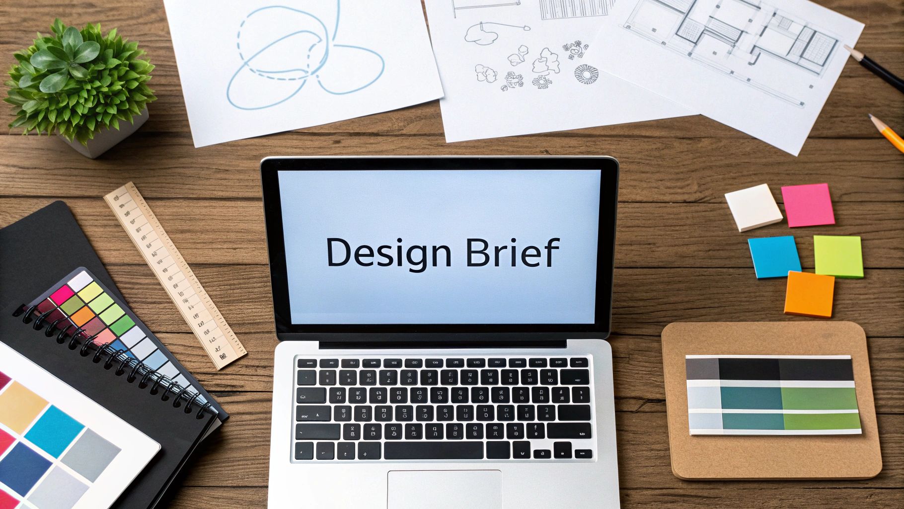
Why These Design Principles Actually Matter
Let's start with a common misconception: visual design is not about splashing color on a screen until it looks "pretty." It's a deliberate and strategic language, built on core principles that guide how a person sees and interacts with your content. Understanding the principles of visual design is what separates a project that connects with users from one that gets ignored.
These fundamentals are the difference-maker, turning a simple idea into a professional and effective experience. They help you create work that makes your audience feel seen and understood, which is the first step toward engagement and action.
From Amateur to Authority
Think about the difference between a handyman who only knows how to use a hammer and an architect who understands physics. The handyman can put things together, but the architect creates buildings that are both beautiful and structurally sound. The principles of design are your architectural plans for communication.
Mastering them gives you the confidence to make choices that aren't just based on personal taste but are rooted in how people actually process information. This allows you to go beyond basic templates and build custom solutions that solve real business problems, positioning your brand as a credible expert.
The Enduring Logic Behind the Tools
The software we use to design is constantly changing. Technology, especially in the last half of the 20th century, dramatically altered the design process. The switch to digital tools was a major turning point, and by the year 2000, more than 90% of graphic designers were working digitally.
This evolution brought incredible efficiency and new creative avenues, but it didn't change the foundational rules. The core principles remain the same whether you’re using a printing press or the latest software. If you're curious about this journey, you can explore this design evolution in more detail here.
Designing for the Human Brain
At their core, these principles matter because they are based on human psychology. Our brains are hardwired to search for order and clarity, and good design works with that instinct to make information easier to understand.
When a design lacks balance, it feels jarring and unstable. When it has poor contrast, important information gets lost in the noise. These aren't just arbitrary rules; they are direct responses to how our brains interpret the world. By applying principles like hierarchy and alignment, you're having a silent conversation with the user, telling them exactly where to look first and what to focus on. This process builds subconscious trust.
Turning Principles into Performance
This subconscious trust is where design starts to produce real business results. A well-composed design doesn't just look the part; it guides users toward a call-to-action, clarifies complex data, and strengthens your brand identity. Every decision, from a font size to a color choice, adds up to a cohesive experience that builds customer loyalty.
To make sure your visuals are doing their job, you need to pair these fundamentals with proven techniques, like implementing effective blog design best practices. This combination ensures your message isn't just seen but also felt, paving the way for work that achieves tangible goals.
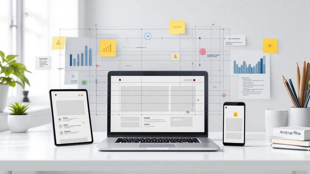
Creating Visual Flow That Guides Without Forcing
Imagine your design is a conversation with a user. Visual hierarchy is your body language—the tone of voice, gestures, and eye contact that show what’s most important. It’s an invisible storyteller, guiding the eye through your content in a specific, intentional order. This creates a smooth journey for the user, turning a potentially confusing maze into a clear path.
Getting this right is one of the most fundamental principles of visual design because it makes information easy to digest. When done well, users don’t even notice it; they just feel like your design is intuitive and effortless to use.
The Director's Tools for Guiding the Eye
Achieving a strong hierarchy isn’t about magic; it’s about the deliberate use of visual cues. By orchestrating these elements, you can create a clear path for the user’s eye to follow, telling them exactly where to look first, second, and third.
Size and Scale: Bigger things feel more important. A large, bold headline will always capture attention before the smaller body text below it.
Color and Contrast: Our eyes are naturally drawn to things that stand out. A bright "Sign Up" button on a muted background is practically impossible to ignore.
White Space: Sometimes, the most powerful tool is the empty space around an element. Generously surrounding an object with white space, also known as negative space, gives it room to breathe and signals its importance.
Positioning: Where you place elements matters. We naturally look at the top or center of a page first. This aligns with common reading behaviors, like the “F-pattern” often seen on websites.
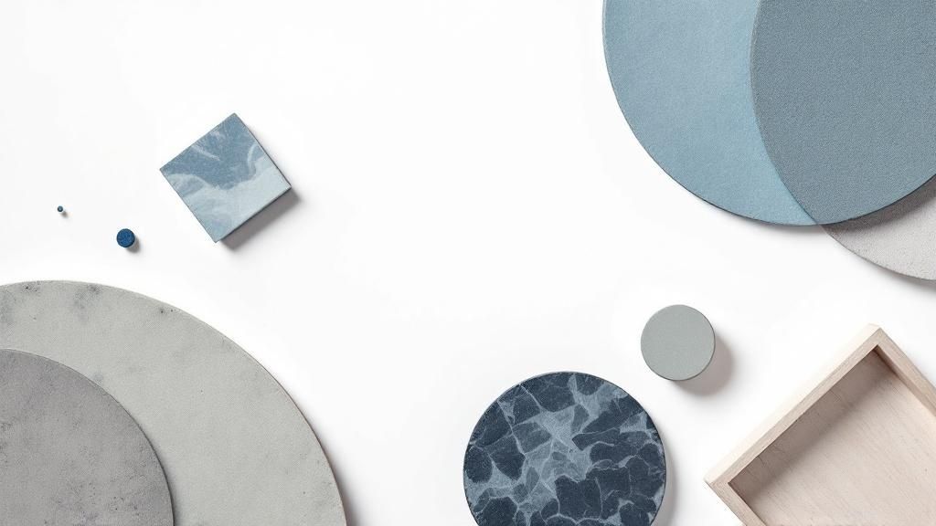
Contrast is one of the most effective ways to create a focal point. Notice in the image below how the high contrast between the shapes and the background creates an immediate point of interest, pulling your eye in.

This simple demonstration shows how a strong difference in color or tone commands attention. You can apply this same principle to buttons, key statistics, or any other element you need to make pop.
To help you decide which technique to use and when, here’s a quick comparison of their strengths and weaknesses.
Visual Hierarchy Techniques and Their Impact
Comparison of different hierarchy methods showing their effectiveness and best use cases
Technique | Primary Function | Best Used For | Potential Pitfalls |
|---|---|---|---|
Size | Establishes importance and sequence | Headlines, hero images, and primary call-to-action buttons. | If too many elements are large, they compete for attention and create visual chaos. |
Color & Contrast | Draws attention and indicates interactivity | Buttons, links, alerts, and highlighting important data points. | Clashing colors or poor contrast can cause accessibility issues for users with visual impairments. |
White Space | Creates focus, separation, and improves readability | Separating content sections, isolating logos, and decluttering complex interfaces. | Too much empty space can make a design feel disconnected or unfinished. |
Alignment | Creates order, connection, and a sense of professionalism | Organizing blocks of text, form fields, and navigation menus into a clean grid. | Inconsistent alignment can make a layout appear messy, unprofessional, and hard to scan. |
Understanding these trade-offs allows you to build a more balanced and effective design where every element works together to guide the user.
The Psychology Behind the Flow
Why do these techniques work so well? Because our brains are wired to find patterns and take shortcuts to process information efficiently. Eye-tracking studies have repeatedly confirmed that on pages with a lot of text, users often follow an F-shaped pattern. They read across the top headlines, scan down the left side for interesting keywords or subheadings, and then read across again on a line that catches their eye.
By understanding this natural tendency, you can place your most critical information along this F-shaped path. This isn't about tricking the user; it's about designing in a way that respects their time and attention. Without a clear hierarchy, the user is left to wander aimlessly. They won’t know what’s important, what’s clickable, or where to go next. This leads to confusion and frustration, often causing them to leave.
The ultimate goal is to make the user’s journey feel completely natural. A strong hierarchy ensures your message is not just seen, but understood in the exact sequence you intended. The only way to truly know if your visual flow works is to test it with real people. User feedback will quickly reveal where your intended path breaks down, allowing you to refine your design until it guides users perfectly.
Balance That Feels Right, Not Rigid
Balance is the invisible force that gives a design a sense of stability. It’s what makes a layout feel complete and grounded, rather than chaotic and ready to topple over. But this isn't about the rigid, mirror-image perfection you might remember from art class. In visual design, balance is less about strict math and more about creating a feeling of equilibrium.
Think of your layout as a seesaw on a playground. You can achieve balance by placing two children of equal weight at the same distance from the center. But you can also balance a large adult with a small child simply by moving the adult closer to the fulcrum. This is the core idea of visual weight—different elements have a perceived "heaviness" that you can arrange to create a stable composition.
The Two Faces of Balance: Symmetrical vs. Asymmetrical
Symmetrical balance is the most direct approach. It involves arranging elements in a mirrored layout on either side of a central axis, either vertically or horizontally. This method creates a feeling of formality, order, and tranquility. It's a popular choice for traditional or institutional designs because it feels safe and structured, but its main weakness is that it can sometimes come across as static or uninspired.
This is where asymmetrical balance shines. It happens when you place different elements on each side of your design, but they still have an equal visual weight. For example, a large, light-colored object on one side can be balanced by a small, dark object on the other. This technique produces a more dynamic, energetic, and engaging composition that feels more modern and alive.
Mastering Visual Weight
To use asymmetrical balance effectively, you first need to understand what gives an element its visual weight. It's a combination of several characteristics:
Size: Larger elements feel heavier and naturally draw more attention.
Color: Bright, bold, and dark colors have more visual heft than muted or light ones.
Complexity: An intricate pattern or detailed photograph feels heavier than a simple, solid block of color.
Negative Space: Isolating an element with a generous amount of white space makes it feel heavier and more important.
A Broader View on Balance
It’s worth noting that the concept of balance can be shaped by culture. For instance, some design philosophies inspired by Indigenous principles achieve balance not through a central axis, but around communal focal points, like a fire pit or a circular garden. This reminds us that balance can also be about creating a sense of holistic connection and community, proving there is more than one path to harmony.
Balancing for a Fluid Digital World
Achieving perfect balance in a printed piece is one thing, but on the web, your design must adapt to countless screen sizes. A layout that feels beautifully balanced on a wide desktop monitor can fall apart completely on a small mobile phone. Here, a flexible system is far more valuable than a static composition.
This means you should be designing with a strong grid and focusing on modular parts that can reflow without losing their sense of order. Achieving this dynamic equilibrium is a key skill in modern web design. To see how professionals apply this principle, you can explore some effective website layout design examples that showcase fantastic asymmetrical balance. Ultimately, trust your instincts; if a layout feels "off" on a different device, it probably is. Your job is to use visual weight to restore that feeling of stability, no matter the container.
Making Data Tell Stories That Actually Matter
Data visualization is where visual design principles truly come to life. It’s the art of taking a mountain of raw information and shaping it into a clear, understandable insight. Think of it as the place where aesthetics and analysis shake hands, working together to create understanding that leads to smart decisions.
This isn't just about dressing up a boring spreadsheet; it's about turning a flood of data into a compelling story your stakeholders can actually follow and act on. The design choices you make directly influence how people see the facts and what they do next.
From Numbers to Narratives
Every compelling data story stands on three pillars: clarity, consistency, and context. Clarity makes your message easy to grasp at a glance. Consistency in your use of colors, labels, and scales creates a trustworthy and predictable visual language, making comparisons effortless. And context answers the all-important "so what?" question, framing the data within a bigger picture to show why it matters.
Without these elements, even the most precise data just becomes meaningless noise, failing to deliver its intended message.
The idea of telling stories with data is far from new. The groundwork for what we do today was laid during the Golden Age of Statistical Graphics, a fascinating period between 1850 and 1900. Visionaries of that era merged new data collection techniques with better printing technology, producing graphics that were stunningly clear and insightful.
They were the first to prove that a well-designed visual could explain complex information much better than a simple table of numbers—a principle that is still at the heart of data design. Explore the history of this foundational period to see how these early ideas took shape.
Choosing the Right Visual Language
Picking the right chart is a lot like choosing the right words. You wouldn’t write a poem to explain how to assemble furniture. In the same way, a pie chart is a poor choice for showing trends over time, while a line chart is perfect for it.
Our brains are hardwired to process visual information in specific ways. A bar chart makes it easy to compare amounts, and a scatter plot quickly shows if two things are related. Your goal is to pick the visual format that lets your audience grasp the main point with the least amount of mental strain.
A poor chart choice can do more than just create confusion—it can actively mislead your audience. A badly designed graph can distort proportions, hide key trends, or suggest connections that don't exist, shaping a false understanding of the data. Imagine a sales chart where the Y-axis is manipulated to make a small dip look like a complete disaster. This isn't just a design mistake; it's a failure in communication that can steer a team toward bad decisions based on a faulty story.
To avoid these common mistakes, ground your work in a clear purpose before you even think about opening a design tool. The goal is to build a visualization strategy that serves your story and your audience. Before you start designing, ask yourself these three critical questions:
What is the single most important insight I need to communicate?
Who is my audience, and what do they already know?
What decision or action should this visualization inspire them to take?
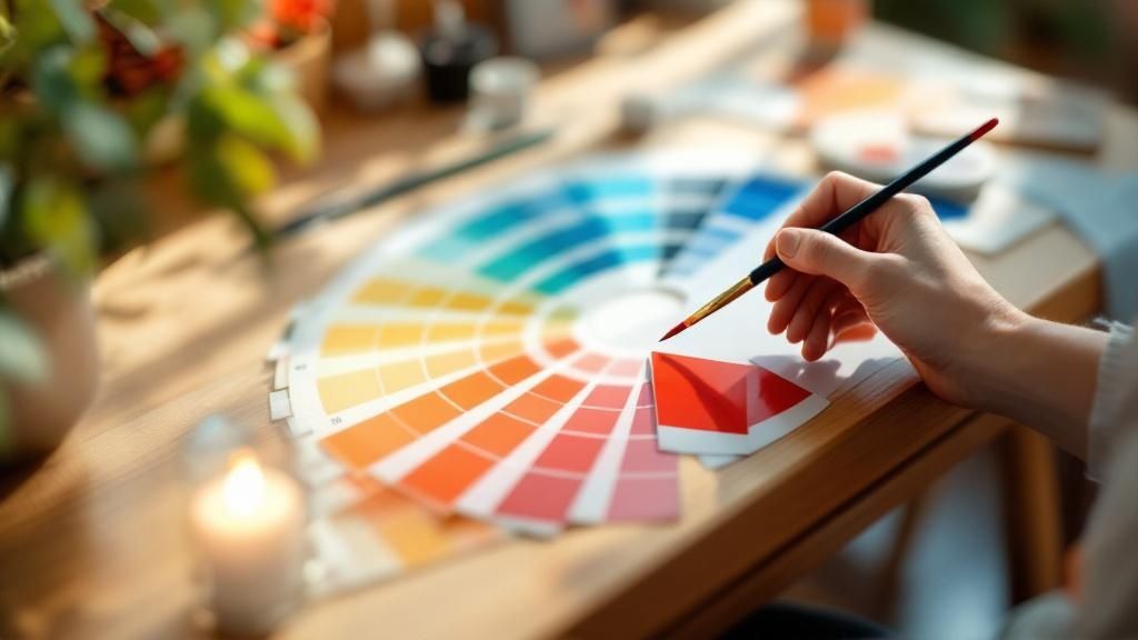
Color Strategies That Connect, Not Confuse
Think of color as the first handshake between your design and your audience. Long before they read a headline or click a button, the colors you choose have already set the emotional tone. They act as the unspoken language of your interface, capable of sparking excitement, building trust, or even creating a sense of urgency.
Getting it right makes your message feel intuitive and clear. But a misplaced color choice can send mixed signals, confusing users and weakening the impact of your work. Mastering color isn't just about making things look good; it's about making sure your design communicates effectively from the very first glance. It's one of the most potent principles of visual design for this reason.
The Psychology of a Palette
Every color comes with its own set of built-in associations that can subtly influence how people feel and act. This connection between color and emotion is a powerful tool for any designer. By understanding these psychological links, you can pick a palette that actively supports your message instead of accidentally working against it.
Of course, these associations aren't universal. They are deeply tied to personal experiences and, importantly, cultural backgrounds. For instance, in many Western countries, white is the color of weddings and purity, while in some Eastern cultures, it's traditionally worn for mourning. To get a solid footing in these concepts, this guide on Color Theory For Beginners is an excellent starting point.
To help you make more intentional choices, the table below breaks down the common psychological effects of key colors and where they are most effective.
Color Psychology in Different Design Contexts
How different colors impact viewer emotions and behavior across various design applications
Color | Psychological Effect | Best Applications | Cultural Considerations |
|---|---|---|---|
Red | Urgency, passion, excitement, danger | Call-to-action buttons, sale announcements, food brands | In South Africa, it's a color of mourning; in many Asian cultures, it symbolizes luck and happiness. |
Blue | Trust, security, calmness, professionalism | Corporate websites, financial institutions, tech products | A widely accepted color, but can feel cold or impersonal if not balanced with warmer tones. |
Green | Growth, health, nature, harmony | Environmental causes, health and wellness products, finance (money) | In some South American countries, it can be associated with death. Also linked to envy in the West. |
Yellow | Optimism, warmth, happiness, caution | Grabbing attention for highlights, warnings, promoting fun or affordable products | In Germany, it represents envy; in Egypt, it's the color for mourning. It can cause eye fatigue. |
As you can see, a color’s meaning is never set in stone. The key is to consider both the psychological gut reaction and the cultural context of your audience to ensure your message lands as intended.
Building a Cohesive and Accessible Color System
So, how do you combine these powerful colors without creating a visual mess? A great palette needs structure, and a time-tested guideline for achieving that is the 60-30-10 rule. Think of it as a simple recipe for visual balance that keeps your design from feeling cluttered or overwhelming.
This rule provides a straightforward starting point for creating harmony and guiding the viewer’s eye:
60% Primary Color: This is your dominant hue, setting the overall mood. It’s often used for large background areas and establishes the design's personality.
30% Secondary Color: This color supports the primary and creates visual interest. It's perfect for highlighting secondary information or key sections.
10% Accent Color: This is your pop of color. It should be the most vibrant shade in your palette, reserved for crucial elements like CTAs, icons, or links that need to grab attention.
Beyond aesthetics, a truly effective color strategy must be inclusive. An estimated 8% of men experience some form of color vision deficiency, making it a critical mistake to rely on color alone to communicate information. Always ensure there is sufficient contrast between your text and its background. You can test your color pairs with free tools like the WebAIM Contrast Checker.
To make your design truly accessible, always pair color with other visual cues, such as bold text, icons, or descriptive labels. This ensures that every user, regardless of how they perceive color, can understand and navigate your design with ease.
The Three C's That Separate Good From Great
Once you get past core principles like hierarchy and balance, you’ll find three concepts that elevate design from decent to exceptional: clarity, consistency, and context. While some designers stumble upon these qualities by chance, professionals build them into their work with intention. These aren’t just optional extras; they are the foundation for communication that works, ensuring your message is seen, understood, and trusted.
The First C: Unmistakable Clarity
Clarity is the ultimate goal of any design. It means your message is understood instantly, leaving zero room for confusion. Think of a design with great clarity as a well-marked hiking trail—the path is obvious, every sign is easy to read, and you never question where to go next. A design without it is like a trail that’s overgrown and unmarked, leaving you frustrated and lost.
To achieve this, always put yourself in the shoes of a first-time viewer. Ask yourself: can someone figure out what this is and how to use it in five seconds? If the answer is no, it's time to simplify.
The Second C: Building Trust Through Consistency
Consistency makes your design feel reliable and professional. When visual elements like buttons, fonts, and colors look and behave the same way across an entire website or application, users quickly learn the rules. This predictability builds confidence and trust.
Inconsistency shatters that trust. If a blue button means "submit" on one page but is just a decorative element on another, it creates a confusing and unprofessional experience. This is especially vital for branding, where a consistent visual language reinforces your identity. To learn how to use color to create a cohesive feel, a good first step is understanding the basics. You can get a solid introduction with this guide on Color Theory For Beginners.
The Third C: Making It Meaningful with Context
Context is what gives your design purpose. It’s the story that surrounds the visuals, answering the user's most important question: "So what?" A beautifully designed bar chart is just a set of colorful rectangles if the viewer doesn't understand what the data represents or why it's important. Context turns that raw information into a useful insight.
This is particularly important in data visualization, a field built on making complex information understandable. The value of these principles is so recognized that by 2020, over 70% of business intelligence tools had features specifically built to support the 3 C's. You can discover more about how data visualization has evolved with these ideas at its core.
These three C’s—clarity, consistency, and context—work together. A clear design that is also consistent feels dependable. When you add context, that dependable design becomes meaningful and persuasive. Intentionally applying these principles of visual design is what transforms your work from a simple collection of elements into a powerful tool for communication.
Your Action Plan For Design Success
Knowing the individual principles of visual design is a great start, but the real power comes from making them work together. A great design isn't just a collection of rules you've checked off a list. It's a cohesive experience where hierarchy, balance, color, and alignment cooperate to guide the user. This is how you move from hoping a design works to knowing it will.
From Theory to Tangible Results
Imagine you're conducting an orchestra. Each design principle is a different instrument. Hierarchy is your powerful brass section, grabbing attention with a bold statement. But without the steady beat of the drums (balance and alignment) or the emotional feel of the strings (color theory), you just have noise. Your role is to be the conductor, making sure every piece works in harmony.
These principles are not solo acts; they're a band. A strong hierarchy is often created using high contrast and bold colors. A sense of balance feels solid and professional because everything is locked into a clean alignment grid. When one principle is weak, it weakens the others.
A Practical Workflow for Every Project
Instead of facing a blank page with uncertainty, you can approach every new project with a clear game plan. This simple framework will help you apply the core principles of visual design right from the start.
Find Your "One Thing": Before you do anything else, decide on the single most important message a user must see. This becomes the anchor for your entire design and creates clarity.
Create a Path for the Eye: Next, map out the journey you want the user's eye to take. What's the main headline (primary)? What's the supporting text (secondary)? What are the finer details (tertiary)? This is how you build hierarchy.
Lay Down the Grid: Use an alignment grid as your foundation. This invisible structure will help you place every element deliberately, ensuring a clean sense of balance.
Choose Your Mood: Select colors and fonts that match the emotional tone of your message. Are you going for energetic and bold, or calm and trustworthy?
Keep It Consistent: Ensure that all your interactive elements—like buttons, links, and forms—look and behave the same way. This builds trust and predictability through consistency.
Developing Your Designer’s Eye
Sometimes, even with a plan, a design just feels... off. Learning to spot the problem is a skill that separates good designers from great ones. You have to become your own design detective.
Take a step back and ask specific questions. Is it hard to figure out what to read first? Your hierarchy probably isn't strong enough. Does the page feel messy or stressful? Check your alignment and balance, as you might have a clutter problem. This self-critique is how you turn textbook knowledge into a real-world instinct.
It's a continuous process of learning and fine-tuning, not a one-and-done lesson. By consistently applying these fundamentals, you build design wisdom that you can put to work on any project.
Applying these principles with purpose is what separates forgettable designs from impactful ones. If you're looking for a partner who understands how to blend these elements to create designs that deliver real results, we're ready to help. See how Happy Pizza Studio can bring your next project to life.