Revitalize Your Online Presence
A website is crucial for business growth. This listicle provides eight website redesign best practices to ensure your next project is a success. Learn how to create a high-performing website by focusing on user-centered design, mobile responsiveness, content strategy, performance optimization, accessibility, data-driven decisions, cross-functional collaboration, and a phased implementation strategy. Following these website redesign best practices will help you refresh your brand, improve conversions, and expand your online reach.
1. User-Centered Design Approach
A user-centered design (UCD) approach is paramount for any successful website redesign. It prioritizes the needs and preferences of your website visitors above all else, placing them at the forefront of the entire redesign process. This means that instead of focusing solely on aesthetics or business goals, you're designing a website that is intuitive, easy to use, and effectively addresses the needs of your target audience. This involves conducting thorough user research, creating representative user personas, mapping typical user journeys, and continuously testing and refining the design based on user feedback. By understanding how users interact with your site and what they hope to achieve, you can create a truly effective online experience.

This approach deserves the top spot in our list of website redesign best practices because it's the foundation for achieving all other goals, from improved SEO to increased conversions. Without a user-centered design, even the most visually stunning website will fail to deliver results if it doesn't cater to the needs of its users. This approach benefits everyone from startups to established brands seeking to connect with their audience more effectively.
Features of a user-centered design process include comprehensive user research methods such as surveys, interviews, and analyzing website analytics. This data is then used to create detailed user personas, representing key segments of your audience. Mapping user journeys helps visualize how users navigate your site and identify potential pain points. Usability testing throughout the design process ensures that the website is intuitive and easy to use. Finally, iterative design, based on user feedback, allows for continuous improvement and refinement.
Pros:
Higher user satisfaction and engagement
Reduced bounce rates
Improved conversion rates
More intuitive navigation
Solutions that address actual user pain points
Cons:
Can be time-consuming and resource-intensive
May create tension between user needs and business goals
Requires ongoing commitment to user testing
Examples of Successful Implementation:
Airbnb's 2014 redesign: Focused on user experience, making booking accommodations more intuitive.
Spotify's continuous redesign process: Based on user behavior data, Spotify consistently adapts its platform.
Mayo Clinic's website redesign: Simplified navigation for patients seeking medical information.
Actionable Tips for Implementing UCD:
Start with analytics data to identify current user behavior patterns.
Create 3-5 detailed user personas representing key audience segments.
Test designs with actual users before full implementation.
Prioritize design decisions based on user impact rather than stakeholder preferences.
Document user journeys to identify pain points in the current site.
When and Why to Use This Approach:
A user-centered design approach is essential for any website redesign project. Whether you're a startup launching your first website or an established brand undergoing a rebranding, understanding your users is crucial. This approach is especially important if you're experiencing high bounce rates, low conversion rates, or negative user feedback on your current website.
Key Figures & Influences:
The user-centered design philosophy has been popularized by thought leaders like Don Norman (author of The Design of Everyday Things), Jakob Nielsen (usability expert), IDEO design firm, and the Stanford d.school.
2. Mobile-First Responsive Design
In today's mobile-driven world, prioritizing the mobile experience is no longer optional—it's a necessity. Mobile-first responsive design, a crucial element of website redesign best practices, addresses this by designing for smaller screens first and then scaling up to larger devices like desktops. This approach ensures your website delivers an optimal user experience across all devices, acknowledging the growing dominance of mobile traffic. It involves creating flexible layouts, appropriately sized touch targets, and a streamlined content hierarchy that adapts seamlessly to different screen sizes.

This methodology works by employing techniques like fluid grid layouts, flexible images and media, and CSS media queries. These tools allow the website to dynamically adjust its layout and content presentation based on the user's device. Starting with the mobile design forces you to prioritize content and streamline the user experience, which benefits users on all devices, not just mobile.
Why is mobile-first design so important for a website redesign?
Several factors contribute to its significance:
Improved Mobile Performance: Sites designed mobile-first load faster and perform better on mobile devices, leading to lower bounce rates and higher user engagement.
Future-Proof Design: This approach ensures your site is compatible with current and future devices, even those not yet invented.
Better SEO: Google utilizes mobile-first indexing, meaning the mobile version of your site is the primary version Google uses for ranking.
Reduced Development & Maintenance Costs: A single responsive design is typically more cost-effective to develop and maintain than separate mobile and desktop versions.
Consistent User Experience: Provides a uniform and high-quality experience regardless of how users access your site.
Examples of Successful Mobile-First Design:
The Boston Globe: One of the first major news sites to embrace responsive design, providing a seamless reading experience on any device.
Starbucks: Offers a consistent brand experience and easy navigation from mobile to desktop.
Etsy: Maintains the core shopping experience across devices, making browsing and purchasing equally enjoyable on mobile.
Pros & Cons:
Pros: Improved performance on mobile, future-proof design, better SEO, reduced development costs, consistent user experience.
Cons: Can potentially limit complex desktop design possibilities, requires thoughtful content prioritization, potential performance challenges with media-heavy sites.
Actionable Tips for Implementing Mobile-First Design:
Use Relative Units: Use percentages (
%),em, andremunits instead of fixed pixels for flexible sizing.Test on Real Devices: Don't rely solely on browser emulators. Test on various physical devices to ensure real-world functionality.
Prioritize Content: Ruthlessly prioritize essential content for mobile views, ensuring users see the most important information first.
Optimize Images: Employ responsive image techniques like
srcsetand the<picture>element for optimal image delivery.Touch-Friendly Navigation: Consider navigation patterns that work well on touch screens, such as hamburger menus and large touch targets.
Aim for 44x44 Pixels: Ensure touch targets are at least 44x44 pixels to accommodate fingertip interaction.
Key Figures and Technologies:
Mobile-first design was popularized by figures like Ethan Marcotte (who coined "responsive web design") and Luke Wroblewski (a strong advocate for the mobile-first approach). Google's adoption of mobile-first indexing further solidified its importance. Frameworks like Bootstrap have also made implementing responsive design more accessible.
Mobile-first responsive design is a critical website redesign best practice for any business, from startups to established brands. By prioritizing the mobile experience, you ensure your website reaches a wider audience, performs better in search rankings, and ultimately provides a better user experience for everyone.
3. Content Strategy and Information Architecture
Content strategy and information architecture are crucial for any successful website redesign. They form the backbone of a user-friendly and effective online presence, directly impacting how visitors find, consume, and engage with your content. This process involves much more than just moving content around; it's about strategically aligning your content with both user needs and business goals. Think of it as building a house: you wouldn't start constructing walls without a blueprint. Similarly, a robust content strategy and information architecture serve as the blueprint for your website, ensuring a solid foundation for a positive user experience. This is why it deserves its place amongst the best practices for website redesign.
What it is and how it works:
Content strategy focuses on planning, creating, delivering, and managing useful, usable content. Information architecture, on the other hand, is about structuring and organizing that content in a way that makes it easy for users to find and understand. Together, they ensure that the right content reaches the right users at the right time. This involves auditing your existing content, identifying gaps and redundancies, and organizing information in a logical and intuitive way. It also requires creating clear navigation paths and developing a sustainable content plan for the future.
Features of a Strong Content Strategy and Information Architecture:
Comprehensive content audit: Analyzing all existing content for relevance, accuracy, and effectiveness.
User-focused taxonomy and categorization: Organizing content into logical categories and using terminology that resonates with your target audience.
Clear navigation hierarchy: Designing an intuitive navigation system that allows users to easily find what they’re looking for.
Strategic content planning: Creating a content calendar and plan that aligns with your business objectives and user needs.
Content governance framework: Establishing guidelines and workflows for content creation, publishing, and maintenance.
SEO-optimized content structure: Structuring your content and URLs to improve search engine visibility for relevant keywords, including "website redesign best practices."
Benefits (Pros):
Improved findability of information: Users can easily find what they're looking for, leading to a more satisfying experience.
Reduced content bloat and redundancy: Eliminating outdated or duplicate content streamlines the user journey and improves site performance.
Better search engine visibility: A well-structured website with optimized content ranks higher in search results.
More engaging user journeys: Intuitive navigation and relevant content lead to increased user engagement and conversions.
Clearer messaging and brand voice: A cohesive content strategy ensures consistent messaging across the entire website.
Sustainable content management: A clear framework makes it easier to maintain and update your website content over time.
Challenges (Cons):
Time-consuming: Especially for content-heavy websites, auditing and reorganizing content can take significant time and resources.
Stakeholder alignment: Getting buy-in from all stakeholders on content strategy and information architecture decisions can be challenging.
Difficult content removal decisions: You may need to make tough choices about removing or archiving outdated or irrelevant content.
Examples of Successful Implementation:
Mailchimp: Simplified its website and product offerings through a comprehensive content restructuring, improving user experience and clarity.
REI: Reorganized its content to better serve users interested in different outdoor activities, creating a more personalized experience.
Patagonia: Developed a product architecture that balances compelling storytelling with e-commerce functionality, engaging users while driving sales.
Actionable Tips for your Website Redesign:
Begin with a comprehensive content inventory and audit. Document every piece of content on your current site and assess its relevance, accuracy, and performance.
Use card sorting exercises to inform navigation structure. This helps you understand how users think about your content and how they would prefer to navigate your site.
Create a content model that defines content types and relationships. This provides a framework for consistent content creation and management.
Develop content templates and style guides for consistency. Ensure a cohesive brand voice and user experience across all pages.
Plan for content maintenance and updates after launch. A website is a living entity; establish a process for regularly updating and refreshing your content.
Use analytics to identify high-performing and underperforming content. Data-driven insights help you refine your content strategy over time.
When and why to use this approach:
A well-defined content strategy and information architecture are essential for any website redesign project. Whether you're a startup launching your first website, a small business looking to refresh your online presence, or an established brand undertaking a major rebranding, these practices are crucial for success. They ensure that your website is user-friendly, search engine optimized, and aligned with your business objectives. For entrepreneurs, startups, and small businesses, a focused content strategy can be the differentiating factor in a competitive market. For established brands, it's a chance to refine your message, improve user experience, and drive growth. Tech companies and digital service providers can leverage this approach to showcase their expertise and build trust with potential clients. By prioritizing content strategy and information architecture as part of your website redesign best practices, you are setting your business up for long-term online success.
4. Performance Optimization
Performance optimization is a crucial aspect of any website redesign. It focuses on making your site load quickly and run smoothly, regardless of the device or internet connection speed someone is using. A slow website can frustrate users, leading to higher bounce rates and lost conversions. In the context of a website redesign, performance optimization isn't just a nice-to-have; it's a fundamental element of a successful relaunch. This is why it deserves a prominent place in the list of website redesign best practices.
How it Works:
Performance optimization tackles several key areas:
Minimizing File Sizes: Smaller images, code files, and other assets reduce the amount of data that needs to be downloaded.
Reducing Server Requests: Each element on a page (image, script, stylesheet) requires a separate request to the server. Fewer requests mean faster loading.
Implementing Caching Strategies: Caching stores frequently accessed data so it can be retrieved quickly, reducing server load and improving response times.
Prioritizing Critical Rendering Paths: This involves optimizing the delivery of the content that's visible "above the fold" first, so users see something quickly, even if the entire page hasn't finished loading.
Features of Performance Optimization:
Image and asset optimization: Compressing and resizing images, using appropriate file formats (like WebP).
Code minification and bundling: Removing unnecessary characters from code and combining multiple files into one.
Efficient loading strategies (lazy loading, progressive loading): Lazy loading delays the loading of images or other content until they are needed. Progressive loading displays a low-resolution image first, then gradually improves the quality as it loads.
Server-side optimizations (caching, CDN integration): Implementing server-side caching and using a Content Delivery Network (CDN) to distribute content closer to users geographically.
Critical CSS rendering: Prioritizing the loading of CSS necessary for the initial view of the page.
Performance budgeting: Setting limits for page size, number of requests, and other performance metrics.
Pros:
Improved user experience and engagement: Fast-loading websites are more enjoyable to use, leading to increased user satisfaction and engagement.
Lower bounce rates: Users are less likely to leave a site that loads quickly.
Higher conversion rates: A faster site can improve conversion rates, as users are more likely to complete desired actions (e.g., making a purchase, filling out a form).
Better search engine rankings: Google considers page speed as a ranking factor, so a faster website can improve your search visibility.
Reduced server costs: Optimized websites require less server resources, leading to potential cost savings.
Improved accessibility for users with slow connections: Performance optimization benefits everyone, especially users in areas with limited internet access.
Cons:
Can require significant technical expertise: Implementing some performance optimization techniques may require specialized knowledge.
May create tension with design desires for rich media: Balancing performance with rich media can be challenging.
Requires ongoing monitoring and maintenance: Performance optimization is an ongoing process, requiring regular monitoring and adjustments.
Examples of Successful Implementation:
The Guardian: Their performance-focused redesign resulted in a 60% improvement in page load times.
Pinterest: Pinterest's performance optimization reduced perceived wait times by 40%.
Walmart: Walmart saw a 2% conversion increase for every 1-second improvement in page speed.
Actionable Tips for Website Redesign Best Practices:
Establish performance budgets before design begins: Define acceptable limits for page size, load times, and other metrics.
Compress and properly size all images: Optimize images for web use.
Implement lazy loading for below-the-fold content: Only load images and content when they are visible in the viewport.
Minimize third-party scripts and plugins: Third-party scripts can slow down your site.
Use browser caching and CDNs: Leverage caching mechanisms to improve load times.
Regularly test performance across devices and connection speeds: Ensure your site performs well on different devices and connection speeds.
Consider using newer image formats like WebP: WebP offers superior compression and quality compared to older formats.
Popularized By:
Performance optimization as a discipline has been championed by experts like Steve Souders (performance expert and author), Ilya Grigorik (Google web performance engineer), Tim Kadlec (performance consultant), and Harry Roberts (CSS performance specialist).
By prioritizing performance optimization during your website redesign, you can create a faster, more engaging, and ultimately more successful online presence for your business. This benefits everyone from your end-users to your bottom line and your search engine rankings. It's an essential element of any modern website redesign project and a key contributor to achieving your business goals online.
5. Accessibility-First Design
Accessibility-first design is a crucial best practice for any website redesign. It means building a website that's usable by everyone, including people with disabilities. Instead of tacking on accessibility features as an afterthought, this approach integrates them from the very beginning of the process. This is essential for modern website redesign best practices and benefits everyone, not just those with disabilities.
Why is this so important in a website redesign?
Simply put, an accessible website is a better website for everyone. By prioritizing accessibility during a redesign, you are ensuring that your new site reaches the widest possible audience, provides a superior user experience, and adheres to legal requirements. It's not just about ticking boxes; it's about creating a genuinely inclusive online experience. For businesses, this translates to increased customer satisfaction, a stronger brand reputation, and reduced legal risk. For users, it means equal access to information and services.
How does it work?
Accessibility-first design hinges on using semantic HTML, ensuring proper color contrast ratios, enabling keyboard navigation, providing alternative text for images, designing accessible forms and interactive elements, and leveraging ARIA attributes (Accessible Rich Internet Applications) when needed. These techniques ensure that users with disabilities can perceive, understand, navigate, and interact with your website. This adherence to web standards like WCAG (Web Content Accessibility Guidelines) 2.1 (or the latest version) ensures your website is usable by people using assistive technologies like screen readers, keyboard navigation, and voice control.
Features of an Accessible Website:
WCAG 2.1 (or latest) compliance: Meeting the latest WCAG guidelines ensures your website meets international accessibility standards.
Semantic HTML structure: Using HTML elements for their intended purpose improves site structure and accessibility for assistive technologies.
Proper color contrast ratios: Sufficient contrast between text and background colors is essential for users with low vision.
Keyboard navigation support: Users who cannot use a mouse should be able to navigate the entire site using only their keyboard.
Alternative text for images: Descriptive alt text conveys the meaning and purpose of images to users who cannot see them.
Accessible forms and interactive elements: Forms should be easy to understand and complete for all users, including those using assistive technologies.
ARIA attributes when necessary: ARIA attributes provide additional information to assistive technologies, enhancing the accessibility of dynamic content and complex widgets.
Pros:
Broader audience reach and inclusivity: Reach a larger audience and demonstrate your commitment to inclusivity.
Legal compliance (ADA, Section 508, AODA, EAA): Minimize the risk of legal action by complying with accessibility legislation.
Improved SEO through semantic markup: Semantic HTML benefits both accessibility and SEO, improving search engine rankings.
Better usability for all users: Accessibility improvements often enhance usability for everyone, not just those with disabilities.
Positive brand reputation: Show your commitment to social responsibility and build a positive brand image.
Reduced legal risk: Avoid costly lawsuits and penalties by proactively addressing accessibility.
Cons:
May require additional development time: Building in accessibility from the start may add some development time, but it’s significantly less expensive than retrofitting later.
Can create constraints for certain design elements: Accessibility considerations may influence design choices, but they rarely prevent achieving a visually appealing and functional website.
Needs ongoing testing and maintenance: Regular testing and maintenance are necessary to ensure continued accessibility as your website evolves.
Examples of Accessible Websites:
GOV.UK: The UK government website sets a high standard for accessible design with its comprehensive design system.
Microsoft: Microsoft has made significant strides in improving accessibility across its web properties.
Slack: Slack’s redesign focused on enhanced keyboard navigation and screen reader support.
Actionable Tips for Implementing Accessibility:
Use automated tools but also conduct manual testing: Automated tools are helpful for identifying some accessibility issues, but manual testing is essential for a comprehensive evaluation.
Test with actual assistive technology users: User testing with people who use assistive technologies provides invaluable insights.
Maintain a minimum 4.5:1 color contrast ratio for text: Ensure sufficient contrast for users with low vision.
Ensure all functionality is available via keyboard: Enable keyboard-only users to access every feature of your website.
Provide clear focus indicators for interactive elements: Visual cues help users understand which element currently has keyboard focus.
Structure content with proper heading hierarchy: Using headings correctly improves readability and navigation for everyone, including screen reader users.
Include captions and transcripts for multimedia content: Make audio and video content accessible to users who are deaf or hard of hearing.
Popularized By:
The push for website accessibility has been championed by organizations and individuals like the W3C Web Accessibility Initiative, accessibility advocate Marcy Sutton, screen reader user and accessibility expert Léonie Watson, and The A11Y Project. Their work has been instrumental in raising awareness and promoting best practices. Including accessibility-first design in your website redesign best practices checklist will not only improve the lives of your users with disabilities but will also create a more robust and user-friendly experience for everyone.
6. Data-Driven Decision Making
In the world of website redesign, gut feelings and guesswork simply don't cut it anymore. Data-driven decision making is now a cornerstone of successful website redesign best practices, offering a robust framework for informed choices that minimize risk and maximize impact. Instead of relying on assumptions or subjective opinions, this approach uses concrete quantitative and qualitative data to guide every step of the process, from initial planning to post-launch optimization. For entrepreneurs, startups, established brands, and tech companies alike, embracing a data-driven strategy is paramount for achieving a truly effective website redesign.
This method involves meticulously analyzing user behavior, rigorously testing design hypotheses, and continuously measuring performance to optimize the website based on solid evidence. Rather than succumbing to subjective preferences, data-driven decision making empowers you to understand what truly resonates with your target audience and what drives conversions.
How it Works:
Data-driven website redesign hinges on several key features:
Comprehensive Analytics Implementation: Tools like Google Analytics provide a wealth of data about user behavior, traffic sources, and conversion patterns.
Heatmaps and Session Recordings: Visualizing user interactions through heatmaps and watching actual user sessions provides invaluable insights into how people navigate and engage with your site.
A/B and Multivariate Testing: Experimenting with different design elements, content variations, and calls to action allows you to identify the most effective options through rigorous testing.
User Feedback Collection Systems: Gathering feedback directly from users through surveys, polls, and feedback forms provides qualitative insights that complement quantitative data.
Conversion Funnel Analysis: Pinpointing bottlenecks and drop-off points in the conversion process helps identify areas for improvement and optimization.
KPI Tracking and Reporting: Establishing Key Performance Indicators (KPIs) and regularly monitoring their progress provides a clear measure of the redesign's success.
Why This Approach is Essential:
Data-driven decision making deserves its place on this list because it mitigates the risks inherent in website redesign. It replaces guesswork with informed decisions, leading to more predictable and positive outcomes. This is particularly crucial for startups and small businesses where resources are often limited and every investment counts.
Pros:
Reduced Risk of Redesign Failure: By relying on data, you're less likely to make costly mistakes based on flawed assumptions.
Clear ROI Measurement: Data allows you to track the impact of your redesign efforts and demonstrate a return on investment.
Ability to Identify Specific Improvements: Data highlights areas for improvement and allows for targeted optimization.
Ongoing Optimization Opportunities: Data-driven decision making fosters a culture of continuous improvement, allowing you to constantly refine your website based on user behavior.
Objective Resolution of Stakeholder Disagreements: Data provides a neutral ground for resolving design disputes and aligning stakeholders around common goals.
Better Alignment with Business Goals: By focusing on data-driven KPIs, you ensure that your website redesign directly supports your overall business objectives.
Cons:
Can be Overwhelming with Too Much Data: It's essential to focus on the most relevant data points and avoid analysis paralysis.
Requires Proper Analytics Expertise: Interpreting data effectively requires analytical skills and understanding of web analytics tools.
May Delay Decision-Making Process: Data gathering and analysis can take time, which may prolong the redesign process.
Can Sometimes Miss Innovative Opportunities Not Supported by Existing Data: Relying solely on existing data may prevent you from exploring truly innovative ideas that haven't been tested before.
Examples of Successful Implementation:
Booking.com: Known for its continuous experimentation approach, Booking.com runs thousands of A/B tests annually to optimize every aspect of the user experience.
Amazon: Data informs every design decision at Amazon, leading to incremental improvements in conversion rates and user satisfaction.
Netflix: Netflix's interface evolution is driven by extensive user behavior analysis, ensuring that the platform remains intuitive and engaging.
Actionable Tips:
Establish clear KPIs before beginning the redesign.
Implement proper tracking before, during, and after the redesign.
Use both quantitative and qualitative data sources.
Start with high-impact, high-traffic pages first.
Establish a testing roadmap for post-launch optimization.
Create dashboards for ongoing performance monitoring.
Test designs with statistically significant sample sizes.
Popularized By:
The data-driven approach has been championed by industry leaders like the Google Analytics team, digital marketing evangelist Avinash Kaushik, A/B testing platform Optimizely, and CRO specialists Conversion XL.
By embracing data-driven decision making, you're not just redesigning your website; you're building a platform optimized for performance, user satisfaction, and business growth. This approach empowers you to make informed choices, minimize risks, and achieve measurable results – essential ingredients for success in today's competitive digital landscape.
7. Cross-functional Collaboration
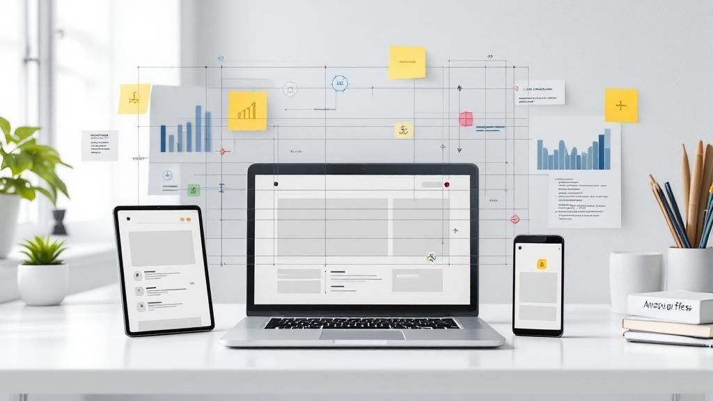
Cross-functional collaboration is a crucial website redesign best practice that brings together diverse stakeholders and specialists throughout the entire process. This approach ensures that all perspectives—from marketing and design to development, content, and business—are considered and integrated. By breaking down silos and fostering open communication, cross-functional collaboration helps create a website that truly meets both user needs and business objectives. It leads to more holistic solutions, reduces rework, promotes knowledge sharing, and increases buy-in from all departments, ultimately resulting in a smoother implementation and a more successful website redesign.

The infographic above visualizes a simplified process flow for cross-functional collaboration in a website redesign project. It highlights the cyclical nature of the process, starting with defining shared goals and moving through iterative phases of design, development, and testing.
The infographic illustrates a simplified five-step process for achieving cross-functional collaboration: 1) Defining shared goals, 2) Collaborative design & prototyping, 3) Development and Content Creation, 4) Testing and Feedback, and 5) Launch and Iteration. This cyclical process ensures continuous improvement and alignment throughout the project. The importance of this sequence lies in its iterative nature, allowing for continuous feedback and refinement, ultimately leading to a better final product. Each step feeds into the next, ensuring all teams are working towards the same objectives.
When redesigning your website, cross-functional collaboration should be employed from the very beginning. This approach is particularly valuable when dealing with complex projects involving numerous stakeholders or when seeking significant improvements in website performance and user experience. It's essential for website redesign best practices because a website is no longer just a marketing tool; it's a core business asset that impacts every department.
Features of Effective Cross-functional Collaboration:
Integrated project teams: Assembling a dedicated team with representatives from each relevant department.
Clear roles and responsibilities: Defining who is responsible for what to avoid confusion and overlap.
Shared project management tools: Utilizing platforms that facilitate communication and track progress.
Regular cross-team communication: Implementing scheduled meetings and updates to keep everyone informed.
Collaborative design workshops: Bringing teams together to brainstorm and solve problems creatively.
Stakeholder engagement plans: Strategies to keep stakeholders informed and involved throughout the process.
Decision-making frameworks: Establishing clear processes for making decisions efficiently.
Pros:
Holistic solutions that address multiple needs
Reduced rework and revisions
Better knowledge sharing across disciplines
Increased buy-in from all departments
More innovative problem-solving
Smoother implementation
Cons:
Can slow decision-making with too many voices
Requires strong project management
May create scheduling challenges
Can lead to design by committee without clear leadership
Examples of Successful Implementation:
Salesforce: Their website redesign famously involved marketing, UX, engineering, and product teams working closely together.
Slack: Their collaborative approach to their own website redesign mirrored their product's focus on communication and teamwork.
Mailchimp: Their distinctive brand presence is a result of a cross-functional redesign team ensuring brand consistency across all aspects.
Actionable Tips:
Define clear decision-making authority from the start.
Use collaborative design tools that all team members can access (e.g., Figma, Inboard).
Establish regular cross-team check-ins.
Create shared documentation and knowledge repositories.
Use design systems to align visual and development efforts.
Involve all stakeholders early in the requirements gathering phase.
Conduct collaborative workshops to solve complex problems and foster innovation.
Cross-functional collaboration, popularized by agile methodology and design thinking frameworks, is essential for achieving a successful website redesign. By embracing this approach, businesses can create websites that are not only visually appealing but also effectively achieve their business goals and provide an exceptional user experience.
8. Phased Implementation Strategy
A phased implementation strategy is a crucial element of website redesign best practices. Instead of launching a completely revamped website all at once, this approach breaks the redesign process into smaller, more manageable stages. This allows for incremental improvements, testing, and refinement, ultimately reducing risk and maintaining business continuity while still achieving a comprehensive redesign. This method is especially beneficial for complex websites or those with high traffic volumes where a sudden, complete overhaul could disrupt user experience and business operations.
How it Works:
A phased approach begins with a prioritized roadmap outlining clear milestones and deliverables for each phase. Instead of building an entirely new site in isolation, progressive enhancement of the existing site is often employed. This can involve parallel development tracks where new features are built alongside existing ones. Controlled feature releases, staged migration of content and functionality, and an incremental user transition are all hallmarks of this strategy.
Features of a Phased Implementation:
Prioritized roadmap with clear milestones: Defining what gets implemented when and setting clear goals for each phase.
Progressive enhancement of existing site: Gradually improving the current website rather than starting from scratch.
Parallel development tracks: Developing new features alongside existing ones.
Controlled feature releases: Using feature flags and other techniques to manage the rollout of new functionalities.
Staged migration of content and functionality: Moving content and features to the new site in stages.
Incremental user transition: Gradually introducing the redesigned elements to the user base.
Benefits (Pros):
Reduced risk and business disruption: Minimizes the impact of potential bugs or user experience issues.
Earlier realization of benefits from high-priority improvements: Key features and improvements can be launched sooner.
Opportunity to learn and adjust based on real user feedback: Gathering data and iterating on design and functionality based on user interaction.
More manageable QA and testing processes: Easier to test and identify issues in smaller releases.
Better resource allocation: Allows for more efficient use of development and design resources.
Greater flexibility to adapt to changing requirements: The phased approach provides room to adjust to evolving business needs or market trends.
Challenges (Cons):
Longer overall timeline to complete full redesign: Implementing changes in stages can extend the overall project duration.
Potential technical complexity managing transitions: Requires careful planning and execution to avoid technical issues during the transition phases.
May create temporary inconsistencies in user experience: Users might encounter different design elements or functionalities during the transition period.
Requires more coordination and planning: A phased approach demands meticulous planning and coordination between teams.
Examples of Successful Implementation:
The Guardian: Their phased responsive redesign spanned multiple years, allowing them to incrementally improve their website's mobile experience.
IBM: Gradually implemented their design system across their various web properties for consistency and scalability.
Shopify: Incrementally redesigned their merchant dashboard while maintaining usability throughout the transition, minimizing disruption for their users.
Actionable Tips for Implementation:
Start with a comprehensive audit and prioritization exercise: Determine what needs improvement and what should be addressed first.
Identify high-impact, low-risk components to implement first: Focus on quick wins that deliver value early on.
Create a clear technical architecture plan for the transition: Outline the technical steps involved in migrating to the new site.
Implement feature flags for controlled rollouts: Allows for A/B testing and gradual feature releases.
Establish consistent measurement across phases: Track key metrics to monitor progress and identify areas for improvement.
Communicate the roadmap to all stakeholders: Keep everyone informed about the redesign process and timeline.
Plan for content migration and redirects early: Ensure a seamless transition of content and avoid broken links.
Why This Approach Deserves Its Place in the List:
A phased implementation strategy is essential for mitigating risk and maximizing the success of a website redesign. By allowing for incremental improvements, testing, and feedback integration, this approach ensures a smoother transition, minimizes disruption, and allows businesses to adapt to changing needs throughout the process. It’s particularly relevant to website redesign best practices because it embodies the core principles of user-centric design, iterative development, and data-driven decision making. This approach is popularized by the Growth-Driven Design methodology, Agile web development practices, Enterprise UX practitioners, and advocates of progressive enhancement. It's a powerful tool for entrepreneurs, startups, marketing professionals, established brands, and tech companies alike, helping them achieve their redesign goals effectively and efficiently.
Top 8 Website Redesign Practices Comparison
Best Practice | Implementation Complexity 🔄 | Resource Requirements ⚡ | Expected Outcomes 📊 | Ideal Use Cases 💡 | Key Advantages ⭐ |
|---|---|---|---|---|---|
User-Centered Design Approach | High - involves extensive research and testing | High - user research, testing tools | Increased user satisfaction, engagement, conversions | Projects prioritizing UX and customer needs | Solutions aligned with real user pain points; intuitive navigation |
Mobile-First Responsive Design | Medium - requires thoughtful content prioritization | Medium - design frameworks and device testing | Consistent experience across devices; better SEO | Sites with high mobile traffic or device diversity | Future-proof, improved mobile performance; lower maintenance costs |
Content Strategy & IA | High - comprehensive audits and stakeholder alignment | High - content audits, modeling tools | Improved findability, reduced content bloat, better SEO | Content-heavy sites needing logical structure | Clear messaging; sustainable content management; engaging user journeys |
Performance Optimization | Medium-High - technical expertise needed | Medium - optimization tools and monitoring | Faster load times, lower bounce rates, higher SEO | Sites with rich media or slow user connections | Enhanced user experience; reduced costs; better rankings |
Accessibility-First Design | Medium - requires adherence to standards | Medium - accessibility testing and tools | Inclusive usability; legal compliance; improved SEO | Sites targeting broad audiences, regulated sectors | Broader reach; reduced legal risks; better usability overall |
Data-Driven Decision Making | High - extensive analytics setup and testing | High - analytics platforms and expertise | Reduced redesign risk; clear ROI; ongoing optimization | Data-rich environments requiring measurable impact | Objective decision-making; stakeholder alignment; continual improvement |
Cross-functional Collaboration | Medium-High - coordination and communication | High - collaboration tools and processes | Holistic end product; reduced rework; innovation | Complex projects with diverse teams | Increased buy-in; innovative solutions; smoother execution |
Phased Implementation Strategy | Medium - requires careful planning and coordination | Medium - project management and testing | Reduced risk; incremental benefits; flexibility | Large-scale redesigns needing risk mitigation | Early gains; adaptable roadmap; manageable rollout |
Craft Your Winning Online Strategy
A website redesign isn't just about a fresh coat of paint; it's a strategic investment in your online presence. From prioritizing a user-centered design approach and mobile responsiveness to optimizing performance and ensuring accessibility, mastering these website redesign best practices is crucial for success in today's digital landscape. By focusing on data-driven decisions, fostering cross-functional collaboration, and implementing a phased approach, you can transform your website into a powerful engine for growth. Remember, a well-executed redesign not only elevates your brand but also drives conversions, improves user engagement, and future-proofs your online presence for years to come. Embracing these best practices sets the stage for achieving your business objectives and establishing a lasting online impact.
Ready to transform your online presence and reap the rewards of a strategic website redesign? Partner with Happy Pizza Studio (Happy Pizza Studio), experts in crafting user-centered and high-performing websites. We leverage the best practices outlined in this article to deliver impactful online experiences that drive measurable business growth.