Understanding Visual Hierarchy Fundamentals That Actually Work

Visual hierarchy isn't some abstract design theory; it's the core of effective communication. It subtly guides the user's eye, ensuring they process information in the intended order. A well-structured hierarchy dramatically impacts user interaction, influencing everything from conversions to overall user satisfaction. For a deeper dive into the principles, check out this helpful resource on visual hierarchy in design.
The Building Blocks of Visual Hierarchy
Several key elements combine to create a strong visual hierarchy. Size and color are two immediate factors. Larger elements naturally attract attention, while strategic color use can highlight calls to action or create engaging visuals. Think of a large, bold headline in a contrasting color: it instantly grabs attention compared to smaller, less vibrant text. Contrast, in both color and value (light vs. dark), also plays a crucial role, separating elements and directing the user's gaze.
Spacing and typography are equally vital, subtly impacting how users process information. Ample whitespace around important elements allows them to stand out, preventing a cluttered feel. Thoughtfully chosen fonts and font sizes further reinforce the hierarchy, ensuring readability and a clear visual flow.
Why Visual Hierarchy Matters
Visual hierarchy is a fundamental design principle that organizes visual elements by importance. It helps users navigate information efficiently. A well-established hierarchy guides the eye, typically using tools like size, color, contrast, alignment, repetition, proximity, whitespace, texture, and style to prioritize content. You can learn more about visual hierarchy and its impact on user experience. This structure impacts how quickly users find information and complete desired actions. Conversely, a confusing hierarchy can lead to frustration and a negative experience.
Real-World Impact
Imagine the difference between a cluttered landing page with no clear call to action and a streamlined page with a prominent signup button. The latter, with its strong visual hierarchy, instantly directs the user to the desired action, likely resulting in higher conversion rates. A well-structured mobile app with intuitive navigation, thanks to good visual hierarchy, will be much more user-friendly than one with a confusing layout. These are just a couple of examples of how visual hierarchy transforms user experience and drives positive results. Mastering visual hierarchy allows for effective communication, guiding users seamlessly and achieving desired outcomes.
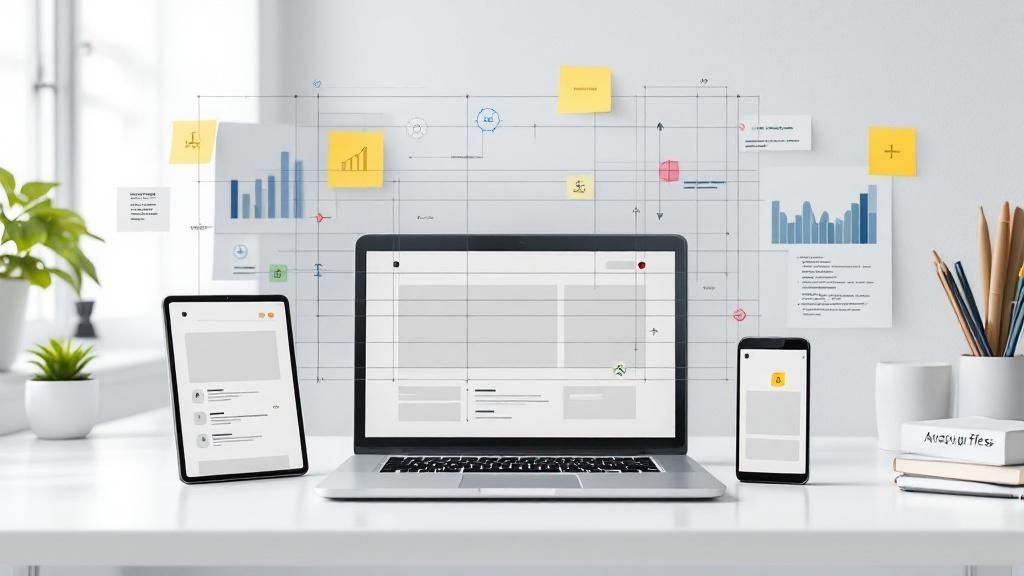
The Eye-Tracking Science Behind User Attention Patterns
What happens in the split second after a visitor lands on your website? Understanding how users visually process information is crucial for effective web design. Eye-tracking studies offer fascinating glimpses into how our eyes navigate digital interfaces. This knowledge empowers designers to create layouts that highlight key information and guide users towards desired actions.
Understanding Eye Movement
Research reveals predictable patterns in how we scan web pages. Many users follow an F-pattern, concentrating on the top and left side, then scanning down the left side before briefly scanning horizontally. This is especially common on text-heavy sites like blogs or news websites. Alternatively, the Z-pattern describes how users scan simpler layouts, starting at the top left, moving horizontally to the top right, then diagonally down to the bottom left, and finally across to the bottom right.
This isn't to say every single user follows these patterns precisely. However, understanding these tendencies allows designers to strategically position important elements where they are most likely to be noticed. For example, calls to action are often placed along the top or left side of the page to take advantage of these natural scanning behaviors.
The Impact of Visual Hierarchy
Empirical research from Princeton University demonstrates a direct correlation between strong visual hierarchy and effective design. By analyzing eye movements, the study found that designs with a clear visual hierarchy led to more consistent scanning patterns among participants. This underscores the importance of well-structured design in directing user attention.
Debunking Myths About User Attention
One common misconception is that users read every word on a page. The reality is that people tend to scan content, looking for keywords and pertinent information. This reinforces the need for clear headings, concise writing, and the strategic use of visual cues like bullet points and bold text. Another myth is that large, flashy elements always capture attention. While size and color are important factors, overwhelming users with too many competing elements can backfire, creating visual clutter and confusion.
This is where visual hierarchy becomes essential. By using design principles like size, color, contrast, and spacing, designers can steer the user's eye and ensure they focus on the most critical information first. A well-defined hierarchy ensures content is not only visually appealing but also easy to understand and navigate, contributing to a positive and effective user experience. This understanding helps designers build interfaces that truly resonate with their target audience and achieve desired outcomes.
Essential Techniques That Create Powerful Visual Impact

This infographic perfectly illustrates how contrast impacts readability. It compares dark text on a light background with light text on a white background. The difference is striking! Even small contrast adjustments can drastically change how easily we process information. High contrast makes text easier to scan and understand. This simple principle is a cornerstone of effective visual hierarchy.
Harnessing the Power of Typography
Typography is more than just picking a pretty font. It’s a powerful tool for establishing visual hierarchy. Using different font sizes, weights, and styles signals the importance of content. A large, bold headline grabs attention, while smaller, lighter body text indicates supporting details. This helps readers quickly grasp the main points.
Font Size: Larger fonts for headings and subheadings stand out from body text.
Font Weight: Bolding key phrases or using heavier fonts for titles emphasizes important information.
Font Style: Italics for emphasis or different font families for distinct sections also contribute to a clear visual hierarchy.
Color as a Guiding Force
Color is a powerful tool. It attracts attention and influences user behavior. Strategic color choices guide the eye to key elements, like call-to-action buttons. A brightly colored button on a neutral background will naturally draw the user's click.
Contrast: Contrasting colors create visual interest and separate elements.
Color Psychology: Understanding color associations helps designers choose hues that align with the brand message.
Call to Actions: Highlighting calls to action with distinct colors improves visibility and encourages engagement.
The Impact of Whitespace and Layout
Whitespace – the negative space around elements – is crucial. It gives important elements room to breathe, preventing clutter. This makes content more digestible. Cluttered designs overwhelm users; strategic whitespace creates calm and clarity.
Micro Whitespace: Small spaces between letters, words, and lines affect readability.
Macro Whitespace: Larger spaces separate sections and highlight key elements.
Grid Systems: Grid systems provide structure and consistency, improving visual flow.
Applying Visual Cues for Emphasis
Designers use visual cues to draw attention and guide the user's gaze. These cues, combined with other techniques, create a more engaging experience. They reinforce the hierarchy and help users understand the content.
Lines and Borders: These elements separate sections and emphasize specific areas.
Icons and Symbols: Visual representations communicate information quickly and add visual interest.
Shapes: Geometric shapes frame important content and create distinct visual elements.
To better understand how to create this visual hierarchy, let's look at a comparison of different techniques:
Introduction to Visual Hierarchy Techniques Comparison Table: The following table provides a comparison of various visual hierarchy techniques, outlining their effectiveness and ideal applications. This comparison helps illustrate the strengths and weaknesses of each approach.
Technique | Effectiveness Level | Best Use Case | Implementation Difficulty |
|---|---|---|---|
Font Size Variation | High | Headings, titles, and emphasizing key information | Low |
Font Weight Variation | Medium | Titles, subheadings, and highlighting important words | Low |
Color Contrast | High | Call to actions, highlighting key information, creating visual separation | Medium |
Whitespace Usage | High | Improving readability, creating visual breathing room, emphasizing key elements | Medium |
Lines and Borders | Medium | Separating sections, creating visual breaks | Low |
Icons and Symbols | High | Communicating complex information quickly, adding visual interest | Medium |
Shapes | Medium | Framing important content, creating visual elements | Medium |
Conclusion of Visual Hierarchy Techniques Comparison Table: As the table demonstrates, different visual hierarchy techniques offer varying levels of effectiveness and complexity. Selecting the right technique depends on the specific context and desired outcome. By understanding these nuances, designers can create more impactful and user-friendly experiences.
These techniques, used strategically, create a seamless flow of information. This clear visual hierarchy guides the user, ensuring a positive experience. This leads to better engagement, improved usability, and ultimately, achieves design goals. This separates aesthetic design from impactful design that drives results.
Mastering Complex Data and Information-Dense Interfaces
Navigating intricate dashboards or data-heavy applications can feel overwhelming. Effective visual hierarchy is the key to managing this information overload. Think about how companies like Tableau and Notion present large amounts of data: it's digestible and prioritized, guiding users rather than overwhelming them.
Organizing Multi-Layered Interfaces
How do we structure complex interfaces without overwhelming users? Progressive disclosure is one effective technique, revealing information gradually as the user interacts. Think expandable menus or helpful tooltips that appear on hover. These prevent information overload.
Another strategy involves using visual separators. Lines, whitespace, and color blocks can distinguish different sections and functionalities, making the interface easier to navigate.
Transforming Data Into Insights
Visual hierarchy can transform confusing data into actionable insights. Imagine a dashboard displaying key performance indicators (KPIs). Highlighting the most crucial metrics, perhaps through size, color, or positioning, draws the user's attention where it needs to be.
This allows for quick understanding of overall performance and pinpoints areas needing attention. Charts and graphs further simplify data interpretation, revealing hidden patterns within raw numbers. Studies show that effective visual hierarchy in charts and dashboards significantly improves user efficiency, leading to up to 40% faster understanding of data. Learn more about improving your data visualizations with data hierarchy best practices.
Creating Compelling Visual Stories
Award-winning data visualizations transform complex information into engaging narratives. Techniques like storyboarding and visual metaphors guide users through the data, highlighting key trends and insights. Strong visuals combined with well-considered typography create a memorable impact. For a deeper dive into typography, explore Design in Typography. These visualizations create an immersive experience, connecting users with the data on a deeper level.
Real-World Application Analysis
Real-world applications, such as project management software or financial dashboards, demonstrate how visual hierarchy supports efficient workflows. Prioritizing tasks, displaying progress visually, and using intuitive icons and labels guide users through complex processes without increasing cognitive load. This ultimately improves productivity and creates a smoother, more satisfying user experience.
Avoiding The Hierarchy Mistakes That Kill User Experience

Even seasoned designers can fall prey to hierarchy pitfalls that negatively impact user experience. This section explores common missteps that can weaken a design. We'll cover everything from muddled focal points to subtle contrast problems that make reading difficult. By examining examples of design failures and their improved versions, you'll learn to spot and fix these problems before they affect your users.
The Problem of Competing Focal Points
One of the most frequent mistakes is creating competing focal points. This occurs when multiple elements vie for attention, leaving the user disoriented. Imagine a landing page with a large hero image, a brightly colored promotional banner, and a prominent call-to-action button, all fighting for dominance.
The result is a cluttered, confusing experience. A well-defined hierarchy, however, should guide the user through the page, prioritizing elements based on their importance.
Contrast Issues That Hinder Readability
Subtle contrast issues can significantly reduce readability. While aesthetics are important, insufficient contrast between text and background can hinder reading, especially for users with visual impairments.
Light gray text on a white background might look sleek, but it’s a strain on the eyes. Adequate contrast is crucial for a comfortable and accessible user experience.
Inconsistent Spacing and Alignment
Inconsistent spacing and alignment create a feeling of disorganization. Picture a website with uneven margins, randomly placed elements, and a lack of clear visual structure. It appears unprofessional and makes navigation difficult.
Consistent spacing and alignment, on the other hand, create a sense of harmony and order, smoothly guiding the user through the content.
Ignoring User Scanning Patterns
Overlooking user scanning patterns is another common trap. Users often scan web pages in predictable patterns like the F-pattern or Z-pattern. Failing to place key information along these paths means users might miss crucial content entirely.
Designers should utilize these patterns to strategically position calls to action, important headings, and other vital elements where they are most likely to be seen.
Identifying Warning Signs and Auditing Your Designs
Several warning signs indicate a hierarchy problem. If users struggle to complete tasks, quickly leave pages, or complain about difficulty finding information, your design's hierarchy needs a second look.
A hierarchy audit, where you systematically analyze the visual weight of different elements, can pinpoint areas for improvement. This involves evaluating size, color, contrast, spacing, and alignment to create a clear and effective visual flow.
Preventing Hierarchy Mistakes in Future Projects
By understanding these common errors, you can proactively prevent them. Establish a clear visual hierarchy from the start of the design process. Prioritize elements based on their importance, and be consistent with spacing, alignment, and contrast.
Regularly test your designs with users to validate your decisions and identify any potential problems before launch. This saves time and effort in the long run, creating a better user experience and a more successful final product. Addressing these details up front can also minimize revisions, saving you valuable time and effort. Mastering visual hierarchy allows you to craft designs that are both aesthetically pleasing and effective in guiding users and achieving your goals.
Testing and Measuring Your Hierarchy's Real-World Success
Creating a visually appealing design is only the first step. How do you know it truly resonates with users? This section explores practical, budget-friendly methods to validate your design decisions. We'll cover user testing, analytics, and direct feedback, providing actionable insights to enhance user experience.
Metrics That Matter: Measuring Hierarchy Effectiveness
Several key metrics offer valuable insights into your visual hierarchy's performance. Task completion rates reveal how easily users find and interact with essential elements. Struggling users often point to a hierarchy problem.
Heatmaps visually represent user clicks and scrolls. They highlight areas of interest and those often ignored, helping you see if users focus on the intended elements. For example, a neglected call-to-action button may need repositioning or a visual refresh. User satisfaction scores, from surveys or feedback forms, provide qualitative data on the overall experience, further illuminating your design’s effectiveness.
Cost-Effective Testing Methods: Validating Your Design
Testing doesn't have to be expensive. Remote testing tools like UserTesting let you observe user behavior online. These tools offer valuable insights into how people interact with your design from their natural environment. Even simple observation techniques, like watching someone navigate your website or app, can be revealing, especially for smaller projects.
Guerrilla testing offers a quick, informal approach. Simply ask people around you for feedback. This method provides rapid insights and can uncover unexpected issues. These budget-friendly options give you valuable data to refine your visual hierarchy.
Interpreting Test Results and Implementing Improvements
Data analysis is crucial. Reviewing heatmaps, task completion rates, and user feedback helps pinpoint improvement areas. For example, low click-through rates on a call-to-action might suggest a more prominent button or a better location.
However, data should inform, not dictate. Consider user comments and observations alongside quantitative data for a well-rounded understanding. This ensures data-driven improvements truly benefit users. Regular testing and iteration based on feedback lead to a truly effective design.
Visual Hierarchy Testing Methods: A Comparison
To help you choose the best testing method for your project, the table below compares several options, outlining costs, time investment, insights provided, and ideal use cases.
Visual Hierarchy Testing Methods
Testing Method | Cost | Time Required | Insights Provided | Best For |
|---|---|---|---|---|
Remote User Testing | Low to Medium | A few days | User behavior, pain points, task completion rates | Websites, apps, prototypes |
Observation Testing | Low | A few hours | User interactions, navigation patterns | Early-stage prototypes, quick feedback |
Guerrilla Testing | Very Low | A few hours | Quick feedback, general usability issues | Early-stage designs, informal feedback |
A/B Testing | Low to Medium | Varies | Comparison of different design versions | Optimizing conversions, refining specific elements |
Heatmap Analysis | Low to Medium | Ongoing | Clicks, scrolls, attention areas | Understanding user behavior, identifying areas of interest |
This table shows that the best testing method depends on your specific needs and resources. Combining different methods often yields a more complete understanding of your hierarchy’s effectiveness. This helps you create user-centered designs that achieve your goals and ensure your visual hierarchy is both attractive and effective.
Key Takeaways
This section offers a practical guide to implementing visual hierarchy effectively. We'll break down key concepts into actionable strategies you can use right away. Each takeaway includes specific steps for auditing your current designs, techniques for various project types and budgets, and measurable goals for tracking real improvements in user engagement. You'll also find helpful resources, tools, and communities to support your design journey.
Auditing Your Current Designs: A Practical Checklist
Before making any changes, take a look at your current designs. This audit will reveal the strengths and weaknesses of your existing hierarchy, setting the stage for targeted improvements.
Identify Focal Points: What grabs your attention first? Are there too many competing elements? A clear hierarchy should have one primary focal point, followed by secondary and tertiary elements.
Analyze Contrast: Is there enough contrast between text and background? Check for readability, especially for users with visual impairments. Use online contrast checkers to ensure accessibility.
Evaluate Spacing: Is whitespace used effectively to separate elements and create visual breathing room? Inconsistent spacing can make a design feel cluttered and unprofessional.
Review Typography: Do font sizes, weights, and styles effectively communicate the relative importance of different elements? A well-defined typographic hierarchy improves readability and visual flow.
Assess Alignment: Is content aligned consistently? Proper alignment creates a sense of order and professionalism, making the design easier to navigate.
Implementing Practical Techniques: Tailored for Your Needs
Different projects require different approaches. A simple landing page needs a different hierarchy than a complex web application. These techniques cater to various project types and budget constraints:
Prioritize Content: Identify the most important information and make sure it receives the most visual emphasis. Use size, color, and placement to guide the user’s eye.
Establish a Clear Visual Flow: Guide users through the design logically. Use visual cues like lines, arrows, and whitespace to create a clear path.
Test Different Approaches: Experiment with different hierarchy variations and test them with users. A/B testing can help determine the best approach.
Consider User Scanning Patterns: Design with the F-pattern and Z-pattern in mind. Place key information where users are most likely to look.
Start Simple: Don’t overcomplicate things. Begin with basic hierarchy principles like size, color, and contrast before adding more complex techniques.
Measuring Real Improvement: Trackable Goals for User Engagement
Measuring the impact of your design changes is crucial. These goals help you track real improvement in user engagement:
Increased Task Completion Rates: A well-defined hierarchy makes it easier for users to complete desired actions, like making a purchase, signing up for a newsletter, or finding information.
Improved Time on Page/App: Engaging content, guided by a strong visual hierarchy, encourages users to spend more time interacting with your content.
Reduced Bounce Rate: A clear hierarchy can reduce bounce rate by directing users to the information they need quickly.
Higher Conversion Rates: By highlighting calls to action and guiding users through the conversion process, a well-structured hierarchy can lead to more conversions.
Positive User Feedback: Collect user feedback through surveys or feedback forms to gain insights into their experience and find areas for improvement.
Essential Resources and Tools
Many resources can help you further develop your understanding and implementation of visual hierarchy:
Online Design Communities: Platforms like Dribbble and Behance offer inspiration and feedback from other designers.
Design Blogs and Articles: Stay up-to-date with the latest design trends and best practices by following industry blogs and reading articles on visual hierarchy.
Accessibility Checkers: Tools like WebAIM's contrast checker help ensure your designs are accessible to everyone, including users with visual impairments.
User Testing Platforms: Platforms like UserTesting provide valuable insights into user behavior and can validate your design decisions.
For businesses looking to improve their design and user experience, Happy Pizza Studio offers a comprehensive suite of services. From meme marketing to brand redesigns and motion graphics, we create impactful visuals that convert. Visit Happy Pizza Studio today to learn how our expert design team can help your business thrive.