
The Hidden Science Behind Every Great Design
Think about the last time you used an app and it just flowed. Or maybe a website’s layout felt so intuitive, you barely noticed it. That wasn’t an accident—that was psychology at work. Our brains process visuals incredibly quickly, making snap judgments that determine whether we stay or go. This section explores how understanding these split-second decisions empowers designers to craft experiences that feel natural and engaging, ultimately boosting conversions and building brand loyalty.
The Power of First Impressions
We all know first impressions matter, and the digital world is no different. Users decide in seconds whether a website is worth their time, often based on subconscious reactions to visual cues. This is where design psychology truly shines. By strategically using visual hierarchy, designers can guide users' attention, making sure they absorb the most important information quickly. Think larger fonts for headlines, contrasting colors for calls to action, and whitespace to give the eye a break. All these details contribute to a more pleasant and effective user experience. And speaking of user experience, strong form design is essential. To dive deeper into that, check out this insightful article on Form UX Design Mastery.
From Aesthetics to Experience: The Evolution of Design
Design has come a long way. Early on, it was all about aesthetics—making things look pretty. But as we’ve learned more about human behavior, the focus has shifted to crafting experiences that not only look good but also feel good. This shift acknowledges that design isn’t just about visual appeal; it’s about how something feels to use. This is clear in the rise of user experience (UX) design, a field devoted to optimizing designs for user satisfaction and ease of use. Psychological principles are now a cornerstone of modern design. In fact, the number of design programs incorporating psychology has skyrocketed—from 15% in the late 1990s to over 60% by 2020 in leading Western universities, reflecting a global movement. Want to learn more? Discover more insights.
To illustrate this evolution, let's look at a timeline:
To understand how psychology has become increasingly important in design education, take a look at the following table:
Evolution of Psychology in Design Education: Timeline showing the integration of psychological principles in design curricula over the past decades.
Year | Percentage of Programs | Key Developments | Industry Impact |
|---|---|---|---|
Late 1990s | 15% | Early adoption of user-centered design principles | Limited impact, primarily in usability testing |
Early 2000s | 30% | Growing awareness of cognitive psychology and its applications in design | Increased focus on user interface design and information architecture |
Mid 2010s | 45% | Emergence of behavioral economics and persuasive design as key areas of study | Rise of UX design as a distinct discipline; emphasis on user research and testing |
2020 | 60%+ | Integration of neuroscience and emotional design principles in curricula | Greater emphasis on creating emotionally resonant and personalized user experiences |
As you can see, the integration of psychology in design is a growing trend with a significant impact on the industry.
Leveraging Psychology for Business Success
Big names like Netflix, Apple, and Airbnb strategically use psychology in design to create truly engaging experiences that drive conversions. Netflix, for example, uses personalized recommendations, playing on our tendency toward confirmation bias (seeking information that confirms our existing beliefs). Apple meticulously crafts product unboxing experiences, tapping into the thrill of anticipation. And Airbnb builds trust and connection between hosts and guests through carefully designed profiles and reviews. These examples highlight how psychology can be a major asset for businesses. The image below, from the Wikipedia page for Design Psychology, shows the diverse fields that contribute to this interdisciplinary area.
The connections between fields like cognitive science, ergonomics, and human-computer interaction demonstrate how broad design psychology really is. It shows how important it is for designers to think beyond the purely visual aspects of their work and consider the cognitive and emotional responses they create. By understanding how users perceive and interact with designs, we can create experiences that are both effective and engaging, transforming users into loyal customers.
Gestalt Principles That Shape How We See Everything
Ever glance at a bunch of dots and instantly see a face? Or notice the FedEx arrow cleverly embedded in their logo? That's your brain's innate pattern-recognition system humming along, following the Gestalt principles. These principles, discovered nearly a century ago, explain how we visually assemble information into meaningful groups. Let's explore the core principles of proximity, similarity, closure, and continuity, and see how they impact design.
Proximity: Grouping by Closeness
The proximity principle states that objects close together appear as a group. Think of Google search results. They're neatly organized into groups, separated by white space. This use of proximity allows us to scan and understand information quickly. Related links and information are clustered together, creating a natural visual hierarchy. This reduces mental effort, making the experience more efficient and user-friendly.
Similarity: Grouping by Resemblance
Similarity means objects sharing visual traits—like shape, color, or size—appear to belong together. Instagram uses this brilliantly. Their grid layout of similar-sized squares creates visual harmony. This consistency gives a clean, organized feel and encourages exploration. Even consistent filter use contributes to a cohesive look, strengthening similarity. This builds familiarity and promotes user interaction.
Closure: Completing the Incomplete
Our brains love to complete incomplete shapes. This is closure. Nike's swoosh is a perfect example. It's not a fully enclosed shape, yet we see a complete swoosh. This principle taps into our natural desire for wholeness, creating a memorable and impactful design. Its simplicity, combined with our brain filling the gaps, makes the logo instantly recognizable.
Continuity: Following the Flow
The continuity principle suggests we prefer continuous, flowing lines over abrupt changes. Imagine a winding road on a map. We see it as a single, continuous path even if segmented. This principle guides the eye through a design, creating movement and flow. In web design, continuity can smoothly guide users through different sections, ensuring the experience feels natural and intuitive.
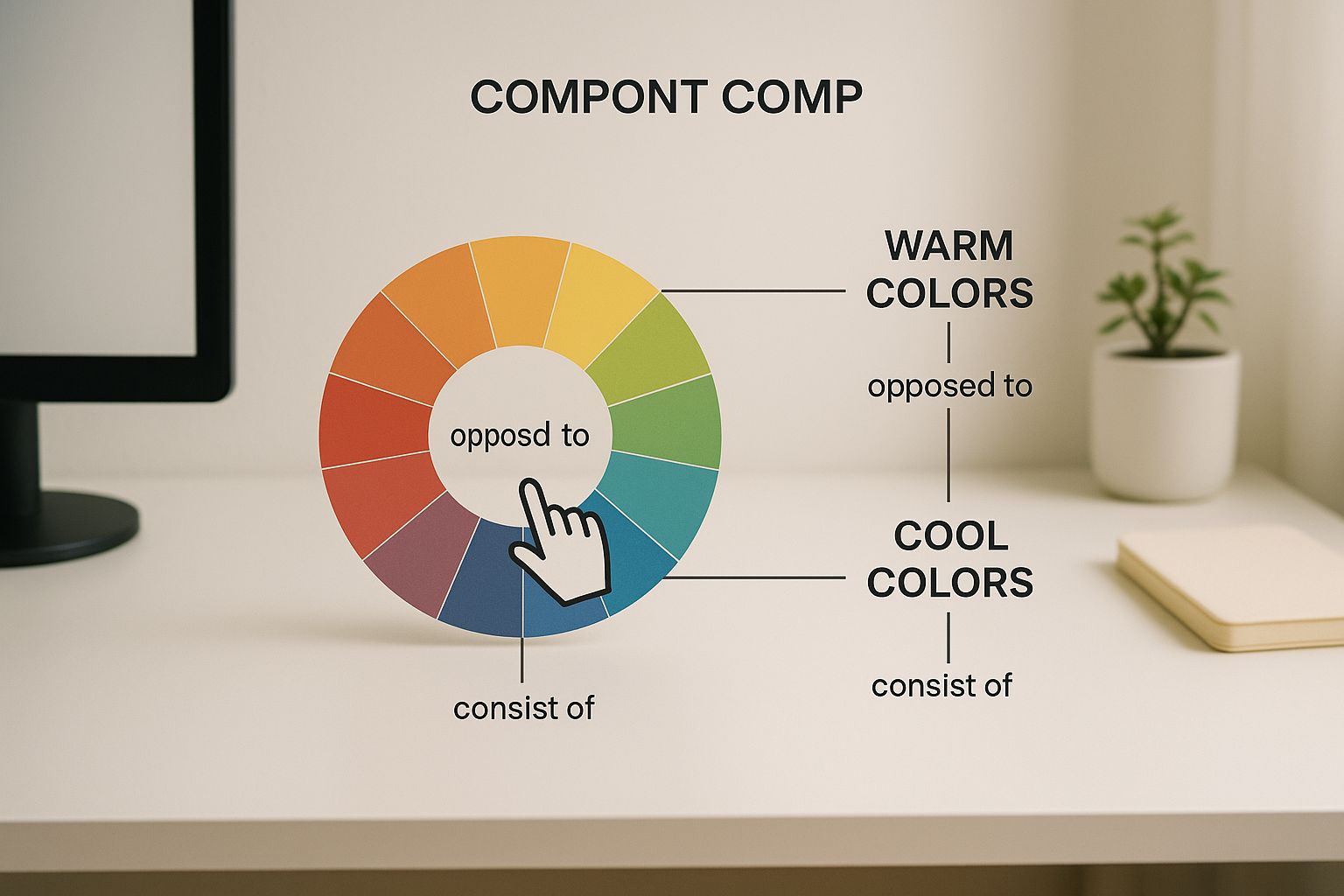
This image highlights the impact of warm and cool colors and how they influence our perception. The cursor suggests the active thought process behind choosing colors with specific psychological effects. Understanding the psychology of color is crucial for creating effective designs.
This image demonstrates key Gestalt concepts. The groupings of shapes and patterns highlight how our brains organize visual data based on proximity, similarity, and other Gestalt principles. By understanding these principles, designers can create visually appealing and effective designs that resonate with users. These principles are essential for creating intuitive and engaging designs.
Color Psychology That Drives Decisions and Emotions
Why does the color red get your pulse pounding, while blue brings a sense of calm? It's a fascinating interplay of millennia of human evolution and decades of research in psychology. We'll delve into how color influences our moods, the choices we make, and how we perceive brands – going far beyond simple aesthetics. This is the core of psychology in design.
The Neurological Basis of Color
Color perception isn't just about our eyes registering light; it's a complex dance happening within our brains. Different wavelengths of light stimulate specific receptors in our eyes, which then send signals to the visual cortex. Think of it like a chain reaction: this triggers a cascade of neurological and hormonal responses, ultimately shaping our emotions and actions. For instance, red is linked to a faster heart rate and heightened alertness, while blue encourages the release of calming hormones.
Imagine our brains as sophisticated control centers, constantly interpreting the world around us. Color acts as a powerful signal, influencing our feelings and reactions in subtle yet profound ways.
Cultural Variations in Color Meaning
It's essential to remember that colors don't speak the same language across all cultures. While red might symbolize luck and celebration in China, it can represent mourning in some African cultures. These cultural nuances are incredibly important for designers, especially those aiming to create campaigns that resonate globally or with specific target audiences. For example, using green in marketing materials for a Middle Eastern audience might be more effective than red, as green holds religious significance in Islamic cultures.
Think of it like choosing the right words for your audience – the same message can be interpreted differently depending on the language spoken. Color operates in a similar way, carrying different cultural baggage and emotional weight.
Color in Branding: Real-World Examples
Businesses, large and small, use color strategically to connect with their customers. McDonald's, with its iconic red and yellow, creates a sense of urgency and stimulates appetite. Hospitals often use calming blues and greens to ease anxiety. Luxury brands frequently opt for black and gold to convey a sense of premium quality. These brands are effectively using psychology in design, forging a deep connection with consumers through color.
Just like a well-chosen word can evoke a powerful image, the right color can create an immediate and lasting impression, shaping how we perceive a brand and its offerings.
Practical Frameworks for Color Selection
This image from Wikipedia shows Plutchik's wheel of emotions, a common reference in color psychology. It visually maps the complex relationships between different emotions and their intensity, reminding us of the intricate ways colors can evoke feelings and shape our responses.
So, how do you choose the right color palette for your project? Think about your target audience, your brand's personality, and the emotional response you want to elicit. A website promoting meditation might use calming blues and greens, while a fitness app might opt for energetic reds and oranges. Designers use color palettes to create specific moods, guide user attention, and even influence behavior, much like a composer uses different musical notes to evoke specific emotions.
To help visualize how color psychology plays a role in brand design, consider the following table:
Color Psychology in Brand Design: How different colors influence consumer behavior and brand perception across industries
Color | Psychological Effect | Industries Using It | Consumer Response Rate |
|---|---|---|---|
Red | Excitement, Urgency, Passion | Food, Retail, Entertainment | High (for impulse buys, grabbing attention) |
Blue | Trust, Calm, Security | Finance, Healthcare, Technology | Medium (builds confidence, fosters loyalty) |
Green | Nature, Health, Growth | Sustainability, Wellness, Finance | Medium (evokes tranquility, promotes well-being) |
Yellow | Optimism, Happiness, Creativity | Food, Education, Children's Products | Medium-High (attracts attention, stimulates creativity) |
Black | Luxury, Sophistication, Power | Fashion, Automotive, Technology | Medium (conveys exclusivity, premium quality) |
This table illustrates how color choices can be strategically aligned with industry and desired consumer response. Choosing the right color can significantly impact a brand's message and effectiveness.
Creating Harmony and Contrast
Effective color palettes aren't just about picking individual colors; it's about how those colors interact. Using analogous colors (those next to each other on the color wheel) creates a sense of harmony, while complementary colors (opposite each other) provide contrast and vibrancy. This intentional use of color results in designs that are both visually appealing and psychologically effective. Understanding color psychology is crucial for creating designs that truly resonate with your target audience. For example, knowing how colors influence decision-making is key, and you can see how this is applied in top-performing personalized email marketing examples. Much like a chef carefully balances flavors in a dish, a designer uses color to create a harmonious and impactful visual experience.
Cognitive Biases: Mental Shortcuts That Control User Behavior
Every day, we make countless decisions. From picking out our clothes to choosing which streaming service to binge, these choices aren't always as rational as we think. Our brains rely on cognitive biases, mental shortcuts that help us process information quickly. Understanding these biases is like having a secret decoder ring for user behavior.
The Paradox of Choice: Less Is More
Imagine standing in front of a wall of jams. Twenty-four delicious flavors, each more tempting than the last. Overwhelmed? You’re not alone. A study found that offering too many choices can actually reduce sales. When researchers presented shoppers with 24 jam varieties, only 3% made a purchase. With just 6 options? The number jumped to 30%. This is the Paradox of Choice: more isn't always better. Giving users fewer, carefully selected options can significantly improve their decision-making experience. Learn more about this fascinating study here.
Anchoring Bias: First Impressions Matter
The first piece of information we encounter often acts as an anchor, influencing how we perceive everything that follows. Think about a shirt originally priced at $200, now marked down to $100. That initial $200 price sets the stage, making the $100 sale price seem like a steal. This is the anchoring bias. As designers, we can use this to our advantage by presenting desirable options first, creating a positive first impression that shapes subsequent choices.
The Decoy Effect: Guiding Choices Subtly
Ever felt swayed by a seemingly less appealing option? That might be the decoy effect at play. It's all about introducing a third option that makes one of the original two seem far more attractive. Take Netflix's subscription plans, for example. They might offer a Basic, Standard, and Premium plan. The Standard plan, often the sweet spot, is priced close to the Premium, making it feel like a much better deal compared to the Basic. This subtle nudge can effectively guide users toward the desired choice.
This screenshot from Wikipedia’s Cognitive Bias page illustrates just how many biases affect our decisions. It's a visual reminder of the complexity of human psychology. Designing with these biases in mind means working with human nature, not against it.
Scarcity Bias: Creating a Sense of Urgency
"Only 3 left in stock!" Ever felt the pressure of that message? That’s scarcity bias tapping into our fear of missing out. Creating a sense of urgency can be a powerful motivator. Amazon frequently uses this tactic with messages like "Limited-time offer!" This encourages users to act quickly, making a purchase before the opportunity disappears. For example, understanding how colors influence our choices is key, and you can see this in action in top-performing personalized email marketing examples.
Social Proof: The Power of the Crowd
We’re social creatures. We often look to others for guidance, especially in uncertain situations. This is social proof. Seeing testimonials, positive reviews, or a large number of followers can significantly impact our decisions. Designers can leverage this by incorporating social proof elements into their designs. Think user reviews, social media share counts, or highlighting the number of app downloads.
Ethical Considerations: Working With Biases, Not Against Them
Cognitive biases are powerful tools. But like any powerful tool, they should be used responsibly. The goal is not to manipulate or deceive users. Instead, we should use these insights to create designs that feel intuitive, reduce cognitive load, and truly benefit the user. By understanding and respectfully applying these principles, we can craft experiences that are both engaging and ethical.
Emotional Design: Creating Connections That Last Forever
Logic has its place, but let's be honest, emotions are the real powerhouses behind our decisions. The best designs get this. They tap into our feelings, creating experiences that feel personal and meaningful – experiences we remember. That's the core of psychology in design: building connections that truly resonate.
The Three Levels of Emotional Design
Think of emotional design as having three layers: visceral, behavioral, and reflective. Visceral reactions are instant, gut feelings about a design's look and feel. Picture the sleek lines of a sports car or the satisfying click of a well-made pen. These first impressions matter.
Behavioral responses come with use. A website that's easy to navigate, for example, creates a positive behavioral response. You feel in control, like you're accomplishing something. Reflective connections, on the other hand, are the long-term impressions that build true brand loyalty. This is where stories, personal meaning, and lasting memories come into play.
Imagine walking into a cozy cafe. The warm lighting and the smell of coffee create a positive visceral reaction. Easy-to-read menus and comfy chairs make for a good behavioral experience. And if that cafe becomes your place, filled with memories and friendly faces, that's a reflective connection.
From Users to Fans: The Power of Emotional Resonance
Emotional design turns users into fans. It's the difference between simply using something and truly loving it. Think about Apple products. The care they put into every detail, from the packaging to the user interface, creates an emotional connection that goes beyond just function.
Similarly, Airbnb connects hosts and guests, building trust and turning strangers into a community. Even in the world of online reviews, understanding the psychology behind anonymous Google reviews can be incredibly valuable.

This image, from the Wikipedia page on Emotional Design, shows how visceral, behavioral, and reflective design all work together. It highlights how these levels shape our experience with a product or service.
Practical Techniques for Emotional Engagement
So how do you bring these emotional elements into your designs? Think about micro-interactions – those tiny moments of feedback that spark a bit of joy. A fun animation after completing a task, or a personalized greeting can make all the difference.
Storytelling is another powerful tool. Weaving narratives into your designs can create deeper engagement and build connections. Imagine a new app onboarding experience. Instead of a boring tutorial, what if it used a short, animated story to introduce the app’s features? That not only explains how things work, but also builds an emotional connection.
Building Emotional Attachment Through Design
Companies like Apple are masters at building emotional attachment through their attention to detail. The satisfying unboxing of a new iPhone is more than just the product; it's the anticipation, the excitement, the feeling of getting something special. Airbnb builds connections by highlighting the personalities of hosts and guests, creating a sense of community and trust.
Building trust is fundamental to long-term customer relationships. Clear communication, transparency, and a genuine focus on the user's well-being create strong emotional bonds that lead to loyalty. This emphasis on emotional connection is key to creating successful, enduring brands. Psychology in design is vital for making products and services that resonate deeply with people, transforming them from casual users into passionate advocates.
Business Impact of Psychology-Driven Design Success
Psychology in design isn't about making things "pretty." It's about truly understanding your users—what motivates them, what frustrates them, and what ultimately makes them click that "buy now" button. By tapping into these psychological principles, businesses can see real, measurable improvements to their bottom line.
The Psychology of Conversion: Turning Lookers into Buyers
Imagine a landing page that doesn't just look inviting, but actually speaks to your visitors' subconscious desires. Using color psychology, designers can create calls to action that pop off the screen and practically beg to be clicked. Think about the power of a well-placed, brightly colored "Add to Cart" button.
Another powerful tool is the scarcity bias. By subtly highlighting limited availability or time-sensitive offers, designers can create a sense of urgency. It's not about manipulating users; it's about nudging them towards a decision they already want to make.
Through techniques like A/B testing, designers can fine-tune every element for maximum impact. For example, an e-commerce site might experiment with different button colors to see which one leads to more purchases. It's all about using data and psychology to optimize the user journey.
Engagement and Retention: Keeping Users Hooked
Think about your favorite apps. What keeps you coming back for more? It's rarely just about the features; it's about the experience. Apps like Spotify tap into our desire for confirmation bias by curating personalized playlists filled with music we already love. Slack leverages the power of social proof and belonging by making team communication seamless and engaging.
These platforms are masters at building habits and fostering loyalty. And that translates to higher user retention rates—a critical metric for any business. By keeping users engaged and invested, companies can build strong, long-lasting relationships.
Customer Satisfaction: Building Positive Experiences
Happy customers are the heart of any successful business. Psychology in design plays a vital role in crafting those positive experiences that lead to lasting satisfaction. Imagine a website that's a breeze to navigate, with crystal-clear information and intuitive interactions.
This doesn't just make the user's life easier; it empowers them. It creates a sense of competence and control, fostering a positive overall experience. And happy customers are more likely to spread the word, leading to valuable organic growth and a stellar brand reputation.
Measuring the ROI of Psychology in Design
It's essential to show stakeholders the real-world benefits of psychology-informed design. By tracking key metrics like conversion rates, user engagement, and customer satisfaction, businesses can clearly see how design choices impact the bottom line.
This data-driven approach empowers designers to make informed decisions and justify budget allocation for psychology-focused initiatives. It's about demonstrating that good design isn't just about aesthetics—it's a powerful business tool.
McKinsey's focus on user-centric design highlights the importance of understanding user needs and motivations. Their data-driven approach shows how psychology in design can be seamlessly integrated into business strategy.
The increasing professionalization of design has led to the integration of robust psychological research methods into industry best practices. For example, a 2018 McKinsey Global Institute report revealed that companies with strong design capabilities outperformed their industry peers by 20–30% in shareholder returns over a five-year period. Much of this success was attributed to a deep understanding of user psychology. Discover more insights. This integration isn't just a passing trend; it's a fundamental shift in how businesses approach product and service development.
Building a Business Case for Psychology-Informed Design
By presenting compelling data and sharing real-world success stories, designers can make a strong case for incorporating psychology into the design process. This involves developing frameworks for measuring the psychological impact of design decisions, calculating return on investment, and demonstrating the long-term value of user-centric design practices.
This strategic approach ensures that psychology-informed design becomes a core component of business strategy, not just a cosmetic afterthought. Ultimately, it's about creating experiences that not only delight users but also drive business growth and deliver tangible results.
Building Your Psychology-Informed Design Toolkit Today
Ready to weave psychology into your design work? This toolkit offers practical frameworks and strategies to help you do just that, without feeling lost in a sea of theories. We'll explore a step-by-step method for conducting user psychology research, analyzing behavioral data, and making design decisions rooted in real insights.
Understanding Your User: A Psychological Deep Dive
The foundation of psychology-informed design is a deep understanding of your user. This means going beyond simple demographics and diving into their motivations, frustrations, and even their cognitive biases. Think of it like building a detailed character profile. You want to understand not just who your users are, but why they do what they do.
For example, imagine creating a persona for a fitness app. Instead of just noting age and location, you'd also explore motivations like the desire to feel healthier, frustrations with limited time, and biases such as being influenced by social proof (seeing others succeed). This richer understanding paints a clearer picture and helps steer your design decisions.
User Testing: Uncovering Hidden Biases
User testing is like holding a magnifying glass up to your designs, revealing how users actually interact with them, and uncovering hidden biases. This means designing specific testing protocols to identify cognitive biases at play. For instance, are users influenced by the decoy effect (choosing an option because it makes another look better)? Or do they exhibit anchoring bias (relying too heavily on the first piece of information they receive)? These insights are gold for optimizing your design.
Consider using eye-tracking software during testing. It’s like having x-ray vision, showing you exactly where users look and what elements capture their attention. This visual data provides a powerful, direct view into user behavior.
Design Systems: Scaling Psychology-Informed Design
Once you’ve gathered valuable psychological insights, it’s time to create a design system. Think of it as a style guide infused with psychology. This system ensures consistency and guarantees that every element of your design, from the color palette to the font choices, reflects your understanding of the target audience.
For example, if your research reveals a positive response to calming blues and greens, your design system should incorporate these colors across the interface. This creates a cohesive experience that resonates with users on a psychological level, like a calming melody played throughout a movie.
This screenshot from the Nielsen Norman Group highlights key psychological principles relevant to design, including Hick's Law, Fitts' Law, and the principle of cognitive load. These principles illustrate the significant influence of human factors on user interface effectiveness. Applying them creates smoother interactions and a more user-friendly experience.
Practical Frameworks and Resources
This toolkit offers practical checklists and templates, putting these principles into action right away. These resources simplify incorporating psychology into your designs. From crafting user personas to designing robust user testing protocols, you’ll have the tools to get started. We also offer curated resources to continue your journey in design psychology.
Building a Psychology-Informed Design Culture
Building a psychology-informed design culture within your team is about continuous learning and collaboration. It's like creating a shared language around user psychology. Sharing research findings, discussing case studies, and encouraging experimentation are key. By fostering this shared understanding, you can create designs that truly resonate with your audience.
This collaborative approach not only improves the quality of your designs but also empowers your team to make more informed decisions. This creates a positive feedback loop of constant improvement and innovation.
Ready to transform your designs and build experiences that truly connect with users? Happy Pizza Studio is your partner in psychology-informed design. We offer a range of design services, from brand redesigns to motion graphics, all rooted in a deep understanding of user psychology. Visit us today and discover how we can help you achieve your design goals.


