
Understanding What Is Gradient Color in Visual Design
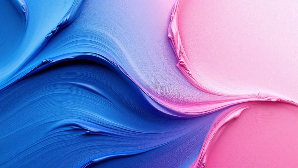
This screenshot gives us a glimpse into the world of gradients. See how smoothly those colors transition? From basic linear fades to intricate radial and multi-stop variations, this image really captures the range of what's possible. At its core, gradient color is all about that gradual shift between hues.
Think about a sunrise. That seamless blend from deep purple to a warm, golden yellow? That's nature's perfect gradient. It's a visual bridge between two distinct colors. Even closer to home, consider the soft gradation of a shadow on a wall, or how cream swirls into your morning coffee. These everyday occurrences are gradients in action.
Gradients: More Than Just Decoration
Gradients often get a bad rap as mere decoration. But they're so much more than that. They hold real power in visual design.
One of the coolest things gradients do is create depth and dimension. Think about how a flat, 2D shape can suddenly feel more substantial with a well-placed gradient. They also act as subtle guides for the eye. They can direct a viewer's attention exactly where you want it to go within your design, highlighting key information or important calls to action.
The Emotional Impact of Gradient Color
Beyond the visual appeal, gradients tap into our emotions. Imagine a warm gradient of reds and oranges. It feels energetic, maybe even exciting, right? Now picture cool blues and greens. Suddenly, the mood shifts to something calmer and more tranquil. This emotional connection isn’t accidental. It’s rooted in our associations with colors in nature and culture.
Designers understand this power and use gradients to evoke specific feelings, setting the tone and influencing how people perceive their work. By harnessing this emotional impact, gradients become tools for telling compelling visual stories.
The Journey From Traditional Art to Digital Gradient Magic

This screenshot shows Adobe Photoshop, a go-to tool for creating digital gradients. Look at the range of gradient options! It really highlights the flexibility and control we have with modern software. The ability to easily tweak colors, direction, and blending has completely changed how we design with gradients.
Long before digital tools existed, artists created gradients by hand. Imagine Renaissance painters carefully blending oil paints to create smooth transitions between skin tones. It was a painstaking process.
Creating a subtle shift from one color to another could take hours of layering and blending. These limitations, however, often pushed artists to find new and innovative techniques.
Tools of the Trade
The invention of the airbrush and later, spray paint, in 1949 was a game-changer. Spray paint really took off in the 1960s and 70s, but both tools gave artists new ways to explore gradient color. They made it possible to create quicker and more dynamic color transitions, opening up exciting creative possibilities. Gradients have a rich history, showing up in art and design across different eras. Want to delve deeper? Discover more insights.
Thinking about color harmonies can really improve your gradient designs. For instance, using complementary colors or even a split complementary color approach can work beautifully with gradients.
Then came digital tools like Photoshop in 1990. They revolutionized the field, giving designers incredible control and precision.
The Science Behind Why Gradients Work (Without the Jargon)
Think of color theory as the psychology of visual communication. Gradient color is one of its most potent tools. Our brains respond powerfully to smooth transitions between colors, and it's not just because they look nice. Gradients tap into something deeper – how we understand depth, light, and feeling.
Picture a sunset. The seamless shift from vibrant orange to a calming purple evokes a sense of peace and wonder. That's the interplay of hue, saturation, and brightness at work.
Some gradient combinations, like ocean blues melting into sandy beiges, feel inherently harmonious because they mirror color relationships found in nature.
Other combinations, such as vibrant pink fading into deep black, create deliberate tension and grab our attention through contrast. Understanding these relationships is fundamental to effective gradient design.
A Little History of Color
Color theory has a rich history. In the early 20th century, Albert Henry Munsell developed a detailed color system, categorizing color into hue, value (brightness), and chroma (saturation). These dimensions are still used by designers today. Munsell's work helps us understand color interactions and transitions, which is essential for creating gradients. Discover more insights about color theory.
This screenshot shows the Munsell color system, a 3D model representing all perceivable colors. The vertical axis represents value, the horizontal axis represents chroma, and the circumference represents hue.
The image reveals how colors relate to each other in terms of these three dimensions. It illuminates how gradients are created by smoothly transitioning through this color space. By understanding these principles, we can anticipate how different color relationships within a gradient will influence how a viewer feels and acts.
Warm, Cool, and Cultural Associations
Warm gradients, like reds and oranges, often evoke feelings of energy and excitement.
Cool gradients, such as blues and greens, create a calmer, more professional feel.
Cultural associations also play a significant role. In some cultures, red symbolizes good luck; in others, it signifies danger. These learned associations influence how we perceive gradient color, adding a layer of complexity.
Crafting an effective gradient isn't about memorizing rules, but about developing an intuitive understanding of these intricate relationships. This understanding empowers you to achieve your design goals.
Mastering the Four Gradient Types That Actually Matter
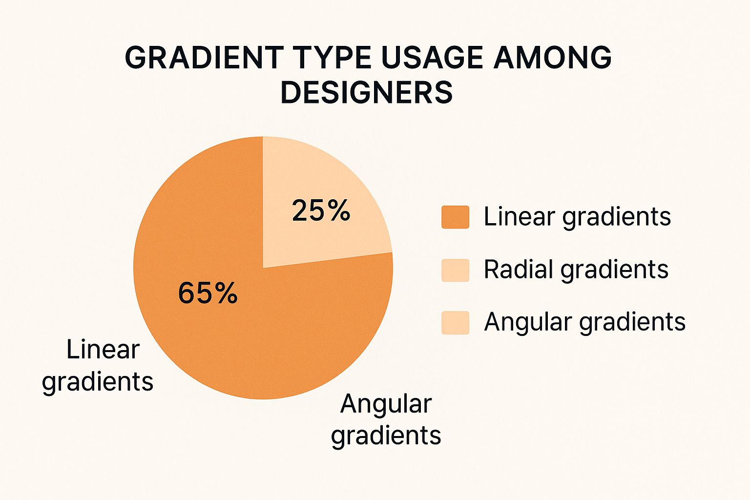
This infographic gives us a peek into how designers use different types of gradients. Linear gradients are the clear favorite, used in 65% of designs. Radial gradients come in second at 25%, while angular gradients round out the top three at 10%. The popularity of linear gradients probably comes down to how flexible and easy they are to use. But knowing how to use all gradient types unlocks a whole new level of creativity.
Not all gradients are the same. Picking the right one is essential for good design. Let's dive into the four gradient types that really make a difference: linear, radial, angular, and diamond gradients. We'll use real-world examples to see how each one shines.
Linear Gradients: The Workhorse
Linear gradients are like the steady workhorses of the design world. They're great for adding depth to backgrounds and showing the direction of light. Think of a clear sky, fading from a pale blue at the horizon to a deeper blue above. That simple linear gradient adds a touch of realism and makes the sky feel vast.
Radial Gradients: The Spotlight
Radial gradients are your go-to for spotlight effects. They pull your eye towards a focal point, just like a spotlight on a stage. Imagine a radial gradient radiating outwards from a product image on a website. It highlights the product's features and instantly grabs attention.
Angular Gradients: Dynamic Energy
Angular gradients inject energy and movement into your designs. They create a sense of rotation, perfect for backgrounds or UI elements that need a bit of life. Picture a vibrant, spinning color wheel – that's the visual punch an angular gradient delivers.
Diamond Gradients: Unique Focal Geometry
Diamond gradients offer a unique, often overlooked, focal point. They create a concentrated burst of color from the center, perfect for highlighting specific elements or adding an unexpected visual flair. Imagine a diamond's facets catching the light – that's the kind of focused attention a diamond gradient brings.
This screenshot shows a gradient color palette tool in Canva. Look at all those pre-made gradient combinations! It's so easy to customize the colors and stops. This really shows how accessible gradient creation has become with modern design tools. These tools make it easy for designers to play with complex color transitions, opening a world of creative possibilities.
Your choice of gradient has a big impact on how users perceive your design and how much they engage with it. A common mistake is using a radial gradient where a linear one would work better. Really understanding each gradient type and how to use it is key for hitting your design goals. By learning these differences, you'll go from just liking a gradient to strategically picking the best one for the job.
To help you choose the right gradient, take a look at this handy comparison table:
Gradient Types Comparison Guide A comprehensive comparison of different gradient types, their characteristics, best use cases, and visual effects
Gradient Type | Direction | Best Use Cases | Visual Effect | Common Applications |
|---|---|---|---|---|
Linear | Straight line | Backgrounds, subtle shading, creating depth | Gradual transition between colors | Website headers, button backgrounds, image overlays |
Radial | Circular, from a central point | Highlighting focal points, creating a spotlight effect | Concentrated color burst, draws the eye | Product showcases, button highlights, image effects |
Angular | Conical, rotating around a central point | Adding dynamic energy, creating a sense of motion | Rotating color wheel effect | Backgrounds, UI elements, loading animations |
Diamond | Diamond-shaped, from the center outwards | Highlighting elements, adding a unique visual twist | Faceted, concentrated burst of color | Logos, icons, image effects |
This table summarizes the key characteristics and applications of each gradient type. Remember, while these are common uses, don't be afraid to experiment and find new ways to incorporate gradients into your designs. By understanding the strengths of each type, you can make informed decisions and create visually stunning and effective designs.
Real-World Gradient Success Stories That Changed Everything
This Dribbble screenshot, showcasing a collection of gradient color designs, reveals just how versatile this technique can be. From subtle background washes to vibrant, in-your-face graphics, it's clear that designers are constantly finding new ways to use gradients. Dribbble is a fantastic source of design inspiration, by the way.
Let's dive into some specific examples of brands using gradients effectively. Think about Instagram. Their logo evolved from a simple camera icon to incorporate a vibrant, multi-stop linear gradient. This became a core part of their brand identity, instantly recognizable and widely imitated.
Spotify's Emotional Resonance
Another great example is Spotify. They often use soft, radial gradients as backdrops for album art. This adds an atmospheric quality, almost like a visual echo of the music itself. It's a subtle touch, but it contributes to the overall emotional experience of using the platform.
Gradients in Web and Mobile UI
Gradients aren't just for logos and branding. They play a big role in web and mobile UI design too. Ever notice how some websites just feel more modern and polished? Often, that's due to subtle linear gradients adding depth and dimension to backgrounds or button elements. Similarly, many mobile apps use gradients to create visual separation between sections or draw attention to key features.
The psychology of color in gradients is an interesting area to explore. Think about the energy of bright, vibrant gradients—often a good fit for tech startups trying to project a sense of innovation. Compare that with the subtle elegance of gradients used by luxury brands, conveying exclusivity and sophistication. The same technique, used in different contexts, can evoke completely different feelings.
These examples aren't just isolated incidents. They illustrate how strategically applied gradient color can solve real design problems, from boosting brand recognition to enhancing the user experience. By studying these successful implementations, we can learn valuable lessons about using gradients effectively in our own projects.
Your Toolkit for Creating Professional Gradient Effects
This screenshot showcases a design in Figma, a popular collaborative design tool. The smooth gradient in the background isn't just visually appealing; it highlights how seamlessly gradients fit into modern design workflows. Figma is known for its collaborative features, and its gradient tools are no exception, making teamwork on complex gradient designs a breeze.
So, we've covered the what and why of gradients. Now, let's dive into the how. Like any design element, bringing your gradient vision to life requires the right tools. Think of it as assembling the perfect team for a project – each member brings unique skills to the table. Similarly, different design software offers unique strengths when it comes to gradients.
Essential Gradient Software
Let's move beyond generic feature lists. We'll explore which tool shines in specific situations. For example, imagine a team project with multiple designers working on the same gradient simultaneously. Figma's collaborative nature makes it the ideal choice. Now, picture a gradient destined for print. You need it to be razor-sharp, regardless of size. Illustrator's vector-based gradients are perfect for this, ensuring your work scales flawlessly without a hint of pixelation. Finally, consider the dynamic world of the web. Animated transitions, complex multi-stop gradients – these are the domain of CSS gradients, offering possibilities difficult or impossible to achieve in traditional design software.
Photoshop: This raster-based powerhouse excels at creating photorealistic gradients and intricate blends within images – think subtle color shifts in a photograph or the soft glow of a digital painting. Photoshop gives you granular control over every pixel.
Illustrator: Need a gradient that stays crisp even on a billboard? Illustrator is your answer. Its vector-based approach ensures your gradients remain sharp at any size, making it the gold standard for print design.
Figma: Built for collaboration, Figma is perfect for team projects and sharing gradient styles. Imagine a team working on a website design – everyone can access and tweak the same gradient styles, ensuring consistency across the board.
CSS: For web designers, CSS offers unmatched control. Manipulate gradients directly in the code, creating dynamic effects and animated transitions that bring your web designs to life.
To help you navigate these options, here's a handy comparison table:
Gradient Tools Feature Comparison Detailed comparison of gradient capabilities across major design tools and platforms
Tool/Software | Gradient Types | Ease of Use | Best For | Price Range |
|---|---|---|---|---|
Linear, Radial, Angle, Reflected, Diamond | Intermediate | Photo editing, raster-based design | Subscription | |
Linear, Radial, Freeform, Mesh | Intermediate | Vector graphics, print design | Subscription | |
Linear, Radial, Angle, Diamond | Beginner-Intermediate | UI/UX design, web design, collaboration | Freemium/Subscription | |
CSS | Linear, Radial, Conic | Intermediate-Advanced | Web design, dynamic gradients | Free (part of web standards) |
This table offers a quick glance at the strengths of each tool, highlighting key differences in gradient types, ease of use, and ideal applications. The pricing information helps you choose the best fit for your budget.
Achieving Professional Results
Creating a truly polished gradient involves more than just picking colors. Let's walk through some professional techniques to achieve seamless transitions. Have you ever encountered color banding, where you see distinct steps in your gradient instead of a smooth blend? It's a common frustration. We'll cover how to avoid this by using the right color modes and bit depths – think of it as choosing the right ingredients for a perfect recipe.
Another challenge is ensuring your gradients look consistent across different media. What looks stunning on your screen might appear dull in print. We'll share techniques for maintaining consistency, so your designs shine regardless of how they’re viewed. We'll also dive into troubleshooting – ever had a gradient render differently across browsers? We'll explore solutions for those browser compatibility headaches. These details are the finishing touches that elevate your work from good to great.
Troubleshooting Common Gradient Problems
Even seasoned designers encounter gradient hiccups. We've compiled a troubleshooting guide – your go-to resource for tackling those occasional frustrations. Think of it as a first-aid kit for your gradient woes. This toolkit empowers you not just to create gradients, but to truly master them.
Learning From Gradient Mistakes (So You Don't Have To)
Let's chat about gradients gone wrong. We've all encountered them: websites where poor contrast makes text illegible, brand identities that look muddy, or UI elements that just feel…off. Spotting these issues early can save you time and headaches, and boost your confidence in using gradient color effectively.
Accessibility First
One major pitfall in gradient design is overlooking accessibility. Imagine a sleek gradient behind some text. Stylish, right? But if the color contrast is too low, anyone with a visual impairment might struggle to read it. Suddenly, style becomes a barrier. It's not just about aesthetics; it's about making design inclusive.
This screenshot powerfully illustrates how low contrast impacts readability. The high-contrast text on the left is easy to read. The same text on the right, with low contrast, practically disappears. It's a clear reminder of why accessibility matters.
Always check your gradients against accessibility guidelines. Make sure there's enough contrast between text and its background. Consider offering alternative text versions for screen reader users.
Context Is King
Another common mistake? Designing gradients in a vacuum. A gradient might look amazing on its own, but how does it interact with the rest of the design? Does it clash with other elements? Does it pull focus from the main message?
Think of a bright, multicolored gradient as a website background. Gorgeous in a mockup, perhaps. But if it makes the text hard to decipher or fights with the site's images, it's a design flop. A good starting point for experimenting is a free online Gradient Maker.
Testing and Iteration
The secret to avoiding these issues? Testing and iteration. Experiment freely, but always test your gradients in real-world conditions. How do they look on different devices, under different lighting, and to different users? Gather feedback, tweak your designs, and refine your gradient use until it strengthens, rather than weakens, your overall goals.
The Takeaway
Gradient color is a powerful design tool, but like any tool, it can be misused. By learning from common mistakes and prioritizing accessibility, context, and testing, you can truly unlock the potential of gradients. You'll create designs that are both visually stunning and effective.
Ready to elevate your designs with visuals that drive conversions? Explore Happy Pizza Studio at https://happypizza.studio for a variety of design services, including brand redesigns and motion graphics. We're passionate about crafting visual experiences that not only impress but also deliver results.


