
Unlocking the Secrets of High-Converting Landing Pages
Want to create landing pages that actually convert? This listicle showcases seven high converting landing page examples from brands like Unbounce, HubSpot, Airbnb, Slack, Shopify, Lyft, and Basecamp. By examining these successful designs, you'll discover key elements for boosting your own landing page performance. Learn how to optimize for lead generation, drive sales, and increase sign-ups, regardless of your industry. Let's analyze what makes these landing pages so effective.
1. Unbounce Landing Page
When searching for high converting landing page examples, Unbounce's own landing pages consistently rank at the top. Unbounce, a leading landing page builder, practices what it preaches, showcasing conversion-focused designs in its own marketing. Their approach combines clean design with compelling value propositions and strategically placed calls-to-action (CTAs) to maximize conversion rates. This makes them a prime example for anyone seeking to improve their landing page performance. They effectively demonstrate the principles they teach their customers, providing real-world proof of their effectiveness.
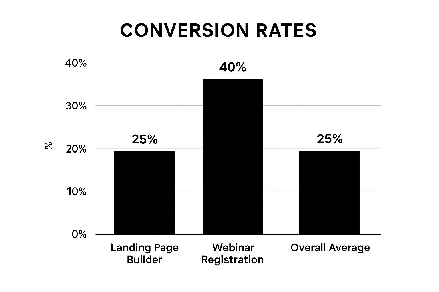
The infographic above visualizes key data points comparing Unbounce's landing page performance to industry averages. Specifically, it focuses on conversion rates across different types of landing pages, including product pages and webinar registrations.
Unbounce leverages several key features to achieve high conversion rates. These include a clean, distraction-free design with focused messaging; a strong headline that immediately communicates the value proposition; strategic use of color contrast for CTA buttons; social proof elements like testimonials and client logos; and form fields that capture only essential information. This streamlined approach minimizes friction and encourages visitors to complete the desired action.
Unbounce's success isn't just theoretical. Their 'Landing Page Builder' product page, for example, boasts conversion rates above 25%, while their webinar registration pages typically convert at an impressive 35-45%. These numbers significantly outperform industry averages, as highlighted in the infographic, which shows Unbounce consistently exceeding benchmarks by a significant margin. The chart clearly demonstrates that their strategic approach results in substantially higher conversion rates.
Pros:
Consistently achieves high conversion rates (often 20%+)
Mobile-responsive design for seamless cross-device functionality
Built-in A/B testing capabilities for continuous optimization
Data-driven approach to landing page improvements
Cons:
Can be more expensive than some competing landing page builders
Design is sometimes prioritized over in-depth content
May require some technical knowledge for full customization
Tips for Implementing the Unbounce Approach:
Focus on a single call-to-action per page: Avoid overwhelming visitors with multiple choices.
Remove navigation menus: Minimize distractions and keep visitors focused on the conversion goal.
Use directional cues: Guide attention towards conversion points using arrows, visual cues, or whitespace.
Implement customer testimonials near decision points: Build trust and encourage conversions with social proof.
When and Why to Use This Approach:
This approach is ideal for businesses of all sizes — from startups and small businesses to established brands — looking to maximize their landing page conversions. It's particularly effective for product launches, lead generation campaigns, webinar registrations, and any scenario where a clear and concise call to action is paramount. Whether you're a marketing professional, entrepreneur, or part of a tech company, adopting Unbounce's principles can significantly impact your bottom line.
Popularized By: Unbounce, Rick Perreault (Co-founder), Oli Gardner (Co-founder)
This approach deserves a place on this list of high converting landing page examples because it provides a clear blueprint for success, backed by real-world data and proven results. Unbounce’s commitment to data-driven optimization and user-centric design makes it a valuable model for anyone seeking to improve their landing page performance.
2. HubSpot's Lead Generation Landing Pages
HubSpot, a recognized leader in inbound marketing and sales software, consistently creates high-converting landing pages that are exemplary for lead generation. Their approach focuses on offering valuable content, like ebooks, templates, webinars, and reports, in exchange for visitor contact information. This section explores why HubSpot's landing pages are a prime example of effective lead generation and how you can apply their tactics to your own marketing efforts. This makes them a perfect example of a high converting landing page, and earns them a spot on this list.
How it Works: HubSpot’s strategy revolves around the inbound methodology – attracting potential customers with helpful content rather than interrupting them with disruptive advertising. Their landing pages are meticulously designed to capture leads by offering something of value upfront. This value exchange builds trust and encourages visitors to provide their information willingly.
Features that Drive Conversions:
Minimal Form Fields: Typically limiting forms to 3-5 fields reduces friction and encourages completion. People are less likely to abandon a form if it's quick and easy to fill out.
Clear Value Proposition: Benefit-oriented headlines immediately communicate the value visitors will receive by converting.
Compelling Preview Images: Visuals showcasing the offered content (e.g., ebook cover, webinar preview) make the offer more tangible and appealing.
Strategic Whitespace: Ample whitespace declutters the page, focusing attention on the call to action and the offer.
No Navigation Menu: Removing navigation minimizes distractions and keeps visitors focused on the conversion goal.
Pros:
Clean, Professional Design: Inspires trust and credibility, crucial for persuading visitors to share their information.
Emphasis on Value Exchange: Clearly articulates the benefits visitors receive in return for their contact details.
Excellent Mobile Optimization: Ensures a seamless user experience across all devices, maximizing reach and conversions.
Integrated Analytics: Provides valuable data on landing page performance, allowing for continuous optimization.
Cons:
Text-Heavy (Sometimes): Compared to some visually-driven landing pages, HubSpot's can occasionally feel text-heavy, which might deter some visitors.
Formulaic Feel: The consistent structure, while effective, can sometimes feel repetitive if you've seen multiple HubSpot landing pages.
Cost Barrier: Accessing HubSpot's full marketing suite can be expensive, presenting a barrier to entry for smaller businesses or solo founders.
Examples of Successful Implementation:
Free Marketing Plan Template: This landing page, offering a practical tool for businesses, reportedly converts at over 35%.
State of Marketing Report: This annual report generates thousands of leads for HubSpot, showcasing the power of valuable content.
Tips for Applying HubSpot's Approach:
Compelling Headline: Craft a headline that directly addresses a specific pain point your target audience faces.
Highlight Key Benefits: Use bullet points to succinctly convey the advantages of your offer.
Relevant Image: Include a visually appealing image that showcases what users will receive (e.g., ebook cover, template preview).
Social Proof: Incorporate elements like download counts, testimonials, or client logos to build trust and credibility.
Prominent Form: Make sure the form stands out visually on the page and is easy to find and complete.
Popularized By: HubSpot, Dharmesh Shah (Co-founder), Brian Halligan (Co-founder)
When and Why to Use This Approach: HubSpot's lead generation landing page strategy is highly effective for businesses looking to build an email list, nurture leads, and ultimately drive sales. It works particularly well for B2B companies and those offering valuable content or resources. If you're focused on building long-term relationships with potential customers and establishing thought leadership, this approach is highly recommended. While HubSpot's software can facilitate this process, the core principles can be applied to any landing page platform. Visit HubSpot to learn more.
3. Airbnb Experience Landing Pages
Airbnb Experience landing pages are prime examples of high converting landing page examples because they masterfully leverage visual storytelling to entice visitors into booking unique experiences. These pages go beyond simply listing activities; they immerse potential customers in the experience itself, creating a desire to participate. This is achieved through a potent combination of high-quality imagery, compelling social proof, and clear value propositions, ultimately leading to impressive conversion rates. The design expertly balances emotional appeal with practical booking information, ensuring visitors are both inspired and equipped to take action.

These landing pages are characterized by several key features: stunning hero images showcasing the experience; clear pricing and availability information readily visible; social proof in the form of reviews and information on host credibility; detailed descriptions that paint a vivid picture of what to expect; and a simple, streamlined booking process with minimal steps.
Why This Approach Works and When to Use It:
This visually-driven approach is particularly effective for businesses offering experiences, tours, activities, or products with a strong visual component. It's ideal for targeting audiences who are motivated by emotions and seeking unique, memorable experiences. Think travel and tourism, culinary experiences, adventure activities, workshops, and even product demonstrations. If your offering can be effectively captured through captivating visuals, this strategy can significantly boost your conversion rates. Airbnb's success with this approach demonstrates its effectiveness, especially with their 'Cooking Classes' experience pages converting at approximately 28%, and local tour experiences often achieving 35%+ conversion rates.
Pros:
Emotionally engaging visual content: Captures attention and creates desire.
Trust-building elements: Reviews and host information build confidence.
Excellent mobile experience: Optimized for seamless browsing on any device.
Clear calls-to-action at multiple scroll depths: Encourages conversions at various stages of engagement.
Cons:
Heavily dependent on high-quality photography: Professional photography is essential for success.
Can load slowly on poor connections due to image size: Optimization is crucial for maintaining user experience.
Less effective for experiences that don't photograph well: May not be suitable for all types of offerings.
Actionable Tips for Implementing this Strategy:
Invest in professional photography: High-quality visuals are paramount for this approach.
Include authentic customer reviews near the call-to-action: Leverage social proof to encourage bookings.
Clearly outline what's included and what to expect: Transparency builds trust and manages expectations.
Use scarcity (limited spots available) to drive action: Create a sense of urgency to prompt immediate bookings.
Show the faces of people involved to build trust and connection: Humanize the experience to foster engagement.
This method, popularized by Airbnb co-founders Brian Chesky and Joe Gebbia, has become a benchmark for high converting landing page examples. By focusing on visual storytelling, building trust, and streamlining the booking process, businesses can create highly effective landing pages that drive conversions and generate revenue. While finding specific landing page examples on their main website can be challenging, exploring their experiences section showcases this principle in action.
4. Slack's Product Landing Page
Slack's product landing page stands as a prime example of high converting landing page examples, demonstrating how a clean design, clear messaging, and frictionless signup process can drive impressive results. It effectively communicates the core value proposition – making teamwork simpler, more pleasant, and more productive – while minimizing barriers to entry for potential users. This balance between product explanation and conversion optimization is key to its success.

Slack's approach centers around a few key features: a simple, clear headline that immediately states the value proposition; a prominent email signup form placed strategically above the fold; animated product demonstrations showcasing its functionality; social proof leveraging recognizable brands; and clear explanations of features and benefits. This combination creates a compelling narrative that draws visitors in and encourages them to explore further.
This approach is highly effective for several reasons. The minimal friction in the signup process, often requiring only an email address initially, makes it easy for interested users to take the first step. The clean, modern design mirrors the product experience itself, creating a sense of consistency and reinforcing the brand's identity. A well-structured messaging hierarchy anticipates user questions and provides answers proactively. Finally, the strategic use of animation brings the product to life, demonstrating its value in a dynamic and engaging way.
Pros:
Minimal friction in the signup process
Clean, modern design reflecting the product experience
Excellent messaging hierarchy anticipating user questions
Strategic use of animation to demonstrate product functionality
Cons:
Limited customization for different audience segments
Could benefit from more specific use case examples
Relies heavily on brand recognition
Examples: Slack's main product page boasts a remarkable 30%+ signup rate for free trials, while their enterprise landing pages convert qualified leads at approximately 22%. These figures underscore the effectiveness of their landing page strategy.
Tips for Implementing a Similar Strategy:
Focus on a single, compelling value proposition: Clearly communicate the core benefit of your product or service.
Minimize form fields for initial signup: Ideally, request only an email address to reduce friction.
Show the product in action: Use animations or videos to demonstrate functionality and value.
Include logos of well-known customers: Leverage social proof to build credibility and trust.
Create a clear path from signup to activation: Make it easy for users to get started and experience the product's benefits.
Popularized By: Slack, Stewart Butterfield (Co-founder), Cal Henderson (Co-founder)
When and Why to Use This Approach: This strategy is particularly effective for SaaS products, software downloads, and other digital services where a free trial or freemium model is used. It's ideal for businesses targeting a broad audience with a clear, easily understood value proposition. While Slack's brand recognition certainly contributes to their success, the core principles of their landing page design – clarity, simplicity, and ease of use – can be applied by businesses of all sizes to create high converting landing page examples.
5. Shopify's Trial Signup Landing Page
Shopify's trial signup landing page stands as a prime example of a high converting landing page, making it a valuable study for anyone looking to optimize their own online lead generation. It masterfully guides visitors toward a free trial signup through a carefully crafted combination of clear value propositions, compelling social proof, and a frictionless signup process. This approach effectively addresses potential concerns about starting an online store while showcasing Shopify's ease of use and comprehensive feature set. This is why it deserves a place on this list of high converting landing page examples.
How it Works:
Shopify's landing page focuses on quickly communicating the core benefit: easily creating and running an online store. It achieves this through a simple, benefit-focused headline, followed by an email-only signup form, minimizing the barriers to entry. The page then reinforces the value proposition with social proof, showcasing successful businesses powered by Shopify, and highlights key features with relevant imagery. Finally, a comprehensive FAQ section preemptively addresses common objections and further reduces friction.
Features:
Simple, benefit-focused headline: Clearly communicates the primary value proposition.
Email-only signup form: Reduces friction by minimizing required information.
Comprehensive social proof section: Features testimonials and examples of successful Shopify stores.
Feature highlights with relevant imagery: Showcases the platform's capabilities in an engaging way.
FAQs addressing common objections: Proactively answers potential customer questions.
Pros:
Extremely low-friction signup process: Makes it easy for visitors to start a free trial.
Strong emphasis on risk reduction (free trial, no credit card): Builds trust and encourages signups.
Effective use of social proof from diverse businesses: Demonstrates the platform's versatility and broad appeal.
Clear communication of key features and benefits: Helps visitors understand the value proposition quickly.
Cons:
Limited personalization for different business types: While Shopify offers industry-specific solutions, the main landing page could be more tailored.
Could benefit from more specific ROI metrics: While testimonials highlight success, quantifiable data could further strengthen the value proposition.
Somewhat generic visuals compared to some competitors: While effective, the visuals could be more distinctive and memorable.
Examples:
Shopify's main trial signup page (shopify.com) converts at approximately 25-30%.
Industry-specific landing pages, targeting niche markets, achieve even higher conversion rates, reportedly up to 40%.
Tips for Implementation:
Emphasize 'free trial' and 'no credit card required': These elements significantly reduce perceived risk and encourage trial signups.
Include diverse testimonials to appeal to various audience segments: Showcase success stories from businesses similar to your target audience.
Address common objections directly in the page content: Preemptively answer questions and alleviate concerns.
Focus on benefits rather than features: Explain how your product/service solves problems and improves lives.
Use simple, jargon-free language: Ensure your message is clear and easy to understand.
When and Why to Use This Approach:
This approach is particularly effective for SaaS businesses, online platforms, and other services offering free trials. It's ideal for attracting leads and converting them into paying customers by minimizing barriers to entry and building trust through social proof and risk reduction. This strategy resonates particularly well with entrepreneurs, solo founders, startups, small businesses, marketing professionals, established brands seeking rebranding, and tech companies looking for high converting landing page examples.
Popularized By:
Shopify, under the leadership of Tobias Lütke (CEO) and Harley Finkelstein (President), has consistently refined and optimized its landing page strategy, making it a benchmark in the e-commerce industry. Their focus on user experience and conversion optimization has contributed significantly to the platform's success.
6. Lyft Driver Recruitment Landing Page
This high converting landing page example focuses on how Lyft effectively recruits drivers through a compelling online experience. This approach exemplifies high-converting design for service provider acquisition, making it a valuable study for anyone looking to optimize their landing pages, especially those in the gig economy or recruiting contractors. It skillfully balances emotional appeal with practical information to motivate potential drivers to sign up. This landing page deserves its place on this list because it demonstrates how a focused, user-centric design can significantly boost conversion rates.
Lyft's driver recruitment landing page works by directly addressing the key motivators and concerns of potential drivers. It showcases the potential for earnings and the flexibility of the job upfront, while simultaneously alleviating common anxieties about getting started, vehicle requirements, and safety. By presenting this information clearly and concisely, Lyft streamlines the decision-making process and encourages visitors to take the next step toward becoming a driver.
Features and Benefits:
Clear earning potential prominently displayed: Often showing estimated hourly or weekly earnings in the user's local area. This immediately grabs attention and motivates potential drivers.
Step-by-step signup process visualization: Breaking down the application process into digestible steps reduces the perceived complexity and encourages completion. A progress indicator visually reinforces advancement through the steps.
City-specific information and incentives: Personalizing the landing page with location-based information and incentives increases relevance and resonates with the target audience.
Social proof from existing drivers: Featuring testimonials and stories from current Lyft drivers builds trust and provides authentic insights into the experience.
Mobile-first design optimized for smartphone users: Recognizing that many potential drivers will access the page on their mobile devices, Lyft prioritizes a seamless mobile experience.
Pros:
Strong focus on key motivators (earnings and flexibility): Caters directly to the primary reasons people choose to become drivers.
Personalized by location for relevance: Tailored information increases engagement and conversion rates.
Clear next steps that reduce uncertainty: Guidance throughout the signup process minimizes drop-off rates.
Effective addressing of common concerns and objections: Proactively addressing potential hesitations builds confidence.
Cons:
Earnings estimates can sometimes be optimistic: While designed to attract drivers, overly optimistic projections can lead to dissatisfaction later.
Heavy focus on benefits with less emphasis on requirements: While highlighting the positives is crucial, a clear presentation of requirements is equally important.
Frequently changing incentives require regular page updates: Keeping the information current requires ongoing maintenance and updates.
Examples of Successful Implementation:
City-specific driver recruitment pages convert at 12-15%.
Special incentive campaigns can achieve 20%+ conversion rates.
Tips for Implementing This Approach:
Highlight earning potential with specific numbers: Instead of vague promises, use concrete figures to demonstrate potential income.
Show real drivers and their authentic stories: Build credibility and relatability by featuring genuine driver experiences.
Clearly outline the application process with a progress indicator: A clear and concise application process with a visual progress indicator simplifies the experience.
Address common concerns directly (safety, vehicle requirements, etc.): Proactive transparency builds trust and encourages sign-ups.
Optimize for mobile users, as many prospects will be on smartphones: Ensure a seamless and user-friendly experience across all devices.
When and Why to Use This Approach:
This approach is particularly effective for businesses seeking to recruit service providers, contractors, or gig workers. It’s ideal when:
You need to rapidly scale your workforce.
You’re targeting individuals seeking flexible work arrangements.
Your target audience is primarily mobile.
By following Lyft's example and implementing these tips, businesses can create high-converting landing pages that effectively attract and acquire the talent they need. While Lyft doesn't publicly share a direct link to their main driver recruitment page due to its dynamic and localized nature, searching for "Become a Lyft Driver" will quickly lead you to the relevant page for your area. This allows them to personalize the experience and showcase city-specific incentives, further optimizing their conversion rates.
7. Basecamp's Homepage as a Landing Page
Looking for high converting landing page examples? Basecamp's approach offers a masterclass in simplicity and directness. They’ve boldly chosen to use their homepage (basecamp.com) as their primary landing page, a move that bucks convention but yields impressive results. Instead of funneling visitors through multiple pages, Basecamp focuses on solving user problems right from the get-go. This strategy has proven remarkably effective, placing their homepage conversion rates in the 5-8% range—industry-leading for a homepage acting as a primary landing page.
This unconventional approach centers around clear, jargon-free messaging, authentic social proof, and a straightforward path to signup. It cuts through the noise often found on cluttered landing pages and gets right to the heart of what potential users need.
How it Works:
Basecamp's homepage functions as a high converting landing page by addressing these key elements:
Conversational Copy: The language used is friendly, direct, and avoids technical jargon. It feels like a conversation with a helpful colleague rather than a sales pitch.
Single Call-to-Action: The primary focus is on getting users to sign up for a trial. This singular focus minimizes distractions and encourages conversions. Their simplified signup process boasts a completion rate of over 80%.
Authentic Testimonials: Real customer testimonials, complete with names and faces, build trust and credibility. These aren't generic endorsements; they are relatable stories from actual users.
Simple Pricing: No confusing tiers or hidden costs. The pricing is transparent and easy to understand, reducing decision paralysis.
Problem-Focused Approach: Instead of listing features, Basecamp focuses on the problems it solves for its users, resonating with visitors who are actively seeking solutions.
Why This Approach Works:
Basecamp's strategy resonates particularly well with their target audience of entrepreneurs, small businesses, and startups who value efficiency and directness. It effectively communicates the value proposition without overwhelming visitors with information. This is a shining example of how a simple, well-executed homepage can be a highly effective landing page.
Pros:
Refreshingly Direct: Compared to competitors' often cluttered and complex landing pages, Basecamp’s homepage provides a breath of fresh air.
High Trust Factor: The use of authentic testimonials builds confidence and encourages conversions.
Transparent Pricing: Clear and simple pricing eliminates confusion and fosters trust.
Problem-Focused: Directly addressing user pain points resonates more effectively than simply listing features.
Cons:
Limited Visual Appeal: Compared to more design-heavy competitors, Basecamp's homepage might appear visually understated.
Minimal Product Showcasing: The page uses minimal product screenshots or demonstrations, potentially leaving some visitors wanting more visual information.
Potentially Insufficient for Complex Cases: The simplified approach may not provide enough information for users with complex needs or those requiring more in-depth product understanding.
Tips for Implementing This Strategy:
Speak to Customer Problems: Focus on the pain points your product solves.
Use Real Testimonials: Include full names and faces for maximum impact.
Simplify Your Pricing: Make it easy for potential customers to understand your pricing structure.
Single Call-to-Action: Focus on one primary conversion goal.
Conversational Tone: Write as if you’re speaking directly to your customer.
When to Use This Approach:
This strategy works best when:
Your product is relatively straightforward and easy to understand.
Your target audience values simplicity and directness.
You want to build trust and credibility quickly.
You aim to streamline the conversion process.
Basecamp's homepage serves as a powerful high converting landing page example. By prioritizing clarity, authenticity, and a problem-focused approach, they’ve created a model for others to follow, proving that sometimes, less is truly more. This approach is particularly effective for entrepreneurs, solo founders, startups and small businesses, marketing professionals, established brands seeking rebranding, and tech companies and digital service providers seeking a cleaner, more effective landing page strategy. This approach deserves its place on this list because it challenges conventional landing page wisdom and demonstrates the power of simplicity.
7 High-Converting Landing Pages Compared
Landing Page Example | Implementation Complexity 🔄 | Resource Requirements ⚡ | Expected Outcomes 📊 | Ideal Use Cases 💡 | Key Advantages ⭐ |
|---|---|---|---|---|---|
Unbounce Landing Page | Moderate - requires some technical skill | Moderate - design and A/B testing tools | High conversions (20-30%) | Conversion-focused marketing campaigns | Data-driven optimization, strong CTAs |
HubSpot's Lead Generation | Moderate - content and design intensive | Moderate to High - content creation and analytics | Very high conversions (25-40%) | Lead generation via valuable content offers | Strong trust-building, integrated analytics |
Airbnb Experience Landing Page | High - needs professional photography | High - quality images and copywriting | High conversions (25-35%) | Visual storytelling for experiential bookings | Emotionally engaging, trust-building visuals |
Slack's Product Landing Page | Low to Moderate - clean, minimal design | Moderate - animations and branding | High signup rates (20-30%) | SaaS product trials and onboarding | Frictionless signup, clear messaging |
Shopify's Trial Signup | Low to Moderate - streamlined signup flow | Moderate - visual and social proof | High conversions (25-40%) | E-commerce platform free trial acquisition | Low-friction signups, strong risk reduction |
Lyft Driver Recruitment | Moderate - localized, mobile optimized | Moderate - video, localized content | Moderate conversions (12-20%) | Service provider acquisition at scale | Personalized content, clear process steps |
Basecamp's Homepage as Landing | Low - simple, direct copy and design | Low - minimal visuals and complexity | Moderate conversions (5-8%) | Simplicity-focused SaaS or service signup | Authentic testimonials, problem-focused |
Creating Your Own High-Converting Landing Pages
By now, you've explored several high converting landing page examples, from Unbounce and HubSpot to Shopify and Basecamp. We've seen how clear value propositions, compelling calls to action, and streamlined designs are crucial for driving conversions. Remember the key takeaways: understanding your target audience, crafting concise messaging, and A/B testing different elements. These insights from high-converting landing page examples are vital for any business, whether you're a startup, an established brand, or a tech company. Mastering these principles empowers you to create landing pages that truly resonate with your audience, generating leads, driving sales, and ultimately fueling business growth.
From analyzing Airbnb's experience-focused pages to Lyft's driver recruitment strategy, these high converting landing page examples showcase the diverse applications of effective landing page design. The success of these companies demonstrates the tangible impact of well-crafted landing pages on achieving business objectives. Whether you're promoting a product like Slack or a service like Shopify, these principles remain constant: clarity, conciseness, and a focus on the user experience.
Ready to transform your own landing pages into high-converting powerhouses? Happy Pizza Studio specializes in designing and developing landing pages that not only look amazing but also deliver exceptional results. We leverage the principles highlighted in these high converting landing page examples to create tailored solutions that drive conversions and maximize your ROI. Visit Happy Pizza Studio today to learn how we can help you craft landing pages that truly convert.


