
The Strategic Power of Typography for Branding
Typography for branding is more than simply picking attractive fonts. It's about strategically creating a visual language that effectively communicates your brand's personality and values before anyone even reads a single word. Think of it as your brand's visual voice, a powerful tool that can either strengthen or weaken your brand identity. Every typeface you select communicates specific traits, influencing how your audience perceives your brand.
How Typefaces Shape Brand Perception
Different typefaces evoke distinct emotions and associations. A classic serif font might convey tradition, sophistication, and reliability, which makes it a good fit for a law firm or a luxury brand. On the other hand, a modern sans-serif font could project innovation, simplicity, and approachability, better aligning with a tech startup or a design agency. This illustrates how important it is to choose typography that matches your brand's core attributes.
Consistent typography systems are also essential for building brand recognition. Just like a recognizable logo serves as a visual anchor for your brand, consistent typography reinforces your brand identity across every touchpoint. This includes your website, marketing materials, physical products, and packaging. This consistency builds a cohesive brand experience that generic approaches can't match.
The Business Impact of Strategic Typography
Typography plays a critical role in branding, and statistics reveal that effective branding can dramatically boost a company's recognition and revenue. The global font market is expected to reach over $4 billion by 2025, demonstrating the substantial investment businesses are making in typography for branding. Even small businesses spend an average of $300 annually on font licensing, highlighting the recognized value of selecting the right typography. This investment shows a growing understanding that typography is a strategic business asset, not just a design detail. For more detailed statistics, check out this resource: Discover more insights about branding statistics
Evaluating and Refining Your Typography Strategy
Evaluating the effectiveness of your current typography is essential for optimizing your brand’s visual communication. Ask yourself some key questions: Does your typography accurately reflect your brand’s personality and values? Does it connect with your target audience? Does it create a consistent and memorable experience? By carefully reviewing your typography choices and making necessary adjustments, you can ensure your brand’s visual voice aligns with your overall strategy. This continuous evaluation and refinement are vital for maintaining a strong brand presence in a competitive market.
Matching Typefaces to Your Brand Personality
Every font tells a story. Is yours telling the right one? Choosing the right typography for branding is crucial for conveying your brand's personality and resonating with your target audience. It's more than just aesthetics; it's about crafting a visual identity that aligns with your brand values. Just as a person's voice can convey confidence or warmth, a brand's typography can communicate similar attributes. This section explores how successful brands use typography to enhance their image and how you can do the same.
Understanding the Psychology of Typefaces
Different typeface categories evoke distinct psychological responses. Serif fonts, with their small decorative strokes, often communicate tradition, sophistication, and reliability. Think of classic brands like The New York Times, which uses serif fonts to project authority.
Sans-serif fonts, lacking these strokes, feel modern, clean, and approachable, making them popular for tech companies and startups.
Display fonts are designed to be eye-catching and unique, perfect for headlines and logos where you want to make a statement.
Finally, script typefaces, resembling handwriting, can add elegance, personalization, or playfulness, depending on the specific script.
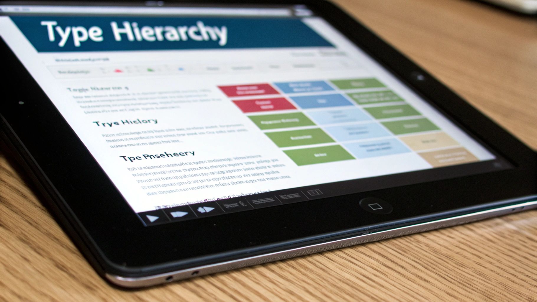
The Decision Tree for Choosing the Right Typeface
Selecting the right typeface can feel overwhelming, but a structured approach simplifies the process. The decision tree below guides you through building your brand identity, considering factors like industry, brand personality, target audience, and typeface application. It visualizes the decision-making process for choosing the right typeface.

As you can see, the decision tree guides you through key questions, leading you to the optimal typeface categories and examples. This strategic approach helps avoid costly mistakes and achieve maximum impact.
To further illustrate the relationship between typeface categories and brand personality, let's look at the following table:
Typeface Categories and Brand Personality Associations
A comprehensive comparison of how different typeface styles communicate specific brand attributes and emotions
Typeface Category | Brand Attributes | Emotional Response | Ideal Applications | Examples |
|---|---|---|---|---|
Serif | Traditional, Sophisticated, Reliable, Authoritative | Trust, Stability, Respect | Newspapers, Magazines, Books, Luxury Brands | Times New Roman, Garamond, Bodoni |
Sans-serif | Modern, Clean, Approachable, Minimalist | Friendly, Innovative, Direct | Tech Companies, Startups, Websites, Mobile Apps | Helvetica, Arial, Futura |
Display | Bold, Unique, Eye-catching, Expressive | Playful, Creative, Energetic | Headlines, Logos, Posters, Advertisements | Impact, Lobster, Playfair Display |
Script | Elegant, Personal, Handwritten, Artistic | Romantic, Feminine, Luxurious | Invitations, Greetings Cards, Branding for Creative Industries | Brush Script MT, Pacifico, Alex Brush |
This table clearly demonstrates how different typeface categories can communicate specific brand attributes and evoke different emotional responses. Choosing the right typeface can significantly impact how your brand is perceived.
Custom vs. Commercial Fonts: Making the Right Investment
Choosing between custom typography and modifying commercial fonts is another key decision. Custom fonts offer unique brand differentiation but require significant investment. Modifying commercial fonts provides a cost-effective solution with some customization. The decision tree also considers your budget and desired uniqueness.
For a startup with a limited budget, modifying a commercial font might be more sensible. However, an established brand seeking a truly distinctive visual identity may find a custom font worthwhile.
By understanding the psychological impact of different typefaces and using a strategic decision-making process, you can ensure your typography accurately represents your brand's personality and effectively communicates your message. This creates a cohesive brand identity that strengthens your brand's presence.
Building Typography Systems That Scale Across Touchpoints
Selecting the right typeface is only the beginning when it comes to effective brand typography. To create a truly cohesive identity, businesses need typography systems that ensure consistency across every touchpoint. This means considering how your chosen fonts appear not just on your website, but also on physical packaging, environmental graphics, and even new and emerging platforms. This consistent approach strengthens brand recognition and creates a more unified experience.
Creating a Typographic Hierarchy
Leading brands establish a clear typographic hierarchy to govern how different typefaces are used. This typically involves selecting a primary typeface for headlines, a secondary typeface for body text, and potentially additional typefaces for accents or special uses. Think of this hierarchy as a family of fonts working together. Each font plays a specific role, contributing to clear and engaging communication. This structure ensures visual consistency while also allowing for dynamic and interesting designs.
Developing Typography Style Guides
Well-defined typography style guides are essential for maintaining consistency, particularly when multiple teams or agencies are involved. These guides detail the specific typefaces, sizes, weights, and spacing to be used in different situations. For instance, your style guide might specify the precise font size and line height for headlines on your website, and different specifications for headlines on printed brochures. These detailed guidelines help ensure consistency, no matter who is working on your brand materials.
Technical Considerations for Brand Typography
Building a scalable typography system involves a number of technical factors. Font licensing is crucial, ensuring you have the legal right to use your chosen typefaces across various media. Responsive typography is also essential. Your typography needs to adapt smoothly to different screen sizes, remaining readable and visually appealing on everything from smartphones to large desktop monitors. Finally, accessibility standards are paramount. These standards dictate minimum font sizes and contrast ratios, ensuring your content is accessible to everyone. These technical details are just as important as the aesthetic choices.
Regional trends also influence typography decisions, highlighting the importance of a global perspective. For deeper insights into font usage and statistics, Explore this topic further.
Testing Typography Performance
Before finalizing your brand’s typography standards, testing performance across different mediums is vital. This could involve printing proofs to evaluate how typefaces appear on different paper stocks. It could also include A/B testing on your website to understand how different font choices affect user engagement. Real-world examples and practical implementation provide valuable insights into how your typography system performs. This testing phase helps refine your choices and ensures your typography effectively conveys your brand message across every platform.
Trend vs. Timeless: Typography Decisions That Last
When crafting a lasting visual identity for your brand, a crucial question arises: should you follow the latest typography trends or rely on established classics? Typography for branding demands careful consideration of current aesthetics and long-term impact. This section explores finding the perfect balance between innovation and recognition in your typographic approach.
Analyzing Typography Evolutions
Looking back at how brand typography has changed over the decades offers valuable insights. We can identify approaches that have endured and those that quickly became outdated. Some brands successfully refresh their typography, achieving measurable results like increased brand recognition or website engagement. Others find that chasing fleeting trends weakens their brand equity. This historical perspective is key to making informed decisions about your own typography.
Balancing Innovation and Recognition
Successful brands master the art of balancing innovation while preserving brand recognition. Take Coca-Cola, for example. While their logo has been modernized over the years, the core typographic elements remain remarkably consistent, ensuring instant recognition. This balanced approach allows for a fresh look without sacrificing the brand's heritage.
A Framework for Evaluating Typography Trends
How can you tell if a typography trend aligns with your long-term brand goals? Here’s a practical framework:
Industry Context: Does the trend fit your industry's visual language? A playful, experimental typeface might suit a creative agency, but perhaps not a financial institution.
Audience Expectations: How will your target audience perceive the trend? Understanding their preferences is essential.
Brand Lifecycle Stage: Are you a well-established brand looking for a refresh, or are you building a brand from the ground up? Newer brands typically have more room for experimentation.
Implementing Typography Updates Strategically
When updating your typography, the focus should be on strengthening, not weakening, your brand equity. Here are some key considerations:
Gradual Implementation: Avoid drastic overnight changes. A phased approach allows your audience to adjust and prevents a jarring experience.
A/B Testing: In digital environments, test different typographic variations. This allows you to see how they impact user behavior and engagement.
Brand Guidelines: Thoroughly document your typography system within your brand guidelines to maintain consistency across all platforms.
By carefully evaluating trends and implementing updates strategically, you can create a visual identity that’s both modern and enduring. This strengthens your brand’s presence and fosters lasting recognition.
Digital Typography: Technical Mastery for Brand Success

The digital world presents unique challenges and opportunities for typography in branding. Understanding how technical implementation affects the user experience, and ultimately, brand perception, is key. By mastering these technical nuances, brands can ensure their message remains clear and consistent across all digital platforms.
Web Fonts: Ensuring Brand Consistency Across Browsers
Web fonts are crucial for consistent branding across different browsers and devices. Unlike system fonts, web fonts are designed specifically for online use. This ensures your chosen typeface renders correctly, regardless of the user’s operating system or browser. This consistency builds a cohesive brand experience.
There are several ways to implement web fonts. You can use font hosting services like Google Fonts or Adobe Fonts, or self-host fonts on your server. Each method has pros and cons relating to performance, cost, and control.
Variable Fonts: Balancing Performance and Flexibility
Variable fonts are a newer technology that allows a single font file to contain multiple variations, like different weights and styles. This reduces the number of font files needed, boosting website performance. This efficiency improves user experience and SEO.
Variable fonts also offer greater design flexibility. Designers can fine-tune a font's weight or width to perfectly match the brand's aesthetic. This allows for a level of typographic precision not possible before.
Responsive Typography: Adapting to Different Screen Sizes
Responsive typography is essential. Your typography needs to adapt seamlessly to various screen sizes, from smartphones to desktops. Ensuring readability and visual appeal across all devices is crucial for a consistent brand experience.
Techniques for responsive typography include using relative units like em and rem for font sizes. Also, adjusting line heights and letter spacing for different screen sizes and using media queries to apply specific typographic styles based on screen width can improve responsiveness.
Optimizing Typography For Performance and Accessibility
Optimizing typography for performance involves minimizing the number of font files used, compressing them, and using appropriate formats like WOFF2. These strategies improve page load times, benefitting user experience and SEO.
Accessibility compliance is equally vital. This means using sufficient font sizes, ensuring good color contrast between text and background, and providing alternative text for decorative fonts. These practices make your content accessible to users with disabilities.
Emerging Frontiers: AR/VR and Voice Interfaces
Typography for AR/VR experiences and voice-integrated interfaces presents new opportunities and challenges. In these emerging environments, legibility, readability, and visual hierarchy are even more important. Careful consideration of font choices, sizes, and spacing is needed.
Maintaining a consistent typographic identity in these new spaces will be key for brands. This forward-thinking approach ensures brand recognition and reinforces brand values across platforms.
The following table summarizes essential technical specifications and best practices for typography implementation. It highlights the impact of typography choices on brand perception and offers practical implementation notes.
Digital Typography Implementation Checklist Essential technical specifications and best practices for implementing typography across digital platforms
Typography Element | Technical Requirement | Brand Impact | Implementation Notes |
|---|---|---|---|
Web Fonts | Use font hosting services or self-host | Consistent branding across browsers | Choose method based on performance needs and budget |
Variable Fonts | Use WOFF2 format | Improved performance and design flexibility | Test across different browsers |
Responsive Typography | Relative units, media queries | Readability across all devices | Define breakpoints for different screen sizes |
Font Size | Minimum 16px for body text | Accessibility and readability | Consider user demographics and context |
Line Height | 1.5-2 times font size | Readability and visual appeal | Adjust for different font sizes and screen sizes |
Letter Spacing | Adjust for headlines and display text | Visual refinement and brand aesthetic | Test for optimal readability |
Color Contrast | WCAG guidelines | Accessibility and readability | Use contrast checkers to ensure compliance |
By following these best practices and understanding the digital landscape, brands can ensure their typography strengthens their brand identity, enhances user experience, and drives engagement.
Measuring the ROI of Typography in Brand Identity
Investing in the right typography for branding is a strategic move. But how can you measure its impact? It's not simply about artistic preference. It's about demonstrable returns. This section explores methods for evaluating how effectively your chosen typography supports your brand's objectives and contributes to tangible business outcomes.
A/B Testing for Data-Driven Decisions
A/B testing provides a practical framework for assessing the impact of typographic choices in digital environments. Create two versions of a webpage or ad, each with different typographic variations, to directly compare their performance. For example, one version might use a serif font for headlines, while the other uses a sans-serif font. Track metrics like click-through rates, conversion rates, and time spent on page to gather concrete data on which variation performs better. This data-driven approach eliminates guesswork and allows for informed decisions.
Gathering Meaningful Feedback During Brand Development
Collecting feedback on typographic choices is crucial during the brand development process. This can involve surveys, focus groups, or user interviews. These methods provide valuable insights into how your target audience perceives different typefaces. Show participants various font options and ask them to describe the feelings or associations each evokes. This qualitative feedback provides a deeper understanding of how your typography resonates with your audience.
Tracking Typography Performance Across Key Metrics
Leading brands track typography performance across several key metrics:
Recognition: How easily do consumers identify your brand based on its typography?
Readability: How easily can users read and understand your content?
Emotional Response: What feelings does your typography evoke in your target audience?
Conversion Metrics: How does your typography impact website conversions or sales?
By monitoring these key performance indicators, brands can gauge the effectiveness of their typography and identify areas for improvement. This continuous monitoring allows for adjustments and optimizations over time.
Ensuring Global Effectiveness: Cultural Context and Language Requirements
When targeting a global audience, consider the cultural context and language requirements. A typeface that works well in one language might not be suitable for another. For example, certain fonts might have specific cultural connotations, while others might not support certain character sets. Testing your typography across different cultural contexts and languages is crucial for global effectiveness. This ensures your message resonates worldwide and prevents misinterpretations.
Implementing Controlled Typography Updates and Measuring Impact
Implementing controlled typography updates allows for precise measurement of their effects on key business outcomes. By making incremental changes and tracking their impact, you can make evidence-based decisions about your typography. This approach minimizes disruption and allows for adjustments based on real-world data. Continuously evaluating the impact of typographic choices helps refine your strategy and maximize its effectiveness.
By utilizing these methods, you can move beyond subjective opinions and make data-driven decisions about typography for branding. This ensures that your typography not only looks good, but also contributes to achieving your brand's strategic objectives and drives measurable business value.


