
Turn Clicks into Customers: Your Ultimate CRO Blueprint
In today's competitive digital marketplace, attracting visitors to your website is only half the battle. The real challenge, and where significant growth lies, is in converting those visitors into loyal customers. This is the core of Conversion Rate Optimization (CRO): the art and science of making systematic, data-driven improvements to your user experience that guide visitors toward taking meaningful action. It’s not about flashy gimmicks but about building a robust framework for improving your website's performance.
To achieve this, it's crucial to adopt an effective conversion optimization strategy. This approach transforms your website from a digital brochure into a powerful revenue-generating machine. Whether you're aiming for more sales, sign-ups, or downloads, a focused strategy can make all the difference. In this comprehensive guide, we'll move beyond the basics and provide eight powerful, actionable conversion optimization tips that you can implement immediately.
From psychological triggers in your copy to the granular details of form design, these strategies are designed to deliver measurable results. We will cover specific tactics for A/B testing, compelling copywriting, CTA optimization, landing page design, and much more, giving you a decisive edge.
1. A/B Testing and Experimentation
A/B testing, also known as split testing, is a core discipline of conversion rate optimization (CRO). It’s a methodical way to compare two versions of a digital asset, like a webpage or an email, to see which one performs better. By showing "Version A" to one segment of your audience and "Version B" to another, you can gather empirical data on what truly resonates with your users and drives them to act. This approach removes guesswork from your marketing and design decisions, allowing you to make incremental improvements backed by real user behavior.
Why A/B Testing is a Game-Changer
Instead of relying on intuition, A/B testing provides concrete evidence. For example, Booking.com famously runs thousands of simultaneous tests on elements ranging from button copy to urgency messaging. This constant experimentation is a key reason for their sustained market leadership. Even small changes can yield massive results. The 2008 Obama campaign raised an additional $60 million simply by A/B testing different media and call-to-action buttons on their donation page. This is one of the most powerful conversion optimization tips because it replaces assumptions with data.
How to Implement A/B Testing Effectively
To get started, focus on high-impact pages like your homepage, landing pages, and checkout process. Identify a single element to change, such as the headline, a call-to-action (CTA) button's color, or the layout of a form.
Here is a simple process flow diagram that outlines the fundamental A/B testing workflow.
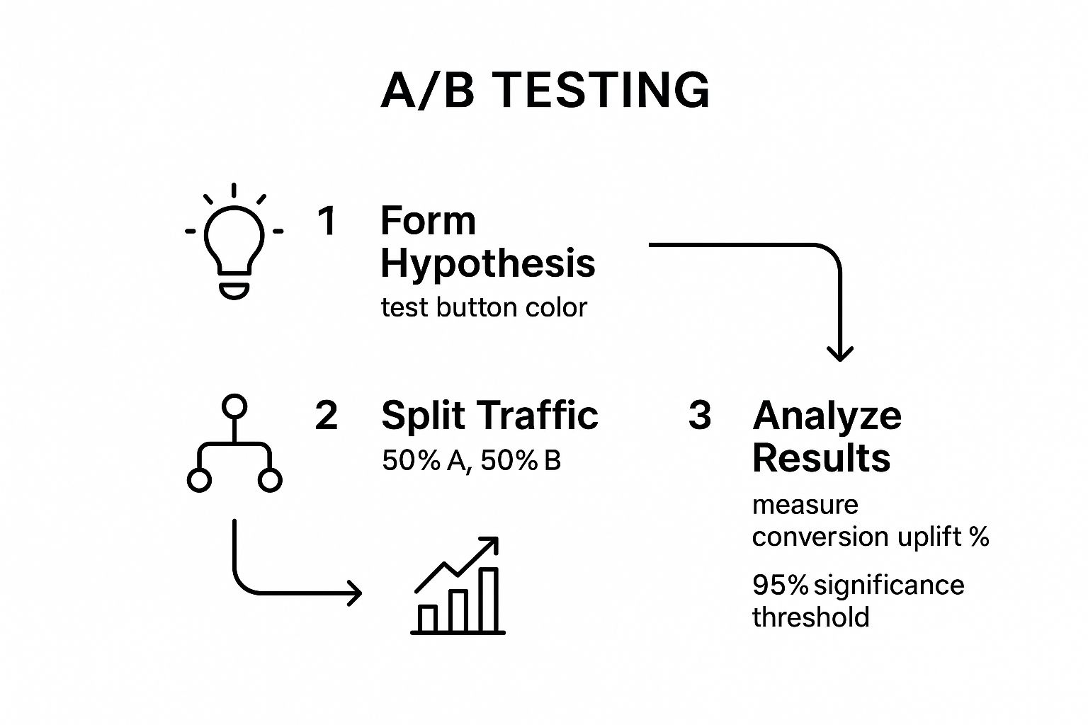
This workflow visualizes the essential steps: start with a clear hypothesis, split your traffic evenly, and analyze the results to find a statistically significant winner.
Test One Element at a Time: If you change the headline and the button color simultaneously, you won’t know which change caused the increase or decrease in conversions.
Ensure Statistical Significance: Don’t end a test too early. Wait until you have enough data to be confident in the result, typically aiming for a 95% confidence level. Platforms like Google Optimize, VWO, or Optimizely handle this calculation for you.
Document Everything: Keep a log of every test you run, including your hypothesis, the variations, and the final results. This creates a valuable knowledge base for your entire team.
For a deeper dive into how to structure your experiments, this video provides a great overview:
2. Conversion-Focused Copywriting and Headlines
Your words are your primary sales tool online. Conversion-focused copywriting is the art and science of writing persuasive, benefit-driven text that guides visitors toward a specific action, whether it's signing up, making a purchase, or requesting a demo. Headlines, in particular, are the gatekeepers of your content; they make the critical first impression that determines whether a user engages further or immediately bounces. A powerful headline grabs attention, and compelling copy holds it, turning passive visitors into active customers.
Why Your Words are Your Strongest Asset
Copywriting isn't just about describing what you do; it's about articulating the value you provide. It bridges the gap between your product's features and your customer's needs. For instance, Unbounce saw a 90% conversion lift by changing their headline from a feature-focused "Build, Publish & A/B Test Landing Pages" to the benefit-driven "Build Beautiful Landing Pages." This simple shift resonated more deeply with their audience's desires. Focusing on clear, persuasive language is one of the most impactful conversion optimization tips because it directly addresses the user's motivations and pain points.
How to Write Copy That Converts
Start by deeply understanding your customer. What language do they use? What problems are they trying to solve? To streamline the process of crafting persuasive messages and eye-catching headlines, you might explore the best AI tools for content writing that can assist in generating effective copy.
Lead with Benefits, Not Features: Your headline should immediately answer the visitor's question: "What's in it for me?" Use powerful, action-oriented words and include specific numbers or outcomes where possible.
Speak Your Customer's Language: Use the same terminology and phrasing your target audience uses. This builds trust and makes your message feel more authentic and relatable.
Address Objections Proactively: Acknowledge and counter potential doubts or hesitations directly within your copy. This demonstrates transparency and builds confidence in your offer.
Test Headline Formulas: Experiment with different headline structures, such as question-based ("Are you struggling with...?"), "how-to" guides, or direct benefit statements, to see what resonates most with your audience.
3. Strategic Call-to-Action (CTA) Optimization
Your call-to-action (CTA) is the gateway to conversion. It's the button or link that prompts a user to take the next step, whether that's making a purchase, signing up for a newsletter, or downloading a resource. Strategic CTA optimization involves refining every aspect of this critical element, from its text and color to its size and placement, to guide users and maximize the chances they will click. It’s about making the desired action both obvious and compelling.

Why CTA Optimization is a Game-Changer
A well-optimized CTA can dramatically lift your conversion rates without altering any other part of your page. For instance, Performable (now part of HubSpot) achieved a 21% increase in conversions simply by changing their button text from "Start your free trial" to the more direct "Create my account". Similarly, marketing software company DMix saw an 83% conversion uplift by making their CTA button larger and changing its color to create better contrast. These examples show how fine-tuning this single element is one of the most high-impact conversion optimization tips you can implement.
How to Implement CTA Optimization Effectively
Effective CTA design goes beyond just picking a bright color. It requires a thoughtful approach to language, design, and placement to remove friction and create a clear path for the user. Focus on making your primary CTAs stand out while ensuring they feel like a natural conclusion to the content that precedes them.
Use Action-Oriented, Benefit-Driven Copy: Replace generic words like "Submit" or "Click Here" with specific, value-focused text. Instead of "Download," try "Get My Free Ebook." Using first-person language ("Get My Free Trial" vs. "Get Your Free Trial") can also create a stronger sense of ownership and increase clicks.
Prioritize Contrast and Size: Your CTA button must be visually distinct from its surroundings. While there's no single "best" color, high contrast is key. The button should also be large enough to be easily noticed and clicked, especially on mobile devices where a minimum tappable area of 44x44 pixels is recommended.
Strategic Placement is Crucial: Place your primary CTA "above the fold" so it’s visible without scrolling. However, don't stop there. Repeat your CTA at natural breaking points throughout the page, especially after you've presented compelling information or at the end of a section.
4. Landing Page Design and User Experience Optimization
A landing page is a standalone web page created specifically for a marketing or advertising campaign. Unlike a homepage with dozens of links and potential actions, a landing page is designed with a single, focused objective, known as a Call-to-Action (CTA). Optimizing its design and user experience is critical because it's where a visitor "lands" after clicking on a link from an email, ad, or social media post. Its sole purpose is to convert that visitor by delivering a streamlined, persuasive, and distraction-free experience.
Why Landing Page Optimization is a Game-Changer
A well-optimized landing page acts as your best digital salesperson. It can dramatically increase conversions from your paid ad campaigns, ensuring you get the maximum return on your investment. For instance, Slack’s early growth was fueled by simple, benefit-driven landing pages that clearly communicated its value proposition for team collaboration, resulting in massive user acquisition. Similarly, Dropbox utilized an incredibly minimalist landing page that focused on a single action: signing up. This laser-focused approach is one of the most effective conversion optimization tips for turning traffic into tangible results.
How to Implement Landing Page Optimization Effectively
Start by ensuring your landing page directly reflects the promise made in your ad or link. If an ad promises a "50% Off Discount," the landing page headline must immediately reinforce that offer. The goal is to create a seamless journey with minimal friction. Companies like Unbounce have built their entire platform around this principle of creating high-converting, dedicated landing pages.
Remove Main Navigation: Eliminate links to other parts of your site, like the homepage or "About Us" page. This keeps visitors focused on the one action you want them to take and prevents them from getting distracted.
Match Ad Copy to Headline: Maintain "message match" between your ad and your landing page. This consistency reassures visitors they are in the right place and builds immediate trust.
Use Social Proof: Incorporate elements like customer testimonials, reviews, client logos, or case study snippets. Seeing that others have had positive experiences with your brand can significantly reduce hesitation.
Optimize for Speed: Ensure your page loads quickly. A slow landing page is a primary cause of high bounce rates. Use tools to check your Core Web Vitals and compress images to improve performance.
5. Form Optimization and Friction Reduction
Forms are the final gateway between a user's intent and a business goal, whether it's a purchase, signup, or lead submission. Form optimization is the practice of methodically designing and refining these gateways to be as simple and frictionless as possible. It involves removing unnecessary fields, clarifying instructions, and improving the overall user experience to prevent user drop-off. By reducing the effort required to complete a form, you directly increase the likelihood of a successful conversion.
Why Reducing Form Friction is a Game-Changer
Every field in your form represents a potential point of friction. The more you ask of users, the more likely they are to abandon the process. Expedia famously increased annual profit by $12 million simply by removing one optional field, "Company Name," from their checkout form. This change eliminated user confusion and streamlined the path to purchase. Similarly, Imagescape saw a 120% increase in conversions when they cut their contact form from 11 fields down to just four. These examples prove that less is often more and make this one of the most impactful conversion optimization tips for any business.
How to Implement Form Optimization Effectively
Begin by auditing your existing forms. Analyze each field and ask, "Is this information absolutely essential to collect right now?" Often, you can gather additional data later in the customer lifecycle. Prioritize clarity and ease of use to guide users smoothly toward the submission button.
Ask for Essentials Only: Limit fields to the bare minimum required to complete the transaction or initial contact. If a piece of information isn't critical, remove it.
Use a Single-Column Layout: Research from CXL Institute shows that single-column forms are processed faster by users than multi-column layouts, leading to higher completion rates.
Implement Smart Defaults and Autofill: Use browser autofill capabilities and pre-fill known information for returning users. For mobile users, set the correct keyboard type (e.g., numeric for phone numbers).
Provide Real-Time Validation: Use inline validation to show users immediately if there's an error in a field, rather than waiting until they hit submit. This prevents frustration and rework.
Offer Social Logins: Reduce manual entry by allowing users to sign up or log in with trusted accounts like Google or Facebook. This can significantly speed up the process.
6. Social proof and Trust Signal Implementation
Social proof is a powerful psychological concept where people assume the actions of others reflect the correct behavior for a given situation. In digital marketing, this means leveraging customer testimonials, reviews, and usage data to guide new visitors toward conversion. Trust signals are complementary elements, like security badges and clear policies, that build credibility and reduce the anxiety associated with making a purchase or submitting personal information. By showing that other people trust and value your brand, you make it easier for new customers to do the same.
Why Social Proof is a Game-Changer
When potential customers are uncertain, they look for external validation. Seeing that others have had a positive experience with your product or service provides that validation and builds instant credibility. For example, Basecamp prominently displays logos of well-known companies that use their software, immediately associating their brand with success. Similarly, Amazon's customer review system and "Customers who bought this also bought" feature are core to their e-commerce dominance. This is one of the most effective conversion optimization tips because it harnesses human psychology to build confidence and reduce friction in the buying process.
How to Implement Social Proof and Trust Signals Effectively
Integrating social proof should be a strategic effort, focusing on placing these elements near key decision-making points like product pages, pricing tables, and checkout forms. To instantly build credibility and address potential customer anxieties, leverage tools like a trust badge generator to display security and trust indicators prominently on your site.
Be Specific and Authentic: Use detailed testimonials that highlight specific benefits rather than generic praise like "Great product!" Include real names and photos of customers to make them more relatable and trustworthy.
Show, Don't Just Tell: Instead of just saying you have happy customers, display tangible proof. This could be user-generated content, case studies with clear metrics, or even real-time notifications of recent purchases or sign-ups.
Leverage Video Testimonials: Video is a highly engaging format that can convey emotion and sincerity far more effectively than text. A short, authentic video from a satisfied customer can have a massive impact on a potential buyer's decision.
Rotate Your Proof: Keep your social proof fresh by regularly updating testimonials and case studies. This signals that your business is active and consistently delivering value to its customers.
7. Mobile Optimization and Responsive Design
Mobile optimization is the practice of ensuring your website, landing pages, and conversion funnels are designed to work flawlessly on smaller screens like smartphones and tablets. With mobile devices now generating the majority of internet traffic, having a mobile-responsive site isn't just a recommendation; it's a fundamental requirement. A poor mobile experience creates friction, frustrates users, and directly harms your conversion rates, making a mobile-first approach essential for modern businesses.
Why Mobile-First Design is a Game-Changer
A mobile-first strategy, championed by design experts like Luke Wroblewski, prioritizes the mobile user experience from the very beginning of the design process. This focus ensures that your most critical content and functionality are accessible to the largest segment of your audience. For instance, Pinterest increased mobile signups by 11% simply by optimizing its mobile registration flow. Similarly, AutoAnything boosted mobile conversions by a staggering 51% after implementing mobile-specific design improvements. These examples highlight how focusing on mobile is one of the most impactful conversion optimization tips you can implement.
How to Implement Mobile Optimization Effectively
Effective mobile optimization goes beyond simply making your site fit on a smaller screen. It involves rethinking the user journey for someone on the go, often with limited time and a different interaction method (touch instead of a mouse). Focus on speed, clarity, and ease of use.
Implement Thumb-Friendly Design: Make sure all interactive elements, especially buttons and links, have a large enough tap target. A minimum size of 44x44 pixels is a widely accepted standard to prevent accidental clicks.
Simplify Layouts and Increase Font Size: Use single-column layouts to avoid horizontal scrolling. Increase font sizes to ensure readability without users needing to zoom in. Break up text into short, digestible paragraphs.
Minimize Form Fields: Typing on a mobile device can be cumbersome. Only ask for essential information in your forms. Use features like autofill and appropriate input types (e.g.,
type="tel"for phone numbers) to streamline the process.Prioritize Page Speed: Mobile users expect fast loading times. Compress images, use modern formats like WebP, and consider implementing Google's Accelerated Mobile Pages (AMP) framework for content-heavy pages to deliver a near-instant experience.
8. Personalization and Dynamic Content
Personalization is the practice of tailoring website content, offers, and communications to individual users based on their data, such as behavior, location, or past interactions. It moves beyond a one-size-fits-all approach by delivering dynamic content that changes in real-time to match the visitor's context. When users see content that feels uniquely relevant to them, they are far more likely to engage, trust your brand, and ultimately convert. This makes it one of the most effective conversion optimization tips for building deeper customer relationships.
Why Personalization is a Game-Changer
Generic experiences get ignored. Personalization cuts through the noise by making your audience feel seen and understood. For instance, Amazon's recommendation engine, which personalizes the homepage for every user, is responsible for an estimated 35% of its revenue. Similarly, Netflix's system, which suggests shows and movies based on viewing history, drives over 80% of all content watched on the platform. These examples prove that a well-executed personalization strategy doesn't just feel nice; it directly impacts your bottom line and user retention.
How to Implement Personalization Effectively
You don't need Amazon's resources to get started. Begin with simple segmentation and gradually introduce more sophisticated tactics as you gather more data. Focus on creating relevance for high-value user segments or at critical stages of the customer journey, like the first site visit or cart abandonment.
Start with Simple Segments: Begin by personalizing content based on easily identifiable data points like location (e.g., showing local stores), traffic source (e.g., tailoring a welcome message for visitors from a specific ad), or new vs. returning visitors.
Use Behavioral Triggers: Implement dynamic content that responds to user actions. For example, show recently viewed items on the homepage or trigger a personalized pop-up offer when a user shows exit intent on a product page.
Respect User Privacy: Be transparent about the data you collect and how you use it. Always provide clear opt-out options. Trust is the foundation of effective personalization, and breaking it will do more harm than good.
For a practical guide on how to approach this, the team at HubSpot offers excellent resources.
For a great visual breakdown of how personalization works in e-commerce, this video is a helpful starting point:
8 Conversion Optimization Tips Comparison
Item | Implementation Complexity 🔄 | Resource Requirements ⚡ | Expected Outcomes 📊 | Ideal Use Cases 💡 | Key Advantages ⭐ |
|---|---|---|---|---|---|
A/B Testing and Experimentation | Medium to High: requires setup and traffic | Moderate: data collection tools and traffic | Reliable data-driven insights, measurable ROI | Testing design & content changes, UX improvements | Eliminates guesswork, continuous improvement |
Conversion-Focused Copywriting and Headlines | Low to Medium: writing skill focused | Low: primarily human resources | Immediate conversion lift, stronger engagement | Improving messaging, landing pages, ads | Cost-effective, builds emotional connection |
Strategic Call-to-Action (CTA) Optimization | Low: design and copy changes | Low: minimal design and testing resources | Quick conversion increases, measurable impact | Buttons, forms, prompts on websites and emails | Fast implementation, easy to measure |
Landing Page Design and UX Optimization | Medium: design and development effort | Medium to High: design, testing, and dev | Higher conversions, better UX, lower bounce rates | Focused campaigns, paid ads, lead generation | Focused user flow, improved quality scores |
Form Optimization and Friction Reduction | Medium to High: complex validation and logic | Medium: tech skills for smart form features | Increased form completions, better data quality | Lead capture, checkout, registrations | Reduces abandonment, improves experience |
Social Proof and Trust Signal Implementation | Low to Medium: content updates and design | Low to Medium: content creation and curation | Builds credibility, reduces buyer anxiety | E-commerce, SaaS, service websites | Quick trust building, leverages psychology |
Mobile Optimization and Responsive Design | Medium to High: technical redesign | Medium to High: development & testing | Improved user experience, higher mobile conversions | Mobile traffic dominant sites and apps | Captures mobile users, boosts SEO |
Personalization and Dynamic Content | High: complex data and tech setup | High: engineering, data, and content resources | Significantly higher engagement & conversions | E-commerce, media, personalized marketing | Competitive edge, increases customer lifetime value |
Start Optimizing: Your Path to Higher Conversions
Navigating the world of digital marketing can feel complex, but the path to a higher conversion rate is built on a straightforward principle: continuous improvement. Throughout this guide, we have explored a comprehensive suite of powerful conversion optimization tips, each designed to systematically enhance your digital platform and drive meaningful results. From the scientific precision of A/B testing to the psychological power of conversion-focused copywriting, you now have a robust toolkit at your disposal.
We've seen how strategic CTA optimization can transform passive visitors into active participants and how frictionless forms can dramatically reduce abandonment. By implementing compelling social proof and prioritizing a seamless mobile experience, you build the trust and accessibility essential for today's discerning audience. These aren't just isolated tactics; they are interconnected components of a holistic conversion strategy.
From Knowledge to Action: Your Next Steps
The sheer volume of strategies can seem overwhelming, but the key is to start small and build momentum. True optimization is a marathon, not a sprint. Don't feel pressured to overhaul your entire website overnight. Instead, adopt a methodical approach.
Here are your actionable next steps:
Identify Your Biggest Opportunity: Dive into your analytics. Where are you losing the most visitors? Is it a high bounce rate on a specific landing page? A significant drop-off at the checkout form? Pinpoint the single biggest "leak" in your funnel.
Formulate a Hypothesis: Based on your findings, choose one strategy from this article that directly addresses the problem. For example, if your landing page bounce rate is high, your hypothesis might be: "By replacing the generic headline with a benefit-driven one and adding customer testimonials, we can increase user engagement and reduce bounce rate."
Test and Measure: Implement the change and run a controlled test. Whether it's a simple A/B test on a headline or a more complex redesign of a form, meticulously track the results. Let the data, not your gut feeling, determine the winner.
This cycle of analysis, hypothesis, and testing is the engine of sustainable growth. Each test, regardless of the outcome, provides invaluable data and deepens your understanding of your audience. Every small win compounds over time, creating a powerful upward spiral of performance.
Mastering these conversion optimization tips is about more than just boosting a single metric. It’s about creating a better, more intuitive, and more persuasive experience for your users. It's about building a digital presence that not only attracts but also effectively communicates your value and guides visitors toward a desired action. This commitment to user-centric design and data-driven decisions is what separates thriving businesses from those that stagnate.
Feeling inspired but need an expert partner to translate these strategies into a visually stunning and high-performing reality? The team at Happy Pizza Studio specializes in crafting user experiences and brand identities that are not only beautiful but are engineered to convert from the ground up. Let them help you build a digital experience that turns clicks into customers.


