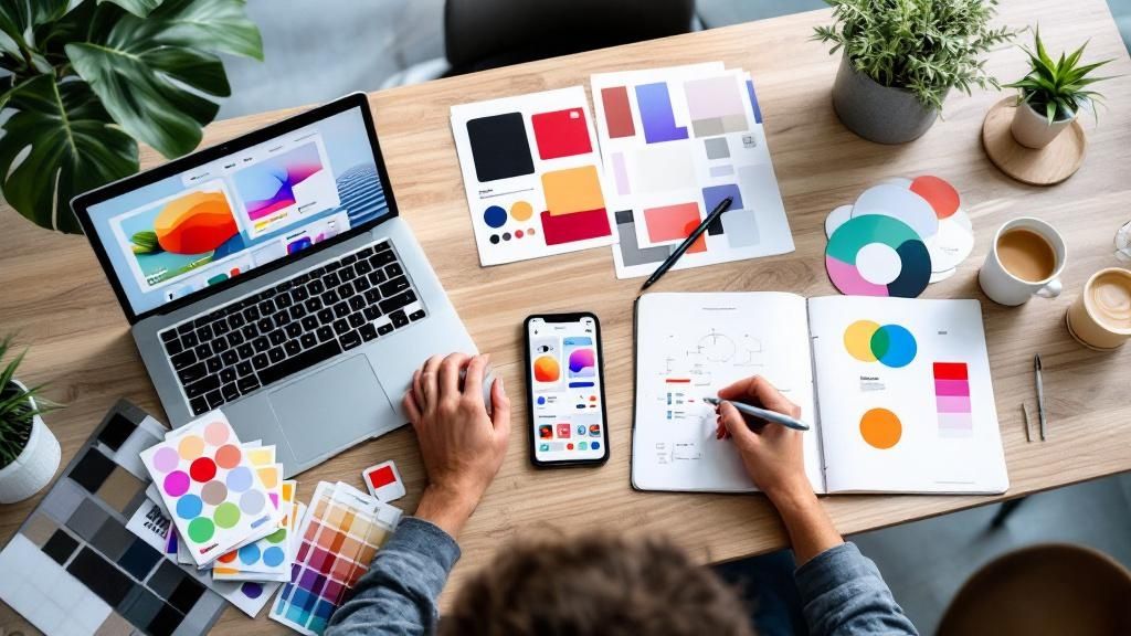
Unleash Your Inner UI Designer: Top Inspiration Sources
Need user interface design inspiration for your next project? This list provides 8 essential resources to fuel your creativity and elevate your designs. Whether you're building a website, app, or rebranding your business, exploring these platforms will expose you to innovative design patterns, micro-interactions, and real-world examples. Discover how platforms like Dribbble and Behance offer visual inspiration, while resources like Google's Material Design and Apple's HIG provide established design guidelines. Good UI design is crucial for attracting and retaining users, and these resources will help you achieve just that.
1. Dribbble
Dribbble (dribbble.com) stands out as a premier online community for designers, particularly those specializing in user interface (UI) design. It's a vibrant hub where creatives showcase their work, share insights, and connect with fellow professionals. Its unique approach revolves around "shots," which are essentially carefully curated snapshots of design projects. These shots offer a glimpse into the creative process, highlighting everything from wireframes and mockups to finished UI elements and full-screen designs. This makes Dribbble an invaluable resource for anyone seeking user interface design inspiration. It serves as a living, breathing portfolio platform, offering a diverse range of styles, trends, and innovative approaches to UI/UX.
The platform's core strength lies in its focus on visual communication. Designers use Dribbble to demonstrate their skills and receive feedback, fostering a dynamic environment of learning and improvement. For those seeking user interface design inspiration, Dribbble offers a rich tapestry of visual ideas, providing a springboard for your own projects. It allows entrepreneurs, startups, marketing professionals, established brands, and tech companies to explore the latest design trends and discover talented designers. Whether you're looking to revamp your website, design a mobile app, or simply stay abreast of the current design landscape, Dribbble provides a valuable resource.
Dribbble's functionality extends beyond simple image sharing. Its robust search and filtering system allows users to quickly find relevant designs based on keywords, colors, and specific design styles. For example, if you're looking for inspiration for a minimalist e-commerce interface, you can filter by those terms to discover relevant shots. This makes it incredibly easy to curate a collection of user interface design inspiration tailored to your specific needs.
Successful implementations of Dribbble's design inspiration are abundant. Companies like Stripe, Airbnb, and Google have all utilized the platform to showcase their UI design work. Stripe often shares shots of their sleek payment interfaces, while Airbnb uses Dribbble to offer glimpses into their mobile app interfaces. Similarly, Google has showcased its Material Design principles through Dribbble, influencing countless other designers in the process. Even financial institutions like Revolut and e-commerce giants like Shopify utilize Dribbble to display cutting-edge UI/UX design from their teams. These examples underscore Dribbble's role as a central hub for design inspiration and innovation.
To effectively utilize Dribbble for user interface design inspiration, consider these actionable tips:
Utilize the platform's advanced search and filtering capabilities: Refine your searches based on specific keywords, colors, or design styles to find designs that align with your project's aesthetic. For instance, searching for "dashboard design dark mode" will yield a curated selection of dark-themed dashboards.
Follow designers whose work resonates with you: Building a curated feed of designers whose work aligns with your vision will provide a consistent stream of user interface design inspiration.
Create mood boards by saving shots to collections: Organize your inspiration by creating collections based on specific themes, projects, or design elements. This facilitates a more structured approach to gathering and utilizing inspiration.
Analyze popular shots to understand current design trends: By observing the most appreciated shots, you can gain insights into prevailing design trends and user preferences.
Engage with the community: Offer constructive feedback and participate in discussions to foster a collaborative learning environment and connect with other designers.
While Dribbble offers numerous advantages, it’s important to be aware of its potential drawbacks. The platform’s focus on visual appeal can sometimes overshadow the practical considerations of design, leading to a prioritization of style over substance. Additionally, the limited context provided with each shot can make it difficult to fully understand the underlying design decisions. Finally, although browsing is free, some features, including the ability to post your own work (though this has become more accessible over time), require a paid subscription.
Despite these limitations, Dribbble remains an invaluable resource for user interface design inspiration. Its curated collection of high-quality designs, combined with powerful search and filtering tools, makes it a must-have tool for any designer, entrepreneur, or business looking to stay ahead of the curve. The platform’s vibrant community and constant influx of fresh content ensure a steady stream of innovative ideas, making Dribbble a powerful engine for creativity and design excellence. By understanding how to effectively navigate and utilize Dribbble, you can unlock a wealth of user interface design inspiration to fuel your own projects and achieve remarkable results.
2. Behance
Behance (www.behance.net) stands as a premier online platform for discovering user interface design inspiration. It serves as a vast digital portfolio showcase where creatives, specifically designers, share their work, offering a unique glimpse into the entire design journey. Unlike platforms that spotlight only polished final products, Behance encourages in-depth project presentations, including case studies, process documentation, and the evolution of designs from initial concept to finished result. This comprehensive approach makes it an invaluable resource for understanding the intricate "why" and "how" behind successful UI/UX projects, making it a powerful tool for finding user interface design inspiration.

Behance works by providing a structured yet flexible platform for designers to upload their projects. These projects are often presented as case studies, detailing the design brief, the challenges faced, the solutions implemented, and the final outcomes. This detailed documentation often includes wireframes, mockups, user flows, and other design artifacts, providing a rich learning experience for anyone seeking user interface design inspiration. The platform's integration with Adobe Creative Suite further streamlines the process, allowing designers to seamlessly publish their work directly from their design tools. Moreover, Behance facilitates community engagement through features like appreciation, comments, and curated galleries, fostering a collaborative environment.
For entrepreneurs and solo founders, Behance provides a wealth of user interface design inspiration that can inform the aesthetic and functionality of their own ventures. Startups and small businesses can glean insights from successful projects in their niche, gaining valuable inspiration for their own branding and digital presence. Marketing professionals can explore current design trends, learn about effective user interface design principles, and discover new talent. Established brands seeking rebranding can use Behance to benchmark against competitors and find fresh, innovative design approaches. Tech companies and digital service providers can delve into detailed case studies of complex UI/UX projects, gaining valuable knowledge and best practices.
The platform boasts several powerful features. The comprehensive project case studies, including process documentation, provide unparalleled insights into the design thinking behind successful projects. The tight integration with Adobe Creative Suite makes publishing and discovering work seamless for designers within the Adobe ecosystem. Live streaming capabilities allow for real-time sharing of the design process, fostering transparency and community engagement. Client presentation tools make it easy to showcase work directly on the platform, while team collaboration features streamline workflows. The integration with Adobe Portfolio allows designers to create personalized websites, extending their online presence.
Examples of successful implementations of user interface design showcased on Behance include the Microsoft Office redesign case studies, demonstrating how a ubiquitous software suite underwent a significant visual and functional overhaul. Netflix UI evolution projects showcase the iterative design process behind a leading streaming platform, highlighting the constant adaptation required in a dynamic digital landscape. Spotify mobile app interface designs provide insights into crafting a user-friendly and engaging music streaming experience. Banking app UX research and design processes demonstrate how user-centered design principles are applied to complex financial applications. E-learning platform complete redesigns illustrate how thoughtful UI/UX can enhance the learning experience.
Pros:
Comprehensive project documentation and case studies provide in-depth understanding of the design process.
Free platform with no invitation requirements, making it accessible to everyone.
Strong integration with professional design tools, particularly the Adobe Creative Suite.
Excellent for client presentations and portfolio building.
Detailed analytics and project insights offer valuable feedback for designers.
Global reach with multilingual support expands accessibility and reach.
Cons:
The interface can feel cluttered compared to more minimalist platforms.
Less direct community interaction and discussion than other platforms like Dribbble.
Search functionality could be more refined to filter for specific project attributes.
Quality control is less stringent than curated platforms, requiring more effort to filter through projects.
Some features are dependent on the Adobe ecosystem, potentially limiting accessibility for non-Adobe users.
Tips for utilizing Behance effectively for user interface design inspiration:
Focus on projects with detailed process documentation: This provides the richest learning experience.
Use the search filters to find specific UI categories: Narrow your search to relevant project types.
Create collections to organize inspiration by project type: Build personalized libraries of inspiring work.
Follow designers who document their design thinking: Stay updated on their latest projects and insights.
Look for projects that show before/after comparisons: Understand the impact of design decisions.
Behance deserves its place on this list because it goes beyond mere visual inspiration, offering a comprehensive view into the design process. Its extensive collection of case studies, detailed process documentation, and integration with professional design tools makes it an indispensable resource for anyone seeking genuine user interface design inspiration.
3. Awwwards
Are you searching for a constant stream of cutting-edge user interface design inspiration? Look no further than Awwwards (https://www.awwwards.com/). This platform isn't just a collection of pretty websites; it's a highly respected competition arena where the best web designers and developers worldwide showcase their most innovative projects. Awwwards provides a valuable resource for anyone seeking user interface design inspiration, offering a curated selection of exemplary websites, detailed analysis, and insights into current and future design trends. Its focus on recognizing and promoting digital excellence makes it an invaluable tool for staying ahead of the curve in the ever-evolving world of UI/UX.
Awwwards operates on a daily award system, recognizing the best website of the day, month, and year. A professional jury, composed of industry leaders and experts, evaluates each submission based on a comprehensive scoring system that considers design, usability, creativity, and content. This rigorous evaluation process ensures that the featured websites represent the pinnacle of digital design and user experience. This isn't just about aesthetics; the judging process delves into the practical aspects of usability, ensuring that form and function are harmoniously balanced.
For entrepreneurs, startups, marketers, and established brands, Awwwards is a treasure trove of user interface design inspiration. Whether you're seeking inspiration for a complete website redesign, a refresh of your brand's online presence, or simply exploring new design trends, Awwwards provides a curated and expertly-vetted collection of exemplary websites. Tech companies and digital service providers can especially benefit from the platform's deep dive into technical innovation and user-focused design. Examples of websites frequently showcased on Awwwards include the visually striking and user-friendly interfaces of Apple product launch websites, the immersive experiences of Nike's interactive campaigns, the experimental interfaces of Google projects, the personalized engagement of Spotify's Wrapped experience, and the sleek and functional design of Tesla's configurator interface. These examples demonstrate the platform's breadth and depth, catering to a diverse range of industries and design sensibilities.
Features and Benefits:
Daily Awards and Recognition: Discover fresh user interface design inspiration daily with the "Site of the Day" feature.
Detailed Scoring System: Understand why a website is considered exceptional through transparent scoring criteria.
Professional Jury Panel: Benefit from the expertise of industry leaders in design, usability, creativity, and content.
Educational Resources and Conferences: Expand your knowledge and network with other professionals at Awwwards conferences.
Design Trend Analysis and Reports: Stay ahead of the curve with insights into emerging UI/UX trends.
Mobile and Developer-Focused Categories: Find specific inspiration for mobile-first design and development best practices.
Pros and Cons:
Pros:
Showcases cutting-edge and innovative designs
Professional jury evaluation provides quality assurance
Detailed analysis of design decisions
Strong focus on user experience and usability
Regular trend reports and industry insights
High-quality educational content
Cons:
Focus primarily on web rather than mobile interfaces (although a mobile category exists)
Can sometimes emphasize aesthetics over purely practical usability
Limited filtering options for very specific UI elements
Some featured sites may be experimental rather than practically implementable for all businesses
Access to premium content, such as in-depth analysis and trend reports, requires a subscription
Actionable Tips for Leveraging Awwwards:
Focus on Sites of the Day: Start with the highest-quality, award-winning designs for initial inspiration.
Read the Jury Comments: Gain valuable insights into the design rationale and decision-making process.
Use the Mobile Category: Specifically target mobile-first design inspiration when needed.
Attend Awwwards Conferences: Network with industry professionals and gain firsthand knowledge of emerging trends.
Analyze Both Winners and Nominees: Explore a wider range of styles and approaches by examining both successful and noteworthy entries. This expands your perspective beyond the winning aesthetic.
By strategically using Awwwards and following these tips, entrepreneurs, marketers, designers, and developers can tap into a rich vein of user interface design inspiration, ensuring their projects remain innovative, engaging, and user-focused. The platform’s consistent focus on recognizing and rewarding excellence in web design makes it an indispensable resource for staying ahead of the curve in the rapidly evolving digital landscape.
4. Material Design by Google
Material Design is Google's comprehensive design system, offering a robust set of guidelines, pre-built components, and tools to empower designers and developers in crafting exceptional user interfaces. It's more than just a visual style; it's a philosophy grounded in research and inspired by the physical world, mimicking the way light interacts with surfaces and how objects cast shadows. This approach creates interfaces that feel tangible and intuitive, enhancing user experience. Material Design provides both high-level design principles and practical implementation guidance, enabling the creation of cohesive, accessible, and visually appealing user interfaces across various platforms. This makes it a valuable resource for anyone seeking user interface design inspiration, from solo founders to established brands.
At its core, Material Design emphasizes a hierarchical approach to layout, using depth and shadow to create visual cues that guide users through the interface. Motion plays a crucial role, providing meaningful feedback and transitions that feel natural and responsive. Accessibility is baked into the system's foundation, ensuring inclusive design for users of all abilities. With pre-built components like buttons, cards, and dialogs, developers can streamline the development process and maintain a consistent user experience across their applications. Design tokens further enhance consistency by defining reusable values for colors, typography, and spacing.
One of the biggest advantages of Material Design is its cross-platform compatibility. Whether you're building for Android, iOS, the web, or using Flutter, Material Design provides the tools and guidelines to create a unified experience. This is particularly beneficial for businesses looking to maintain a consistent brand identity across different platforms. Moreover, the system is continuously updated based on user research and feedback, ensuring it stays relevant and aligned with evolving user expectations. This iterative approach provides designers and developers with access to the latest best practices in user interface design.
Several successful implementations of Material Design showcase its versatility and impact. Google's own suite of products, including Gmail, Drive, and Photos, exemplifies the system's principles in action. The Android operating system interface itself is built upon Material Design, providing a seamless and intuitive experience for millions of users. Beyond Google, companies like WhatsApp and Duolingo have leveraged Material Design elements to refresh their interfaces and enhance user engagement. Medium's reading experience improvements also demonstrate the system's ability to create clean, focused, and immersive interfaces.
For those seeking user interface design inspiration, Material Design offers a wealth of resources. Here are some actionable tips to get started:
Start with the foundational principles: Before diving into components, understand the core principles of Material Design, including its approach to visual hierarchy, motion, and accessibility. This will provide a solid framework for your design decisions.
Use Material Theme Builder: This tool allows you to create custom color palettes and themes that align with your brand identity while adhering to Material Design guidelines.
Focus on motion and interaction guidelines: Material Design emphasizes meaningful animations and transitions. Pay attention to these guidelines to create a more engaging and intuitive user experience.
Adapt, don't copy: While Material Design provides pre-built components, it's important to customize them to fit your brand's unique personality. Avoid simply copying Google's designs; instead, use Material Design as a foundation and adapt it to your specific needs.
Utilize Figma and Sketch libraries: These pre-built libraries provide ready-to-use components and design tokens, accelerating the prototyping process.
While Material Design offers numerous benefits, it also has some potential drawbacks. The system's widespread adoption can sometimes lead to applications looking similar. Additionally, the highly structured nature of Material Design might not be suitable for all brand personalities. Implementing the system fully can require a significant investment of time and resources, and there's a learning curve involved in mastering its intricacies. Some components might also feel distinctly "Google-branded," requiring careful adaptation to avoid a generic look and feel.
Despite these potential downsides, Material Design's comprehensive guidelines, cross-platform compatibility, strong accessibility standards, and continuous evolution make it a valuable resource for anyone seeking user interface design inspiration. By understanding its principles and adapting them to your specific needs, you can leverage Material Design to create beautiful, functional, and user-friendly interfaces that resonate with your target audience. You can explore the official Material Design website (https://material.io/) for detailed documentation, guidelines, and resources.
5. Apple Human Interface Guidelines (HIG)
Seeking user interface design inspiration? Look no further than Apple's Human Interface Guidelines (HIG). These guidelines represent the gold standard for designing interfaces for Apple's ecosystem, encompassing iOS, macOS, watchOS, and tvOS. The HIG provides a comprehensive resource for creating intuitive, engaging, and platform-native user experiences, serving as an invaluable resource for anyone looking to design for Apple products. This meticulous documentation details principles, patterns, and specifications that help ensure your apps seamlessly integrate into the Apple ecosystem, offering a polished and professional feel. They are a crucial resource for entrepreneurs, startups, established brands, and tech companies alike, offering a blueprint for creating user-centered design.
At its core, the HIG emphasizes clarity, deference, and depth. Clarity ensures that the interface is easily understood and navigable. Deference means the interface respects the content and the user's task. Depth adds layers of visual and interactive detail, creating an engaging experience that rewards exploration. This trifecta results in interfaces that are both beautiful and highly functional, a hallmark of Apple's design philosophy. By adhering to the HIG, designers can create apps that resonate with users through their intuitiveness and elegance.
The HIG provides platform-specific guidelines for each of Apple's operating systems, recognizing the unique context and user expectations associated with each device. This granular approach ensures consistency across the entire Apple ecosystem while also allowing for platform-specific customization. You'll find detailed specifications for UI elements, including buttons, navigation bars, and controls, as well as guidance on interactions like gestures and animations. Crucial for modern app development, the HIG also emphasizes accessibility, offering best practices and guidelines for creating inclusive experiences for users with disabilities. This dedication to accessibility ensures your app reaches the widest possible audience.
One of the key strengths of the HIG is its commitment to staying current. Apple releases regular updates in conjunction with iOS and macOS updates, ensuring designers always have access to the latest design paradigms and technological advancements. These updates provide valuable user interface design inspiration, keeping your app design modern and fresh. Furthermore, the HIG offers an extensive library of design resources and templates, streamlining the design process and promoting consistency. These resources integrate seamlessly with Xcode and other Apple development tools, allowing for a smooth transition from design to development.
Pros of using the HIG:
Industry-leading design standards and principles: Benefit from Apple’s extensive user research and design expertise.
Comprehensive coverage of all Apple platforms: Maintain design consistency across your entire Apple product suite.
Strong emphasis on accessibility and usability: Design inclusive and user-friendly apps.
Detailed technical specifications for implementation: Bridge the gap between design and development.
Backed by extensive user research and testing: Build on proven design patterns.
Regular updates with new platform features: Stay ahead of the curve with the latest design trends.
Cons of using the HIG:
Specific to Apple ecosystem only: These guidelines may not be applicable to other platforms.
Can be restrictive for creative expression: Strict adherence may limit design innovation.
Learning curve for non-Apple designers: Familiarization with the guidelines takes time and effort.
May not translate well to other platforms: Direct application to Android or Windows design might lead to inconsistencies.
Some guidelines may feel overly prescriptive: The detailed nature of the HIG can sometimes feel limiting.
Examples of Successful HIG Implementation:
Native iOS apps (Messages, Settings, Photos): These apps exemplify the core principles of the HIG.
Third-party apps like Airbnb and Uber: These demonstrate how to effectively integrate HIG principles into diverse app functionalities.
Banking apps optimized for iOS (Chase, Bank of America): Showcasing adaptability of HIG to specific industries.
Productivity apps like Notion and Todoist: Illustrating the versatility of HIG in different productivity contexts.
Social media apps adapted for iOS design patterns: Demonstrating the integration of established brand identities with Apple’s design language.
Tips for Leveraging the HIG:
Study native Apple apps: Deconstruct their design to understand how the HIG is applied in practice.
Focus on typography and spacing guidelines: These details contribute significantly to a polished and professional look.
Understand the navigation patterns specific to each platform: Ensure intuitive user flow within your app.
Use SF Symbols for consistent iconography: Maintain a cohesive visual language.
Test designs on actual devices: Accurate representation on target devices is crucial for a refined user experience.
The Apple HIG, popularized by design luminaries like Jonathan Ive, Alan Dye, Mike Matas, and Susan Kare, continues to be an invaluable resource for user interface design inspiration. https://developer.apple.com/design/human-interface-guidelines/ By understanding and applying these guidelines, designers can create truly exceptional user experiences that feel seamlessly integrated into the Apple ecosystem. Whether you’re a solo founder, part of a startup, or working for an established brand, the HIG offers a pathway to creating user-centered designs that resonate with Apple users.
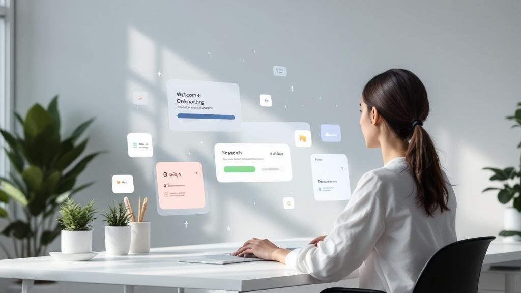
6. UI Movement: Your Go-To Resource for Micro-Interaction Inspiration
Finding user interface design inspiration can be a challenge. You need resources that go beyond static screenshots and showcase the dynamic nature of modern UI. This is where UI Movement (https://uimovement.com/) shines. UI Movement is a curated online gallery dedicated to showcasing the best of UI design patterns and micro-interactions, making it an invaluable resource for anyone seeking user interface design inspiration. It's particularly helpful for entrepreneurs, startups, marketers, established brands, and tech companies looking to elevate their digital presence.
UI Movement differentiates itself by presenting UI elements in motion. Instead of static images, you'll find animated GIFs and videos demonstrating how interface components behave and interact. This dynamic approach provides a much clearer understanding of how these elements function in a real-world context, offering superior user interface design inspiration compared to static mockups. The platform meticulously categorizes these designs by UI patterns (e.g., onboarding, navigation, form validation), allowing you to quickly pinpoint inspiration for specific interface challenges you might be facing.
One of the biggest advantages of UI Movement is its focus on micro-interactions. These subtle animations and transitions play a crucial role in enhancing user experience and providing feedback. Think about the satisfying “pop” when you add an item to your cart or the smooth transition between screens in a mobile app. UI Movement offers a wealth of examples demonstrating how these micro-interactions can be implemented effectively, offering concrete user interface design inspiration.
Features that fuel your UI design inspiration:
Animated demonstrations: Witness UI interactions in action, gaining a deeper understanding of their impact.
Categorization: Easily browse and filter examples by specific UI patterns and components (e.g., navigation menus, loading animations, button interactions).
Mobile-first design focus: A significant portion of the showcased designs are optimized for mobile interfaces, reflecting the current digital landscape.
Curated content: UI Movement features high-quality examples from talented designers, ensuring you're exposed to the best in the field.
Search functionality: While limited, you can search by specific interaction types to find relevant examples.
Regular updates: Fresh content is added regularly, keeping you up-to-date with the latest UI trends and best practices.
Pros and Cons of using UI Movement for user interface design inspiration:
Pros:
Dynamic presentations: See UI elements in motion, understanding their function and impact more effectively.
Focused curation: Specifically tailored to UI patterns and interactions.
Targeted inspiration: Easily find solutions for specific UI challenges.
Mobile-optimized examples: Relevant to today's mobile-centric world.
Clean browsing experience: A distraction-free environment for focused exploration.
Free access: All content is freely available.
Cons:
Limited context: While visually appealing, UI Movement often lacks the context behind specific design decisions.
Smaller community: Compared to larger design platforms, the community interaction is less extensive.
Limited documentation: Don't expect in-depth project documentation or code snippets.
Trend focus: There's a tendency to showcase trendy interactions, sometimes at the expense of pure usability.
Limited search: Filtering and search capabilities could be more robust.
Examples of UI interactions you can find on UI Movement:
Onboarding flow animations for fintech apps
Creative navigation drawer interactions
Form validation and error state animations
Engaging loading states and progress indicators
Smooth card-based interface transitions
Tips for maximizing your use of UI Movement for user interface design inspiration:
Utilize category filters: Narrow your search to specific interaction patterns you’re interested in.
Prioritize user experience: Focus on micro-interactions that genuinely enhance usability, not just flashy animations.
Consider context: Think about how the showcased interactions would fit within your app's overall design and user flow.
Save inspiring examples: Bookmark or save examples that align with your app's personality and target audience.
Study animation details: Pay attention to the timing and easing of animations to inform your own implementation.
UI Movement, popularized by its creator and curator Tony Thomas, and featuring work from designers at leading companies like Uber, Google, and Facebook, is an essential resource for anyone seeking user interface design inspiration. By showcasing the best in micro-interactions and UI patterns, it empowers designers to create more engaging and user-friendly experiences. While it's not a comprehensive design solution, UI Movement serves as an excellent starting point for exploring the dynamic world of UI design and gathering inspiration for your next project.
7. Mobbin: A Treasure Trove of Mobile UI Design Inspiration
Finding user interface design inspiration can be a daunting task, especially for mobile apps. You want to create an interface that is both visually appealing and functionally intuitive, but where do you start? Mobbin (https://mobbin.com/) offers a powerful solution, serving as a comprehensive library of real-world mobile app screenshots and user flows. It's an invaluable resource for anyone seeking user interface design inspiration, from entrepreneurs and solo founders to established brands and tech companies. This platform allows you to dissect the design choices of successful apps, providing a wealth of knowledge and inspiration for your own projects.
Mobbin distinguishes itself from other design inspiration resources by focusing on real, in-production mobile apps rather than conceptual designs. This provides a practical perspective, showcasing how established companies have tackled common UI/UX challenges. With over 300,000 screens from popular iOS and Android apps, Mobbin offers a vast and diverse collection of design patterns, making it a goldmine of user interface design inspiration.
How Mobbin Works:
Mobbin is meticulously organized, making it easy to navigate its extensive library. You can browse by app category (e.g., e-commerce, social media, finance), explore specific UI patterns (e.g., onboarding flows, checkout processes, navigation menus), or search directly for an app by name. The platform also documents user flows, allowing you to visualize the complete user journey within an app. This feature is incredibly useful for understanding how different screens connect and contribute to the overall user experience.
Successful Implementation Examples:
Mobbin provides access to UI elements from a wide range of successful apps. You can analyze onboarding flows from popular apps like Spotify, Instagram, and TikTok, examine e-commerce checkout processes from giants like Amazon and Shopify, or study social media feed designs from platforms like Twitter and LinkedIn. Even complex interfaces like banking app dashboards from various fintech companies and navigation patterns from Uber, Airbnb, and Google Maps are readily available for examination. This breadth of examples makes Mobbin a highly versatile tool for user interface design inspiration.
Actionable Tips for Using Mobbin:
Targeted Pattern Search: Use the pattern search to find solutions for specific UI challenges you're facing. For example, if you're struggling with designing an effective onboarding process, search for "onboarding flows" to see how other apps have approached it.
Comparative Analysis: Compare how different apps handle the same user flow or UI element. This can help you identify best practices and understand the nuances of different design approaches.
Industry Focus: Concentrate on apps within your specific industry for the most relevant user interface design inspiration. This will ensure that the examples you're studying are tailored to your target audience and market.
Curated Collections: Create collections of patterns and flows you find inspiring for future reference. This will build a personalized library of design solutions you can readily access.
Information Architecture Analysis: Go beyond just the visuals and analyze the information architecture of successful apps. Understand how they organize and present information to users for optimal clarity and efficiency.
Pros and Cons:
Pros:
Real-world examples from production apps.
Comprehensive coverage of mobile UI patterns.
Organized structure for easy navigation.
Regularly updated with new app versions.
Valuable for competitive analysis.
Cons:
Limited to mobile platforms.
Limited context regarding design decisions and performance metrics.
Screenshots can become outdated.
Premium features require a paid subscription.
Limited interaction and animation examples.
When and Why to Use Mobbin:
Mobbin is an excellent resource for anyone involved in mobile app design, including entrepreneurs, designers, developers, and product managers. It's particularly useful during the early stages of a project when you're defining the user interface and user experience. Mobbin can also be a valuable tool for ongoing design improvements and keeping up with the latest mobile UI trends. Whether you're seeking user interface design inspiration for a new app or looking to revamp an existing one, Mobbin offers a powerful platform for exploring the best practices in mobile design.
8. Page Flows: Unlocking the Secrets of Seamless User Journeys
Finding user interface design inspiration often focuses on the aesthetics of individual screens. However, truly exceptional user experiences are built on well-crafted, seamless user flows. That’s where analyzing page flows becomes invaluable for gaining user interface design inspiration. This approach shifts the focus from isolated elements to the complete user journey, offering a deeper understanding of how users navigate through complex tasks within an application. For entrepreneurs, startups, marketers, established brands, and tech companies alike, understanding page flows is crucial for creating intuitive and engaging digital products.
Page flows document the complete path a user takes within an application, illustrating the steps involved in completing specific tasks. Think of it like a roadmap of the user experience, highlighting every click, swipe, and interaction along the way. Instead of admiring a single, beautifully designed screen, you're analyzing the entire journey, understanding how users move from point A to point B, and importantly, why. This holistic perspective offers user interface design inspiration that goes beyond visual aesthetics and dives into the core of usability.
Platforms like Page Flows (if a website exists, a link would be placed here) specialize in documenting these user journeys from popular web and mobile applications. They meticulously capture the step-by-step process of various user flows, categorizing them by type, such as onboarding, checkout, account setup, and more. This organization allows designers to quickly find relevant examples and analyze how successful companies have tackled specific UX challenges. For example, you could explore Slack's team onboarding process to understand how they streamline user integration, or dissect Stripe's payment setup flow to see how they minimize friction in sensitive transactions. Other excellent examples include Airbnb’s booking and payment process, Netflix's account creation and personalization, and Dropbox's file sharing workflow. By studying these real-world examples, you gain user interface design inspiration that is grounded in proven success.
The benefits of analyzing page flows are numerous. It provides a valuable understanding of UX strategy and flow optimization, offering insights into how successful companies guide users through complex processes. By examining complete user journeys, you can identify potential pain points, bottlenecks, and areas for improvement in your own product's user flow. Comparing different approaches to similar user flows, such as checkout processes across various e-commerce platforms, allows you to identify best practices and adapt them to your specific needs. This method is particularly helpful for identifying UX patterns that enhance usability and drive conversions.
However, focusing solely on page flows also has its limitations. While they provide valuable insights into user journeys, they offer limited visual design inspiration. The emphasis is on functionality and flow, not the aesthetics of individual UI elements. Furthermore, platforms dedicated to documenting page flows often have smaller libraries compared to screenshot-based platforms, and updates might be less frequent. They may also have limited filtering and search capabilities, and because of their focus on the broader journey, they may sometimes miss crucial micro-interactions that contribute significantly to the overall user experience.
So, when and why should you incorporate page flow analysis into your user interface design inspiration process? It’s especially useful when:
Designing complex user flows: If your product involves multi-step processes, such as onboarding, checkout, or account setup, analyzing existing flows can provide invaluable insights.
Optimizing existing user journeys: If you're looking to improve conversion rates or reduce user frustration, studying successful page flows can help you identify areas for improvement.
Understanding competitor strategies: Analyzing your competitors' user flows can reveal their strengths and weaknesses, allowing you to differentiate your product and offer a superior user experience.
Seeking inspiration for specific flow types: Whether it's onboarding, checkout, or search functionality, focusing on specific flow types allows you to learn from the best in the business.
To effectively utilize page flows for user interface design inspiration, consider these tips:
Focus on flows relevant to your product: Don't get bogged down in analyzing flows that aren't directly related to your core user journeys.
Analyze how companies reduce friction: Pay close attention to how successful companies simplify complex processes and minimize user effort.
Compare different approaches: Don't limit yourself to a single example. Compare different approaches to the same user flow to identify the most effective strategies.
Document your insights: Keep a record of your observations and use them to inform your own design decisions.
By understanding and analyzing page flows, you gain a deeper understanding of user behavior and the intricacies of user experience design. This knowledge translates into more intuitive and effective user interfaces, contributing to the overall success of your digital product. Remember, user interface design inspiration shouldn’t just be about pretty pictures; it should be about creating seamless and enjoyable experiences for your users. And page flows are a powerful tool for achieving just that.
UI Design Inspiration Sources Comparison
Source | Implementation Complexity 🔄 | Resource Requirements ⚡ | Expected Outcomes 📊 | Ideal Use Cases 💡 | Key Advantages ⭐ |
|---|---|---|---|---|---|
Dribbble | Medium - requires membership to post | Moderate - browsing, filtering, pro features | High-quality design inspiration, trend awareness | UI/UX visual inspiration, portfolio showcase | Curated, high-quality, large community |
Behance | Medium - easy to create projects | Moderate - project documentation, Adobe integration | Comprehensive project insights and storytelling | Full project case studies, client presentations | Detailed process documentation, Adobe integration |
Awwwards | High - competitive submission process | Moderate to High - following jury, trend reports | Cutting-edge, innovative web design inspiration | Professional web design innovation, trend analysis | Expert jury review, detailed scoring |
Material Design by Google | High - requires full system adoption | High - design system implementation, customization | Consistent, accessible UI across platforms | Building cohesive, accessible UI systems | Research-backed, comprehensive guidelines |
Apple Human Interface Guidelines (HIG) | High - platform specific strict guidelines | High - adherence to Apple ecosystem specs | Polished, native-feeling Apple apps | iOS/macOS/watchOS app design | Industry-leading, accessibility-focused standards |
UI Movement | Low - browsing animated UI patterns | Low - mostly viewing animations | Practical insight into UI interactions | Micro-interactions, UI pattern inspiration | Animated examples, focused on motion |
Mobbin | Low to Medium - organized browsing | Low - screenshot library access | Real-world mobile UI examples for competitive analysis | Mobile UI design, pattern exploration | Extensive real app screenshots, flows |
Page Flows | Low to Medium - studying full flows | Low - documented user journeys | Improved UX strategy via user flow understanding | UX design, user journey optimization | Complete user flows, UX focused |
Elevate Your UI Design: Turning Inspiration into Action
From exploring design showcases like Dribbble, Behance, and Awwwards to delving into established design systems like Material Design and Apple's HIG, this article has provided a range of resources for finding user interface design inspiration. Key takeaways include understanding the importance of user-centered design, recognizing current UI/UX trends, and leveraging resources like Mobbin and Page Flows for real-world examples of effective interface design. Mastering these concepts is crucial for creating intuitive and engaging user experiences that not only attract users but also keep them coming back. This directly impacts your business’s success, driving user satisfaction, boosting conversion rates, and ultimately fostering brand loyalty.
Sometimes, finding the initial spark for a project can be the hardest part. If you're looking for ways to jumpstart your ideation process, consider resources that help you spark creativity and unlock new design possibilities. This can be especially valuable when adapting the inspiration you've gathered to fit your specific target audience and brand identity. Remember, the best user interface design isn't just visually appealing—it seamlessly blends aesthetics with functionality to create a truly exceptional user experience.
Ready to transform your user interface design inspiration into a stunning reality? Happy Pizza Studio specializes in crafting impactful visual experiences that resonate with your users and achieve your business goals. Visit Happy Pizza Studio to discover how their expertise can elevate your UI/UX design and set your brand apart.