
Before you even think about fonts or color palettes, you need a plan. A great startup website isn't just a pretty face; it’s a strategic machine built to generate leads, drive sales, or acquire users. This whole process kicks off by laying a rock-solid foundation.
Building Your Website's Strategic Foundation

The best websites are born long before a single pixel gets placed or a line of code is written. For a startup, skipping this planning phase is a death wish. It’s what ensures every decision you make serves a real business purpose, saving you from burning cash on a site that just sits there.
First things first: what is your website's one primary job? It can’t be everything to everyone, so get brutally specific. Is its main mission to capture emails for a waitlist, get users to book a demo for your SaaS, or sell your product directly?
A website without a clear objective is like a ship without a rudder. It might look impressive, but it won’t get you where you need to go. Settle on one main goal and maybe one or two secondary ones. This focus will guide every single design and content choice you make.
With your "why" locked in, it's time to figure out who you're actually building this for.
Define Your Ideal Customer
You have to go way beyond vague demographics. It’s time to build a detailed user persona—a semi-fictional character who represents your perfect customer. Give them a name, a job title, and most importantly, a problem that your startup is uniquely positioned to solve.
To really flesh out your persona, ask yourself:
What are their biggest headaches, personally or professionally?
Where do they hang out online to find information (blogs, specific social media channels, forums)?
How tech-savvy are they, really?
What actually motivates them to buy something—is it price, slick features, or trusting the brand?
Building a site for "Marketing Maria," a frantic manager desperate to automate her social media, is infinitely more effective than building for a generic "marketer."
Perform a Quick Competitive Analysis
Next, it’s time to size up the competition. The goal here isn't to copycat them, but to spot opportunities they’ve missed. Just spend a couple of hours checking out 3-5 of your main competitors. No need for a monster spreadsheet—just some quick-and-dirty notes will do.
Try to answer these questions:
What’s their main call-to-action? Does it work?
What are they doing well that you can learn from?
Where does their user experience feel clunky or just plain confusing? That’s your opening.
What key features or information are they missing that you know your customers would love?
This quick teardown will shine a light on gaps in the market your new website can fill, giving you a real edge from day one.
This initial strategic work also gives you a realistic starting point for your budget and team. Knowing who you're targeting and what you need to build helps define the scope of the project.
Startup Website Budget & Team Allocation
Budgeting for a new website can feel like a black box. The costs and team structure can vary wildly depending on your goals and complexity. Here’s a general breakdown to help you get started.
Expense / Decision | Typical Range / Distribution | Key Consideration for Startups |
|---|---|---|
Overall Design Cost | $6,500 – $15,000+ | Focus on an MVP (Minimum Viable Product). Don't overspend on features you think you need. |
Team Approach | 42% In-house, 58% Freelancer/Agency | An in-house team offers more control, but freelancers or an agency can provide specialized expertise faster. |
DIY / Low-Code | $300 – $5,000 | Good for simple brochure sites. Platforms like Webflow or Squarespace can work if your needs are basic. |
Freelancer Hire | $5,000 – $25,000 | A great middle-ground. Find a freelancer with a portfolio that matches your desired style and complexity. |
Agency Partnership | $25,000 – $75,000+ | Best for complex projects needing strategy, design, and development. Highest cost but most comprehensive. |
As you can see from recent web design industry trends, the trend of handling about 42% of this work with in-house teams shows that many startups value the agility and long-term ownership of building internally. Your choice will depend entirely on your funding, timeline, and the technical skills you already have on your team.
Creating a Brand Identity That Resonates

Let’s be honest: a strong brand is so much more than a slick logo. It’s the entire vibe your startup gives off. This identity is the beating heart of your website design for startups, shaping every button, headline, and image. It's the secret sauce that makes you instantly recognizable and builds the trust you need to turn a curious visitor into a loyal fan.
Your first move isn't just picking pretty colors; it's creating a simple brand style guide. This doesn't need to be a 100-page corporate tome. A one-pager is often enough to start. At a bare minimum, nail down your logo usage, color palette, typography, and tone of voice. This little document is your key to staying consistent across your website, social media, and every other piece of marketing you touch.
Choosing Your Core Visual Elements
Every visual choice you make is a shortcut to communicating who you are. Colors are packed with emotion. Blue, for instance, screams trust and professionalism, making it a go-to for fintech startups. But if you’re a wellness brand, you’d likely lean into greens and earth tones to signal nature and vitality.
Typography is just as critical. The fonts you choose must be easy to read, sure, but they also need to match your brand's personality. A cutting-edge tech company might go for a clean, sans-serif font like Inter, while a more traditional service could use a classic serif to project a sense of history and stability.
Think of your brand's visual identity as its "outfit." You wouldn't wear a tuxedo to a beach party. In the same way, your website's colors and fonts have to dress the part to connect with your target audience. A mismatch creates instant distrust.
Once you have these core elements defined, get them into a simple, shareable document. This becomes your North Star for every design decision, making sure every corner of your website feels intentional and completely on-brand.
Finding Your Brand Voice
How you talk to your customers is just as important as how you look. Your brand's tone of voice needs to mirror your startup’s personality and click with your ideal customer. Are you witty and casual? Or are you more authoritative and buttoned-up?
Look at how the pros do it:
Mailchimp has perfected a friendly, encouraging, and slightly quirky voice. It makes a complex technical product feel like a helpful friend is guiding you.
Stripe, on the other hand, uses a clear, precise, and developer-first tone. They build confidence through pure, unadulterated expertise.
Documenting your own tone helps every person on your team write copy that sounds like it’s coming from a single, unified personality. Define the key traits of your voice—maybe it's "confident but not arrogant" or "playful but always helpful." It’s a good idea to include some "say this, not that" examples. This small step has a massive impact on building a brand people actually want to connect with and is a true cornerstone of effective website design.
Designing a User Experience That Drives Action
Let's be honest. A beautiful website that's impossible to use is just an expensive billboard on a deserted highway. This is where User Experience (UX) design stops being a buzzword and becomes a core business driver. Good UX has nothing to do with flashy animations and everything to do with creating a smooth, intuitive path for your visitors to follow.
The impact here is massive. A visitor's first impression is 94% design-related, and if the experience feels clunky, 38% of them will bounce immediately. Get it right, though, and you’re looking at a potential conversion rate jump of up to 400%—a truly game-changing boost for any startup.
The key is to start by mapping out the absolute most critical paths a user will take. Don't get lost trying to perfect every single interaction. Instead, laser-focus on the one or two journeys that directly lead to your main business goal.
Mapping Your Core Customer Journeys
Think about the single most important action you want someone to take. Is it signing up for a free trial? Buying a product? Booking a demo? Once you have it, put yourself in your customer’s shoes—let's call her "Marketing Maria"—and walk through the process.
What exact steps does she have to take to get from your homepage to that final "thank you"?
Entry Point: She lands on your homepage from a social media ad.
Discovery: She's greeted by a clear headline and a compelling call-to-action (CTA) like "Start Your Free Trial."
Action: She clicks the button, which takes her to a dead-simple signup form.
Completion: She fills out only the essentials (name, email, password) and hits "Create Account."
This simple map is a goldmine for spotting friction. Is the headline confusing? Does the form ask for her life story? Every extra click, every unnecessary field, is another chance for Maria to get distracted and leave. To keep visitors on track, you have to obsess over optimizing their overall user experience.
Designing for Scannability and Clarity
Here’s a hard truth: people don't read websites, they scan them. Your design has to work with this behavior, not against it. Use clear headings, short paragraphs, and bullet points to break up text so key information practically jumps off the page. This structure naturally guides the user's eye right where you want it to go—your CTAs.
Your visitor should know exactly what to do within seconds of landing on any page. If they have to stop and think, you’ve already failed. Every page needs a single, primary call-to-action that is impossible to miss.
And use action-oriented language for your buttons. "Submit" is lazy. Try "Get My Free Ebook" or "Book My Demo." This specificity erases any doubt and tells the user exactly what happens when they click.
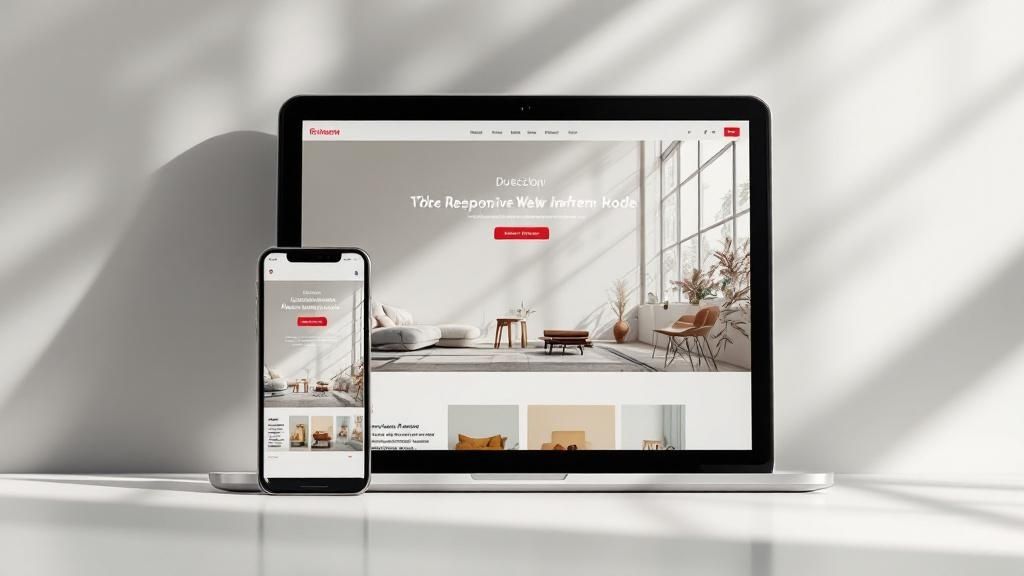
Finally, you have to embrace a mobile-first mindset. It's not optional. With more than half of all web traffic coming from phones, your site has to look and work flawlessly on a small screen. This isn’t just about shrinking things down; it's about ruthlessly prioritizing content and making sure core actions are easy to complete with just a thumb. A clean, responsive design is absolutely non-negotiable.
Choosing Your Tech Stack for Speed and Scale
The technology humming away behind your website is just as crucial as its visual design. The right tech stack—that's the mix of platforms, frameworks, and tools you choose—dictates everything. How fast can you get your site live? How easily can you tweak things? And can it handle a massive wave of traffic when you get that big press feature?
For a startup, this is a classic balancing act. You're juggling speed, budget, and what you'll need down the road.
To find the right path, you have to get real about where you stand right now. Ask yourself:
Who on our team actually has technical skills? Be honest.
What’s our real budget for building this thing and keeping it running?
What's the absolute drop-dead date for launching?
What complex features will we truly need in the next 6-12 months, not five years from now?
Your answers will point you toward the best starting point for your startup's journey.
Platforms for Every Founder
If you're a non-technical founder and your main goal is to launch a beautiful, functional site without a huge delay, no-code and low-code builders are your new best friends. Platforms like Webflow and Framer are game-changers, giving you incredible design freedom without you having to write a single line of code.
For any startup where speed is the name of the game, digging into the Top No Code Website Builders is a must. They really hit the sweet spot between customizability and ease of use.
On the other hand, you have behemoths like WordPress. It’s incredibly powerful, with a massive ecosystem of plugins and themes for almost any function you can imagine. But with great power comes a steeper learning curve and the constant need for maintenance and security updates. This path is often a solid fit for startups with some in-house tech comfort or a developer on speed dial.
The single biggest mistake a startup can make is over-engineering its first website. Pick the simplest tool that gets the job done today. You can always upgrade to a more complex system later when you have the revenue and people to support it. Don't build for a hypothetical empire that may never exist.
Then there's the fully custom-coded route. This gives you ultimate control but is by far the most expensive and time-consuming option. It’s usually reserved for tech startups where the website is the product, or for businesses with highly specific, complex needs that no off-the-shelf tool can meet.
The data below shows just how much your brand presentation—something your tech choice enables or restricts—can influence how users interact with your site.

It’s clear: a cohesive brand, like a consistent color palette, isn't just nice to have. It's linked to a significant 45% lift in user engagement. Your tech needs to make this possible.
Making the Right Choice for Today and Tomorrow
Choosing a platform isn't just about features; it's about matching the tool to your startup's specific situation. To help you weigh your options, here’s a quick comparison of the most common paths startups take.
Comparing Website Platforms for Startups
Platform | Best For | Scalability | Typical Cost | Technical Skill Required |
|---|---|---|---|---|
No-Code (Webflow, Framer) | Non-technical founders needing design control and speed. | Good | $$ | Low |
Website Builders (Squarespace) | Simple, content-focused sites with fast setup. | Fair | $ | Very Low |
WordPress | Content-heavy sites needing extensive plugins and themes. | Excellent | $$-$$$ | Medium |
Custom Code (React, etc.) | Tech startups with unique functionality needs. | Unlimited | $$$$ | High |
Ultimately, effective website design for startups isn’t just about the technology. It's about picking a platform that frees you up to move fast, test your ideas, and actually talk to customers—without getting buried in technical debt.
Choose for where you are now, but keep an eye on where you're headed.
Crafting Core Content with SEO in Mind
A killer design is great, but it's the words on the page that do the heavy lifting. The right content is what transforms your startup’s website from a pretty online brochure into a machine that actually brings in customers. It all starts with building out the essential pages that people expect to see.
These are your non-negotiables. Your homepage needs to hook visitors in seconds. Your "About Us" page is where you build trust and show the human side of your brand. Your product or service pages have to spell out exactly what you do and why it matters. And your contact page? It needs to be dead simple to find and use. Skimp on any of these, and the whole experience feels wobbly.
But just writing compelling copy isn't enough. You have to make sure the right people can actually find you. That’s where search engine optimization (SEO) comes in, and it's a critical part of website design for startups that too many founders ignore until it’s way too late.
Finding What Your Customers Search For
Good SEO begins with speaking your customer’s language. What phrases are they actually typing into Google when they’re looking for a solution like yours? This whole process is called keyword research, and it’s less complicated than it sounds.
You don't need a suite of expensive tools to get a solid start. Just open a document and start brainstorming terms your ideal customer might use. Think along these lines:
Problem-based keywords: What specific pain are you solving? (e.g., "how to automate social media posts")
Solution-based keywords: What is your product category? (e.g., "social media scheduling tool")
Branded keywords: This one’s easy—it’s just your company and product names.
Once you have a healthy list, you can use a free tool like Google Keyword Planner to get a rough idea of which terms people are searching for. Look for that sweet spot: decent search volume without being insanely competitive. A good strategy is to find a mix of broader terms and more specific, "long-tail" phrases.
The point isn't to just collect a list of words to stuff into your pages. It’s about deeply understanding what your customers want. When you know people are searching for "best accounting software for freelancers," you know exactly what kind of page to build and which features to highlight.
Weaving Keywords into Your Content Naturally
Now that you have your list of keywords, it's time to put them to work. The trick is to make it all sound completely natural, as if you weren’t thinking about SEO at all.
Start with the high-impact spots: your page titles and main headings (like H1s and H2s). These are huge clues for search engines. A page titled "Our Services" is forgettable. "Project Management Software for Remote Teams" is specific, helpful, and packed with relevant keywords.
From there, work your primary keyword and a few variations into the body of your text, paying special attention to the first paragraph or two. Always, always write for a human first. If a sentence sounds clunky or forced, rewrite it. A good rule of thumb is to dedicate each page to one main keyword. This gives both your visitors and the search engines a crystal-clear idea of what that page is about, helping you rank for the right things right from the start.
Common Questions on Startup Website Design
Founders have a million questions when it comes to building a website for their startup. It's easy to get bogged down in the details, especially when you're juggling a hundred other priorities. Let's cut through the noise and tackle the questions I hear most often, so you can get moving with confidence.
How Much Should a Startup Website Actually Cost?
This is always the first question, and the honest answer is… it depends. You could spend a few hundred bucks on a DIY site or drop tens of thousands on a custom build from an agency. The number isn't what's important.
The better question is, "What's the smartest way to use the budget I have right now?"
Think Minimum Viable Product (MVP). Your first website only needs the absolute core features to test your business idea. Forget all the bells and whistles for now.
Your first site’s job isn’t to be perfect; it's to get validation. Use it to prove people actually want what you’re selling. You can always build the fancy, complex features later—funded by the revenue your simple, effective first site brings in.
This MVP mindset keeps your initial costs down and focuses your cash on what really matters: learning.
How Long Will This Take and What Do I Do After Launch?
"How long until we're live?" is another big one. And again, the timeline is all about the complexity of the build.
DIY Builders (Squarespace, etc.): You could be up and running in a weekend, assuming your content is ready to go.
No-Code Platforms (Webflow, Framer): Give yourself a few weeks to a month. There’s a learning curve, but the results can be incredibly polished.
Agency or Freelancer: A standard project usually takes anywhere from 6 to 12 weeks, depending on the scope and how quickly you provide feedback.
Want to speed things up? Have your content ready before design even starts. Your text, images, and brand guide are almost always the biggest bottlenecks in any web project.
Once you hit that glorious "launch" button, your job isn't done—it just changes. Your focus needs to pivot immediately to two things:
Getting Eyes on the Site: Start your marketing plan. Whether it's content, social media, or paid ads, a beautiful website with zero visitors is just an expensive digital paperweight.
Watching What Users Do: Get analytics tools like Google Analytics installed from day one. See how real people use your site. Can they find the sign-up button? Are they all leaving from the same page?
This data is gold. It tells you exactly what’s working and what’s broken, so you can make small, informed changes that steadily improve your site's performance. This cycle—launch, measure, iterate—is how you build a website that doesn't just look good, but actually grows your business.
Ready to build a website that not only looks incredible but is engineered to convert visitors into loyal customers? Happy Pizza Studio specializes in creating powerful visual experiences that drive real results. From brand redesigns to Framer development, we offer unlimited design support to help your startup grow. Let's create something amazing together. Learn more about our design services.


