
In a world saturated with digital products, a beautiful interface is no longer enough. The most successful designs are not just visually appealing; they are intuitive, efficient, and genuinely solve user problems. But how do you move from subjective opinion to objective improvement? The answer lies in data. By systematically tracking and analyzing key metrics for user experience, you can uncover hidden pain points, validate design decisions, and directly connect your work to business outcomes.
This guide cuts through the noise to focus on seven essential metrics that provide a comprehensive view of your product's performance. For each one, we will explore:
What the metric is and why it matters.
How to measure it with practical tools.
How to turn raw numbers into actionable design improvements.
Mastering these metrics will transform your approach to creating experiences that resonate with users and drive growth. It's about designing for tangible impact, moving beyond aesthetics to build products that are demonstrably better. To gain a holistic view beyond direct UX measures, consider also analyzing essential content performance metrics to understand how your messaging complements the user journey. Whether you are a designer, product manager, or founder, this framework will equip you to make smarter, data-informed decisions that lead to both happier customers and stronger business results.
1. Task Success Rate
Task Success Rate (TSR), also known as completion rate, is one of the most fundamental and widely used metrics for user experience. It measures the percentage of users who successfully complete a defined task within a product or interface. This straightforward metric provides a clear, quantitative signal of your design’s basic usability and effectiveness. If users cannot achieve their goals, nothing else matters.

Pioneered by usability experts like Jakob Nielsen and Jared Spool, TSR is a direct reflection of how well your product facilitates user goals. It answers a simple but critical question: "Can people do what they came here to do?"
How to Measure Task Success Rate
Calculating TSR is a simple formula:
Task Success Rate = (Number of Successful Completions / Total Number of Attempts) x 100
For example, if 100 users attempt to create a new playlist in a music app and 85 succeed, the TSR for that task is 85%. While the calculation is simple, the setup requires careful planning. You must define what "success" means for each task before you begin testing or tracking. This could be reaching a specific confirmation page, triggering a "success" event in your analytics, or completing a workflow without critical errors.
Real-World Examples
E-commerce: A website tracks how many users who add an item to their cart successfully complete the checkout process. A low rate here points to major friction and lost revenue.
SaaS: A project management tool like Asana might measure the percentage of new users who successfully create their first task and assign it to a team member during onboarding.
Fintech: A banking app measures the completion rate for a "transfer money" workflow. If users frequently drop off, it could indicate a confusing interface or a lack of trust.
Actionable Tips for Implementation
To get the most value from this core UX metric, follow these best practices:
Define Success with Precision: Be crystal clear about what constitutes a successful task completion. Is it simply reaching the final page, or does it require the user to have entered all information correctly? Ambiguity here will invalidate your data.
Combine with Qualitative Data: A low success rate tells you what is wrong, but not why. Pair TSR tracking with qualitative methods like user interviews or session recordings to understand the specific obstacles users are facing.
Segment Your Results: Don't just look at the overall success rate. Segment the data by user demographics, device type, or acquisition channel. You might discover that a flow works perfectly on desktop but fails miserably on mobile, providing a clear direction for improvement.
Track Over Time: Task Success Rate is not a one-time metric. Track it continuously to measure the impact of design changes, A/B tests, and new feature launches. A rising TSR is a strong indicator of a successful UX strategy.
2. Time on Task
Time on Task, often called Task Completion Time, is a core efficiency metric that measures the average time users take to complete a specific task. This metric is a powerful indicator of usability friction. If users can complete a task successfully but it takes them an unreasonably long time, it points to a confusing, clunky, or inefficient user journey. Reducing task time directly improves user satisfaction and productivity.

Pioneered by human-computer interaction researchers like Ben Shneiderman and popularized through frameworks like Google's HEART, Time on Task answers the critical question: "How quickly and easily can users achieve their goals?" It's a foundational element in any robust analysis of metrics for user experience.
How to Measure Time on Task
Measuring Time on Task requires tracking the interval between a defined start and end point for a given workflow. The formula is simply the average of these intervals across multiple users.
Average Time on Task = (Sum of Time Taken by All Users) / (Total Number of Users)
You start the timer when a user initiates the task (e.g., clicks "add to cart") and stop it when they reach the defined success state (e.g., land on the "order confirmed" page). This data can be collected through usability testing sessions (with a stopwatch) or, more scalably, through product analytics tools that track timestamps for key events.
Real-World Examples
E-commerce: Amazon famously optimized its checkout process to a "1-Click" purchase, drastically reducing the Time on Task for repeat buyers and boosting conversions.
SaaS: Slack might measure the time it takes for a user to send their first message or join a new channel. A shorter time indicates a more intuitive and less intimidating onboarding experience.
On-Demand Services: Uber tracks the time from when a user opens the app to when they successfully book a ride. Minimizing this duration is key to their value proposition of speed and convenience.
Actionable Tips for Implementation
To effectively use Time on Task as one of your key metrics for user experience, consider these best practices:
Establish a Baseline: Before making design changes, measure the current Time on Task to create a benchmark. This allows you to quantify the impact of your improvements accurately. Task complexity should inform what a "good" time is.
Combine with Task Success Rate: Looking at Time on Task in isolation can be misleading. A very fast time might indicate users are rushing and making errors, while a long time for a user who eventually succeeds is still better than one who fails. The two metrics together provide a complete picture of effectiveness and efficiency.
Track Both Average and Median: The average time can be skewed by a few users who take an exceptionally long time. The median time (the middle value in your data set) is often a more stable indicator of the typical user experience, as it is less affected by outliers.
Segment by User Expertise: New users will almost always take longer than experienced power users. Segmenting your data by user tenure or expertise level can reveal if your design is easy for beginners to learn or if it remains efficient for experts.
Use Heatmaps to Find Bottlenecks: When you observe a high Time on Task, use tools like heatmaps or session recordings to pinpoint exactly where users are struggling. You might find they are repeatedly clicking a non-clickable element or hesitating on a confusing form field.
3. System Usability Scale (SUS)
The System Usability Scale (SUS) is a standardized, reliable survey used to measure a user's subjective perception of a system's usability. Developed by John Brooke in 1986, it consists of a 10-item questionnaire with a 5-point Likert scale. It provides a quick yet powerful way to generate a single usability score, making it one of the most popular metrics for user experience evaluation.
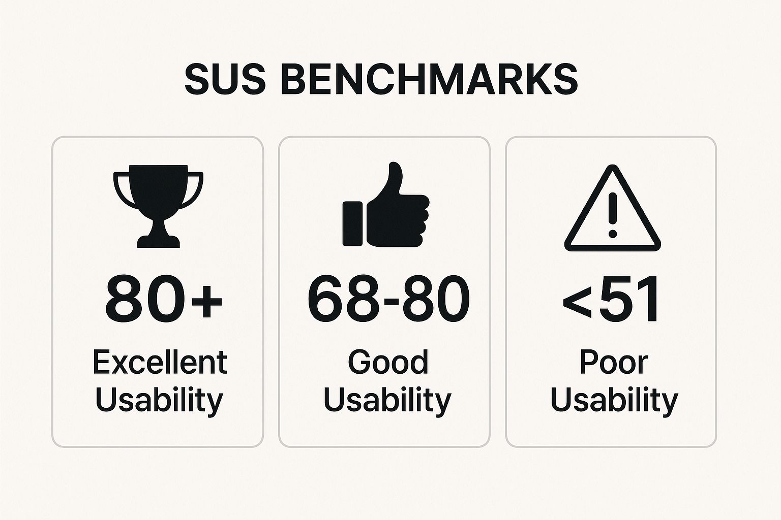
Popularized by usability researchers like Jeff Sauro and Aaron Bangor, SUS is valued for its simplicity and robustness. It answers the crucial question: "How easy do users feel it is to use this product?" This infographic highlights key industry benchmarks for interpreting a system's final SUS score. Understanding these score ranges is essential for contextualizing your results and setting improvement goals.
How to Measure with the System Usability Scale
The SUS score is calculated from a 10-item questionnaire where users rate statements from "Strongly Disagree" (1) to "Strongly Agree" (5). The calculation is specific:
SUS Score = (Sum of participant scores - 10) x 2.5
First, for odd-numbered questions (1, 3, 5, 7, 9), subtract 1 from the user's score. For even-numbered questions (2, 4, 6, 8, 10), subtract the user's score from 5. Sum these new values for all 10 questions and multiply by 2.5. This yields a score from 0 to 100, which is a percentile ranking, not a percentage. An average score is 68.
Real-World Examples
SaaS: Dropbox might use SUS after a major interface redesign to measure if usability has improved or declined, comparing the new score against previous versions.
Software Development: Microsoft often uses SUS to evaluate changes to Office 365, ensuring that new features do not negatively impact the perceived ease of use for millions of users.
Government: Public-facing websites, like those for tax filing or citizen services, use SUS to ensure they are accessible and usable for a diverse population with varying technical skills.
Competitive Analysis: A startup can administer SUS for its own product and its top three competitors to benchmark its usability within the market and identify strategic advantages.
Actionable Tips for Implementation
To effectively leverage SUS as one of your core metrics for user experience, consider these best practices:
Administer Immediately: Present the SUS questionnaire right after a user has completed a set of representative tasks. This ensures their feedback is based on fresh, direct experience, leading to more accurate responses.
Use Benchmarks for Context: A SUS score in isolation has limited meaning. Compare your score to the industry average of 68. Scores above 80 are considered excellent, while scores below 51 indicate significant usability problems that need urgent attention.
Combine with Other Metrics: SUS tells you about users' overall perception of usability but not why they feel that way. Pair it with behavioral metrics like Task Success Rate and qualitative feedback to get a complete picture.
Track Over Time: Treat SUS as a longitudinal metric. By tracking your score across different product versions and updates, you can quantitatively measure the impact of your design and development efforts on user satisfaction.
4. Net Promoter Score (NPS)
Net Promoter Score (NPS) is a widely adopted metric that measures long-term user loyalty and satisfaction. Instead of focusing on a specific task, it gauges the user's overall relationship with your brand by asking a single, powerful question: "On a scale of 0-10, how likely are you to recommend this product/service to a friend or colleague?" This simple question provides a powerful indicator of customer sentiment and potential for organic growth.
Popularized by Fred Reichheld of Bain & Company, NPS has become a standard for many Fortune 500 companies because it connects user experience directly to business growth. A high score suggests you have created advocates for your brand, while a low score is a critical warning sign of dissatisfaction. It is one of the most direct metrics for user experience when it comes to brand perception.
How to Measure Net Promoter Score
Based on their 0-10 rating, respondents are grouped into three categories:
Promoters (9-10): Your most loyal and enthusiastic customers who will advocate for your brand.
Passives (7-8): Satisfied but unenthusiastic customers who are vulnerable to competitive offerings.
Detractors (0-6): Unhappy customers who can damage your brand through negative word-of-mouth.
The NPS is calculated with this formula:
NPS = Percentage of Promoters - Percentage of Detractors
The final score ranges from -100 (if every customer is a Detractor) to +100 (if every customer is a Promoter). For example, if you survey 100 users and get 50 Promoters, 30 Passives, and 20 Detractors, your NPS would be 30 (50% - 20%).
Real-World Examples
Technology: Apple consistently reports industry-leading NPS scores (often 70+) for products like the iPhone, reflecting intense customer loyalty and a strong brand ecosystem.
SaaS: Slack uses NPS not just as a general metric, but to track satisfaction across different user segments (e.g., free vs. paid plans, new vs. power users) to tailor its product strategy.
Automotive: Tesla maintains high NPS scores, indicating that despite some service challenges, the core product experience creates a powerful sense of brand advocacy among owners.
Actionable Tips for Implementation
To make NPS more than just a vanity metric, integrate these practices:
Ask "Why?": The number is just the start. Always follow the rating question with an open-ended question like, "What is the primary reason for your score?" This qualitative feedback is where the most valuable insights are found.
Segment Your Score: A single, company-wide NPS can hide critical issues. Segment your results by user persona, subscription tier, feature usage, or customer journey stage to pinpoint exactly where the experience is excelling or failing.
Track Trends, Not Just Snapshots: Measure NPS at regular intervals (e.g., quarterly) to monitor trends. This helps you understand the impact of product updates, policy changes, or marketing campaigns on customer loyalty over time.
Create Action Loops: Don't just collect data; act on it. Create specific, closed-loop processes to follow up with Detractors to solve their problems and engage with Promoters to encourage advocacy. This demonstrates that you are listening and builds stronger relationships.
5. Customer Satisfaction Score (CSAT)
Customer Satisfaction Score (CSAT) is a direct and versatile metric that measures how satisfied a user is with a specific interaction, feature, or their overall experience with your product. It provides an immediate pulse on user sentiment by asking a simple, direct question, making it a critical component of any comprehensive framework of metrics for user experience.
Popularized by the customer service industry and research firms like J.D. Power, CSAT is designed to capture in-the-moment feedback. It answers the crucial question: "Did this specific part of the experience meet the user's expectations right now?"
How to Measure Customer Satisfaction Score
CSAT is typically measured through a one-question survey, asking, "How satisfied were you with [specific experience]?" Users respond on a predefined scale, commonly 1 to 5, where 1 represents "very unsatisfied" and 5 represents "very satisfied."
The score is calculated with this formula:
CSAT Score = (Number of Satisfied Customers / Total Number of Survey Responses) x 100
"Satisfied customers" are usually those who select the top two ratings (e.g., 4 and 5 on a 5-point scale). For example, if you receive 200 survey responses and 150 of them are a 4 or 5, your CSAT score is 75%. For a comprehensive look at how to quantify user contentment, including insights into CSAT and other key metrics, you can explore these seven effective ways to measure customer satisfaction.
Real-World Examples
Customer Support: Zendesk and other helpdesk platforms automatically send a CSAT survey after a support ticket is resolved to measure the quality of the interaction.
Ride-Sharing: Uber and Lyft prompt users to rate their satisfaction with a ride immediately after it ends, collecting instant feedback on the driver and vehicle quality.
SaaS Onboarding: A software company can trigger a CSAT survey after a user completes the initial setup process to gauge the effectiveness and ease of their onboarding flow.
Travel: Airlines or hotel chains may survey customers about their satisfaction at various journey touchpoints, such as check-in, boarding, and in-flight service.
Actionable Tips for Implementation
To effectively integrate CSAT into your UX measurement strategy, consider these best practices:
Time Your Surveys Perfectly: Deploy CSAT surveys immediately following the relevant interaction. Asking about a support call a week later will yield less accurate feedback than asking right after the call ends.
Keep It Short and Focused: The power of CSAT lies in its simplicity. Restrict the survey to the core satisfaction question and perhaps one optional, open-ended follow-up like, "What could we have done better?"
Use a Consistent Scale: If you measure CSAT at multiple touchpoints (e.g., onboarding, support, feature use), use the same rating scale everywhere. This allows you to benchmark and compare satisfaction levels across the entire user journey.
Combine with a Follow-Up Question: A score tells you what the satisfaction level is, but a follow-up question reveals why. This qualitative context is what transforms CSAT from a simple score into an actionable insight.
Track Trends, Not Just Scores: A single CSAT score is a snapshot. The real value comes from tracking this metric over time. A rising trend indicates your improvements are working, while a dip can be an early warning sign of a new issue.
6. Error Rate
Error Rate quantifies how often users make mistakes while interacting with a product or trying to complete a task. It's one of the key diagnostic metrics for user experience, shining a light on areas of friction, confusion, and poor design. A high error rate is a direct indicator of usability problems that lead to user frustration, task abandonment, and a loss of trust in your product.
Popularized through foundational human-computer interaction research and Jakob Nielsen's usability heuristics, particularly "Error prevention," this metric helps answer a critical question: "Where is our design causing users to fail?" By measuring and analyzing errors, you can pinpoint specific design flaws and make targeted improvements.
How to Measure Error Rate
Calculating a basic error rate can be straightforward, but a truly useful measurement requires careful definition. A common approach is the task-based error rate:
Error Rate = (Total Number of Errors / Total Number of Attempts on the Task) x 100
For this formula to be effective, you must first define what constitutes an "error." This could range from a minor slip, like a typo in a non-critical field, to a critical error, like entering the wrong bank account number for a transfer. It's often more insightful to count the number of users who made at least one error during a task, as one user could make multiple errors, skewing the overall rate.
Real-World Examples
E-commerce: A checkout form tracks how many users submit the form with validation errors (e.g., an invalid credit card number or a poorly formatted postal code). A high rate on a specific field suggests its label or constraints are unclear.
SaaS: A software application monitors how often users try to use a feature in a way it wasn't intended, like attempting to drag and drop an unsupported file type. This signals a mismatch between user expectations and system functionality.
Fintech: A banking app logs failed login attempts due to incorrect passwords or usernames. It also tracks errors made during a bill payment process, such as entering an invalid payment amount.
Actionable Tips for Implementation
To transform error data into design improvements, consider these best practices:
Classify Your Errors: Don't treat all errors equally. Categorize them by type (slips vs. mistakes), severity (critical vs. non-critical), and recoverability (is it easy for the user to fix?). This helps prioritize which issues to address first.
Focus on High-Impact Errors: Prioritize fixing errors that directly prevent task completion or cause significant user frustration. A typo in a "promo code" field is less severe than an error that blocks a user from completing a purchase.
Analyze Error Recovery: It's not just about the error, but what happens next. Track how long it takes users to recover from an error and whether they succeed. If recovery rates are low, your error messages and design guidance are likely ineffective.
Combine with Qualitative Insights: An error log tells you what went wrong, but user testing or session replays will show you why. Watching a user repeatedly make the same mistake provides rich context that raw numbers cannot, making it an essential part of evaluating metrics for user experience.
7. User Retention Rate
User Retention Rate is a critical metric for user experience that measures the percentage of users who return to your product over a specific period. While usability metrics like Task Success Rate tell you if users can use your product, retention tells you if they want to keep using it. It is the ultimate indicator of long-term product value, user loyalty, and business sustainability.
Popularized by the SaaS and mobile app industries through platforms like Mixpanel and Amplitude, retention is a cornerstone of growth strategy. A "leaky bucket" that loses users as fast as it acquires them is not a sustainable model. A high retention rate, on the other hand, signals a sticky product with a strong product-market fit.
How to Measure User Retention Rate
The formula for retention is straightforward, but its application requires careful definition of cohorts and timeframes.
User Retention Rate = ((Number of Users at End of Period - New Users During Period) / Number of Users at Start of Period)) x 100
A more common way to track this is through cohort analysis. For example, if 1,000 users sign up in the first week of January (the cohort) and 350 of those same users are still active in the first week of February, your monthly retention for that cohort is 35%. You must define what "active" means, such as logging in, performing a key action, or simply opening the app.
Real-World Examples
Social Media: Instagram and TikTok track daily and monthly active user retention with extreme precision. High retention is the core of their ad-based business model.
Streaming Services: Netflix closely monitors subscriber retention after a free trial ends and from month to month. A drop-off indicates issues with content value or pricing.
Mobile Gaming: A gaming app will track Day 1, Day 7, and Day 30 retention. Low Day 1 retention signals a poor first-time user experience, while a drop-off by Day 30 suggests a lack of long-term engagement.
SaaS Products: A tool like Slack measures retention across different pricing tiers to understand which customer segments find the most ongoing value in its premium features.
Actionable Tips for Implementation
To make User Retention Rate one of your most powerful metrics for user experience, apply these strategies:
Define Retention with Meaningful Actions: Don't just count logins. Base your definition of an "active" user on core value-driving actions. For a project management tool, this might be creating a task; for a music app, it could be playing a song.
Focus on Cohort-Based Tracking: Overall retention can be misleading. Use cohort analysis to group users by their sign-up week or month. This allows you to measure the impact of product changes on new user groups without old user data skewing the results.
Identify Key Drop-Off Points: Analyze where users stop returning. Is it after day 1, week 1, or after their first month? Pinpointing these moments helps you focus your UX improvement efforts on the most critical parts of the user lifecycle, like onboarding or feature discovery.
Segment Your Retention Data: Compare retention across different acquisition channels, user demographics, or device types. You may find that users acquired via organic search retain better than those from paid ads, indicating higher intent and a better user-product match.
7 Key UX Metrics Comparison
Metric | Implementation Complexity 🔄 | Resource Requirements ⚡ | Expected Outcomes 📊 | Ideal Use Cases 💡 | Key Advantages ⭐ |
|---|---|---|---|---|---|
Task Success Rate | Moderate - requires clear task definitions and testing setup | Moderate - usability testing or analytics needed | Measures how effectively users complete tasks | Usability testing, A/B testing, workflow validation | Directly correlates with user satisfaction and business goals |
Time on Task | Moderate - needs timing tools and workflow tracking | Moderate - analytics tools, session recordings | Measures efficiency; identifies bottlenecks and delays | Workflow optimization, performance benchmarking | Quantifies user efficiency and highlights flow issues |
System Usability Scale (SUS) | Low - quick 10-question survey | Low - survey administration and analysis | Produces a standardized usability score (0-100) | Quick usability evaluation, product comparison | Industry standard, easy to administer, provides reliable benchmarking |
Net Promoter Score (NPS) | Low - single-question survey | Low - survey tools | Measures user loyalty and likelihood to recommend | Customer loyalty tracking, competitive benchmarking | High response rates, strong correlation with business growth |
Customer Satisfaction Score (CSAT) | Low - flexible, quick surveys | Low - survey setup per touchpoint | Measures immediate satisfaction with specific interactions | Customer service feedback, feature-specific insights | Provides actionable, real-time feedback |
Error Rate | Moderate - requires error definition and tracking | Moderate - analytics or manual observation | Measures frequency and type of user and system errors | Usability problem identification, product improvement | Directly highlights usability issues, prioritizes design fixes |
User Retention Rate | Moderate - requires cohort analysis and tracking over time | Moderate - analytics platforms (Mixpanel, Amplitude) | Measures long-term engagement and loyalty | Subscription products, apps, SaaS user engagement | Predicts customer lifetime value, indicates product-market fit |
From Data to Delight: Putting Your Metrics into Action
We’ve journeyed through seven essential metrics for user experience, from the directness of the Task Success Rate to the emotional pulse-check of the Net Promoter Score. Understanding what each metric represents, how to measure it, and why it matters is a foundational step. However, the true value isn't found in the individual data points. It emerges when you weave these numbers into a coherent story about your users and their journey with your product.
Think of these metrics not as a final grade on a report card, but as ongoing, vital signs for your product’s health. They are the language your users speak when they aren't in the room with you. A low System Usability Scale (SUS) score isn't just a number; it's a collective sigh of frustration. A high Error Rate in a specific workflow isn't a user failure; it’s a design flaw whispering for your attention. Your job is to listen, interpret, and act.
Synthesizing the What and the Why
The most powerful insights arise from combining different types of metrics. This synthesis is where you move from observation to understanding.
Behavioral Metrics (The 'What'): Metrics like Task Success Rate, Time on Task, and Error Rate tell you precisely what users are doing. They are objective, factual accounts of user interaction. For example, you might find that users take an average of three minutes to complete a checkout process where you expected it to take one.
Attitudinal Metrics (The 'Why'): Metrics like SUS, NPS, and CSAT tell you why they might be feeling a certain way about their experience. They capture subjective perceptions, frustrations, and delights. Continuing the example, a low CSAT score for that same checkout process confirms that the long Time on Task is not just a statistical anomaly; it's a genuine point of friction and dissatisfaction for your customers.
By pairing a "what" with a "why," you build a complete narrative. You see that the long checkout time (the what) is leading to user frustration (the why), giving you a clear, actionable problem to solve. This holistic view is the cornerstone of a mature UX strategy, enabling you to fix the right problems and make design decisions that have a real, positive impact.
Your Action Plan: Starting Your Measurement Journey
Feeling overwhelmed by the possibilities is normal. The key is to start small and build momentum. Don't try to implement all seven metrics overnight. Instead, follow a focused, incremental approach.
Identify Your Core Goal: What is the single most important thing you want to improve right now? Is it onboarding new users? Driving repeat purchases? Improving a specific feature?
Select 1-2 Key Metrics: Choose the metrics that most directly relate to that goal. If your focus is on improving a critical user flow like creating an account, Task Success Rate and Error Rate are perfect starting points. If you're focused on overall satisfaction and loyalty, NPS or SUS might be more appropriate.
Establish a Baseline: Measure your chosen metrics before you make any changes. This baseline is your point of comparison; without it, you'll never know if your design updates are truly making a difference.
Implement, Measure, and Iterate: Make your design changes, then measure again. Did the metrics move in the right direction? This creates a continuous feedback loop: Build -> Measure -> Learn.
The goal is to cultivate a culture of curiosity, where data isn't a weapon for blame but a tool for collective improvement. It’s about making informed bets, learning from the results, and consistently steering your product toward a better user experience.
Mastering these metrics for user experience is what elevates a business from simply having a product to creating an experience. It’s the discipline that bridges the gap between a beautiful interface and a product that users genuinely love and rely on. This data-driven, user-centric approach is how you build loyalty, reduce churn, and drive sustainable growth in a competitive digital landscape. The journey from raw data to user delight is a continuous one, and you now have the map to get started.
Are you ready to turn user data into design decisions but not sure where to start? At Happy Pizza Studio, we specialize in helping businesses like yours implement robust UX measurement frameworks to create products that perform. Let us help you translate numbers into a better, more profitable user experience. Visit Happy Pizza Studio to see how we can help you grow.


