
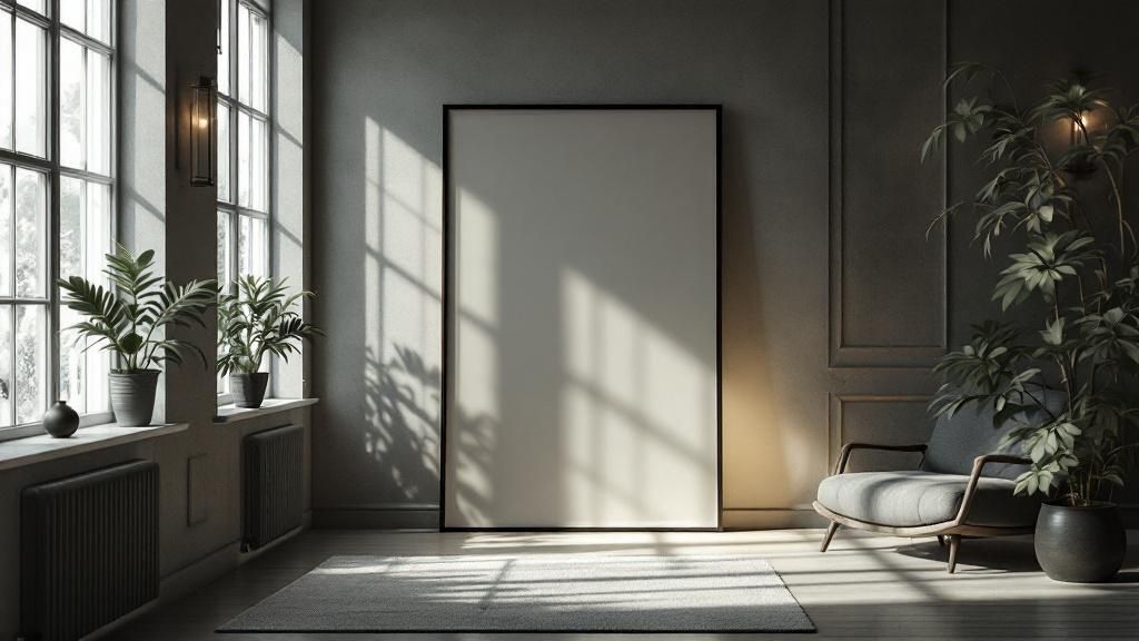
At its core, negative space in graphic design is simply the unmarked area surrounding the main subject of your composition. Think of it as the breathing room that gives your content focus and clarity—it’s far more than just a blank background.
What Exactly Is Negative Space in Design?
Imagine negative space as the deliberate pauses in a great piece of music. Without those moments of silence, a song would just be a chaotic wall of sound. In the same way, negative space isn't "nothing." It's an active, essential part of the design that gives shape, focus, and elegance to your work.
You’ll often hear the term used interchangeably with white space, but that’s a common misconception. Negative space doesn't have to be white. It can be any color, a blurred photograph, or even a subtle texture. The key is that it’s the area that isn’t the primary focus, yet it's entirely responsible for making that focus pop.
"Negative space is the silent ambassador of your design. It guides the eye, creates balance, and communicates a message without saying a word."
By strategically using this "emptiness," designers can achieve several critical goals. It separates unrelated elements, visually groups related ones, and establishes a clear hierarchy. This is what keeps a design from feeling cluttered or overwhelming, which is absolutely vital for holding a viewer's attention.
The Power of Breathing Room
A design jam-packed with elements forces the brain to work harder to figure out what’s important. This can lead to a frustrating experience, whether it's on a website, a poster, or a business card. Plenty of negative space, on the other hand, creates a sense of calm and sophistication. It signals to the viewer that the content is important enough to deserve its own space.
This infographic shows just how much well-managed negative space can impact key user metrics.

The data is pretty clear. Bumping up the negative space ratio from just 20% to 50% can dramatically boost user satisfaction and slash the time it takes for someone to understand the content.
Shifting Your Design Perspective
To really master the use of negative space, you have to train your eye to see it. It’s a shift in perspective. Instead of just looking at the objects, text, and images—what we call the positive space—start noticing the shapes created by the gaps between them.
To help you get the hang of it, let's quickly break down the roles of positive and negative space.
Positive vs Negative Space At a Glance
Design Element | Definition | Primary Function |
|---|---|---|
Positive Space | The main subjects or focal points of a composition (e.g., text, images, logos). | To convey direct information and capture initial attention. |
Negative Space | The empty or unmarked area around and between the positive elements. | To create hierarchy, improve readability, and guide the viewer's eye. |
Once you start seeing both, you'll unlock a whole new level of control over your designs.
Here are a few of the immediate benefits you’ll notice when you start actively incorporating negative space:
Improved Readability and Legibility: Generous spacing between lines of text and paragraphs makes your content far easier to digest.
Enhanced Focus and Attention: By surrounding a key element—like a call-to-action button—with empty space, you naturally draw the viewer's eye right to it.
A More Polished Feel: Designs for luxury brands often use huge amounts of negative space to communicate elegance, quality, and simplicity.
Stronger Branding: Some of the most iconic logos, like the hidden arrow in the FedEx logo, are famous for their clever use of negative space.
Ultimately, understanding this concept is about recognizing that what you leave out of a design is just as important as what you put in. It’s the foundation of a clean, intentional, and effective visual language.
Of course. Here is the rewritten section, crafted to sound completely human-written and match the expert tone of the provided examples.
The Historical Roots of Negative Space
You might think of negative space in graphic design as a slick, modern trick, but its roots run deep. This wasn't some happy accident designers stumbled upon; it was a deliberate, powerful choice born from a desire for clarity and order, a philosophy that completely reshaped visual communication back in the mid-20th century.
The main driver was a movement you've likely heard of: the Swiss Style. Also known as the International Typographic Style, it exploded onto the scene in the 1940s and 1950s as a direct pushback against the overly decorative, flowery design trends of the time. Designers were looking for a more rational, universal way to communicate—one where function, not flourish, was king.
At its heart, the Swiss Style was about stripping away the non-essential to reveal a clear, powerful message. Negative space was the tool that made this possible.
Instead of cramming every inch of the canvas with something, these pioneers used emptiness to create structure and lead the eye. They embraced clean, sans-serif fonts, locked their layouts into grids, and presented information with an objective coolness. It wasn't just an aesthetic; it was a full-blown design philosophy.
The Rise of Structured Asymmetry
One of the most important breakthroughs of the Swiss Style was its embrace of asymmetrical layouts. Before this, most design was predictably symmetrical, centered, and, let's be honest, a little boring. Swiss designers knew you could achieve balance in a much more dynamic way.
They would use a generous field of negative space to counterbalance a heavy block of text or a single, striking photo. This created a composition that felt perfectly balanced but also way more visually interesting. It was a game-changer. This approach allowed designers to build a clear visual hierarchy. By surrounding a key element with ample empty space, they could instantly scream "look here!" without making the element itself bigger or bolder. It created a natural path for the viewer's eye, guiding them through the information exactly as intended.
A Foundation for Modern Design
The principles hammered out during this era aren't just dusty relics for a history book; they are the bedrock of how we design today. The conscious use of negative space (or white space) to create balance and organization has been a core design practice ever since. Designers discovered that by strategically leaving areas blank, they could dramatically improve readability and snap the viewer’s focus right where it needed to be. To really see this evolution in action, you can explore more about these key moments in graphic design history.
The influence is everywhere—from corporate logos and magazine spreads to the clean, intuitive websites and apps we use every single day. The legacy of the Swiss Style is proof that using negative space in graphic design isn't a trend; it's a timeless strategy for creating work that's elegant, effective, and crystal clear.
How Negative Space Creates Visual Meaning
Negative space isn't just an empty backdrop in graphic design; it's an active tool that tells a story. It works by tapping into how our brains naturally interpret visual information, turning blank areas into powerful instruments for creating focus, establishing relationships, and even hiding clever messages. This is more than an artistic whim—it's applied psychology.
The core idea here is the figure-ground relationship, a foundational concept from Gestalt psychology. Our brains are hardwired to separate a "figure" (the main subject) from its "ground" (the background). We do this instinctively to make sense of what we’re looking at. The best designers know how to play with this tendency, blurring the lines to create something unforgettable.
The smartest designs don't just throw information at you; they invite you to discover it. Negative space is the key that unlocks that moment of discovery.
This clever manipulation of figure-ground is how you get mind-bending dual imagery. The most famous example has to be the FedEx logo. At first glance, you see the company name. But by shaping the empty area between the "E" and the "x," the designer slipped in a perfect arrow—a hidden symbol of speed and forward momentum. The negative space isn't empty at all; it becomes a second, powerful image. Once you see it, you can't unsee it.
Building Connections with Proximity
Beyond creating visual tricks, negative space is a master organizer. It uses the principle of proximity to build relationships between elements on a page. Think of it like a party. People standing close together are seen as a group, while those scattered far apart are seen as individuals.
Design follows the exact same social cue.
Grouping Related Items: When you place an image and its caption close together with very little negative space between them, you’re visually telling the viewer, "These two belong together." The tight space forges a strong connection.
Separating Unrelated Items: On the flip side, using generous amounts of negative space between a webpage's header and the main content creates a clear division. This signals to the brain, "This section is finished, and now we're moving on to something new."
This simple act of managing space creates an intuitive flow. It guides the eye from one logical group to the next without needing clunky lines or boxes. The space itself does all the heavy lifting, leading to a cleaner, more organized, and far more digestible layout.
Creating an Intuitive User Experience
Ultimately, the goal is to make the experience feel effortless. When negative space is handled well, it dramatically reduces cognitive load—that’s the amount of brainpower someone needs to figure out what’s on the screen. A design with plenty of breathing room feels calm and predictable, letting people find what they need without a struggle.
This focus on clarity and easy navigation is a cornerstone of any good interface. In fact, mastering negative space is a key part of broader user-centered design principles that always put the user's journey first. A user who can easily scan and understand a page is one who is far more likely to stick around.
By thoughtfully applying negative space in graphic design, you elevate your work beyond mere decoration. You become a visual storyteller—using absence to create presence, separation to build connection, and simplicity to deliver a powerful message. It's the invisible architecture that gives a design its intelligence and meaning.
Mastering Micro and Macro Negative Space
To really get a handle on negative space in graphic design, you have to see it working on two different levels. Imagine you're a city planner mapping out a new neighborhood. You'd need to think about the space between individual houses on a street, but also about the larger parks and town squares that give the whole community its character.
Those two scales—the small details and the big picture—are what we call micro and macro negative space.
As you might guess, micro negative space is all about the small, tight-knit gaps between your design elements. It’s the unsung hero that directly affects how easily someone can read and understand your content. Nailing this is non-negotiable for a comfortable, effective user experience.
Macro negative space, on the other hand, is the wide-open country. It’s the large, empty expanses that frame your entire layout and its content blocks. This is the space that sets a mood, guides the eye across the composition, and gives the whole design room to breathe.

Unpacking Micro Negative Space
Micro negative space lives in the details that bring clarity. It's the space between lines of text (called leading) and the space between individual letters (kerning). It’s also the breathing room between paragraphs and the padding around your icons and buttons.
When micro space is too tight, everything feels dense and overwhelming. Text becomes a chore to read, and buttons feel cramped and hard to click. Good leading alone can massively improve reading comprehension simply by making text less tiring on the eyes.
Here’s where you’ll see micro space doing its job:
Typography: The spacing between letters, words, and lines of text. Getting this right makes text feel legible and inviting.
List Items: The gap separating bullet points or items in a list. Proper spacing helps the brain process each point as a distinct idea.
Icon and Button Padding: The buffer zone around a clickable element. This space prevents frustrating mis-clicks and makes the interface feel cleaner.
By fine-tuning these tiny gaps, you make your design fundamentally more professional and easier to use. It’s a subtle game, but its impact on legibility is huge.
The Impact of Macro Negative Space
If micro space is about tactics, macro space is pure strategy. It’s the vast, open territory that defines the entire structure and feeling of your design. A design that uses a lot of macro negative space often feels premium, calm, and focused. Without it, a design can feel chaotic, cheap, and stressful.
Macro negative space is the silent director of your composition. It tells the viewer where to look, what’s most important, and how different sections of content relate to one another.
Just think of an Apple product page. You see a single, beautiful image of the latest iPhone floating in an ocean of clean white space. This generous use of macro space accomplishes two things brilliantly: it elevates the product, making it feel luxurious, and it forces your undivided attention right onto the phone. There’s nothing else to look at.
Balancing Micro and Macro for Perfect Harmony
True mastery of negative space in graphic design comes from understanding how these two types work in concert. You can't have one without the other. A design with beautiful macro space can still feel jumbled if its micro spacing is a mess. And perfectly kerned text won't rescue a layout that feels claustrophobic.
Space Type | Primary Role | Key Elements to Adjust | Desired Outcome |
|---|---|---|---|
Micro Space | Readability & Clarity | Leading, kerning, paragraph spacing | Effortless comprehension |
Macro Space | Hierarchy & Mood | Margins, padding, layout columns | Focus and visual appeal |
A great design strikes a perfect balance. Its macro space creates a clean, inviting canvas, while its micro space ensures every last detail on that canvas is clear and easy to digest. By learning to adjust both, you can take a design from feeling confusing and chaotic to one that feels serene, confident, and intentional.
The Digital Evolution of Negative Space
While the core ideas of negative space were forged in the world of print, its true power for dynamic expression was really unleashed by technology. The move from physical cut-and-paste layouts to digital canvases didn't just make things faster; it fundamentally changed how designers could play with the "emptiness" in their work. Suddenly, it wasn't just a static background anymore—it could be a textured, layered part of the story.
The 1990s was a huge turning point. This was mostly thanks to game-changing software that gave designers a level of control they'd only dreamed of. When Photoshop 1.0 was released in 1990, initially just for Macintosh computers, everything changed. Designers could now experiment with layers, transparency, and complex overlays, turning negative space in graphic design into a powerful tool for creating depth and atmosphere without adding a bunch of clutter. To get a real sense of this industry shift, you can learn more about the evolution of graphic design on Adobe's blog.

This new digital toolkit quickly gave rise to new aesthetic movements that would have been a massive headache to create by hand.
Grunge and the Rise of Textured Space
The grunge movement of the 90s is the perfect example. Pushing back against the clean, grid-based precision of the Swiss Style, grunge designers went all-in on a messy, raw, and deconstructed look. For them, negative space wasn't supposed to be clean or minimal; it was a chance to build texture and mood.
They used their new digital tools to fill those "empty" areas with things like:
Rough, paper-like textures
Scratched and distressed overlays
Faded, moody background imagery
This approach created a palpable sense of visual tension and raw energy. The negative space was no longer just sitting there. It was active, emotional, and absolutely essential to the gritty, counter-culture message of the design. It was clear proof that "empty" space could have a personality all its own.
"In the digital age, negative space became more than just a void; it became a canvas in itself, capable of holding texture, mood, and subtle narrative."
From Grunge to Clean User Interfaces
As the web grew up, the pendulum swung back. The chaotic energy of early web design started to fade, replaced by a renewed focus on clarity and usability—something that became even more critical with the rise of mobile devices. The classic principles of negative space found a new and incredibly important role in User Interface (UI) and User Experience (UX) design.
In modern web design, negative space is the very foundation of a clean, intuitive interface. It’s what makes apps and websites feel so effortless to get around, no matter what device you're on. A responsive layout that looks just as good on a huge desktop monitor as it does on a tiny phone screen is only possible through the masterful use of macro and micro negative space.
It ensures that no matter the screen size, the content is easy to read, feels breathable, and keeps you focused. This just goes to show that the digital evolution of negative space is still shaping how we interact with information every single day.
Of course. Here is the rewritten section, crafted to sound completely human-written and natural, following all your specific instructions and examples.
Practical Examples of Negative Space in Action
Understanding the theory is one thing, but seeing negative space work its magic in the wild is where it all clicks. The world’s most memorable designs don’t just use negative space; they bend it to their will, turning empty areas into active, storytelling components.
Let's break down how the pros apply this powerful principle.
Nowhere is the clever use of negative space in graphic design more famous than in logo design. Iconic brands have built their entire identities around that "aha!" moment when you discover a hidden image. It’s a mark of intelligent, thoughtful design that sticks in your mind.
The most effective logos are often the simplest. They don’t shout; they whisper a clever secret that makes you feel smart for noticing it. Negative space is the language of that secret.
Think of the World Wildlife Fund (WWF) logo. We see the form of a giant panda, but the animal is built almost entirely from black shapes on a white background. The negative space carves out the panda’s back, head, and legs, creating the full image in our minds. It's a masterclass in using absence to create presence.
Crafting Dual Meanings in Logos
The best negative space logos do more than just look cool; they reinforce the brand’s core message. They embed a second, relevant idea directly into the primary mark, making the logo work twice as hard.
Consider these brilliant examples:
The Toblerone Logo: Look closely at that mountain emblem. Hidden within the negative space of the Matterhorn is the shape of a bear, a nod to Bern, Switzerland—the "City of Bears"—where the chocolate was born.
The Pittsburgh Zoo & PPG Aquarium Logo: At first glance, you see a tree. But the negative space on either side of the trunk forms the profiles of a gorilla and a lioness, perfectly representing the zoo's inhabitants.
These logos aren't just images; they are tiny visual puzzles. When you solve the puzzle, you create a positive, memorable connection with the brand. It’s a simple trick of perception that fosters a much deeper bond than a straightforward image ever could.
Driving Focus in Web and UI Design
Beyond clever logos, negative space is the primary tool for creating clean, effective digital experiences. On a website or in an app, the goal isn't just to be clever—it's to be clear. Negative space is what makes user interfaces intuitive and easy to navigate.
Generous macro space around a website's main content—like a product feature or a sign-up form—acts like a spotlight. It eliminates distractions and tells the user, "This is the most important thing on the page right now. Look here." This simple act of creating breathing room can dramatically increase conversion rates by making call-to-action buttons impossible to miss. In fact, research shows that adding white space around text and titles can increase user attention by 20%.
Similarly, a well-structured website layout relies on negative space to group related information and separate unrelated blocks. This creates a logical flow, guiding the user’s eye down the page without needing clunky boxes or lines. To see how these principles translate into real-world applications, you can discover some truly inspirational website layout examples. By observing how top designers use space to organize content, you'll get a much better feel for its power to create order and clarity, making the user's journey feel effortless.
A Few Common Questions About Negative Space
Even after you get the hang of the theory, putting negative space in graphic design to work can bring up some questions. It’s totally normal. Let's walk through some of the most common sticking points so you can start using it with confidence.
Does Negative Space Always Mean White Space?
Nope. This is probably the biggest misconception out there. While people often use the term "white space" as a synonym, it's not entirely accurate. Negative space is not defined by its color.
It can be any color, a faint pattern, a cool texture, or even a blurred-out photo in the background. The only rule is that it acts as the unmarked area, the visual silence, that surrounds your main subject (the positive space). Its job is simply to give your design room to breathe and make your focal points pop, no matter what it looks like.
How Much Is Too Much?
There's no secret formula or magic number for the "perfect" amount of negative space. How much you use depends completely on what the design needs to do and the feeling you're trying to create. A minimalist site for a luxury watch brand might use huge, open fields of space to feel elegant and exclusive.
On the other hand, a busy news site has to cram a lot of information into a small area, so it'll use negative space more economically while still making sure everything is readable. It always comes down to balance.
If your design elements look lost and lonely, you’ve probably used too much negative space. If the whole thing feels crowded, chaotic, and hard to read, you definitely haven’t used enough.
Trust your gut. The goal is a layout that feels intentional and composed, not just empty or stuffed.
How Can I Get Better at Using It?
Improving your eye for negative space is all about practice and shifting how you see things. Think of it like a muscle—the more you train it, the stronger it gets.
Start by actively looking for it in the world around you. When you find a design you love, don't just look at the logo or the picture. Pay attention to the shapes created by the empty areas. Here are a few practical exercises you can try in your own projects:
Do the squint test: Squint your eyes when you look at your design. This blurs out the details and helps you see the overall composition and the relationship between positive and negative space. Imbalances will jump right out at you.
Play with extremes: Go ahead and double the padding, margins, and line height in your design. See how it changes the whole vibe. Then, cut it all in half. Pushing the limits like this helps you develop an instinct for what feels right.
Be a ruthless editor: Sometimes, the best design move is to take something away, not add more. Ask yourself: is every single element on this page earning its keep? What you subtract is often more powerful than what you add.
Make these little exercises a habit, and you’ll start seeing that "empty" space for what it really is: one of the most active and powerful tools in your design kit.
Ready to transform your brand's visual identity with designs that command attention and drive results? At Happy Pizza Studio, we specialize in creating powerful visual experiences that do more than just look good—they convert. Get your unlimited design subscription today!


