
Onboarding UX design is all about how you introduce new users to your product. It’s that critical first handshake, the initial tour that helps them understand what your product does and, more importantly, why they should care. Get it right, and you've got a user for life. Get it wrong, and they're gone before you can say "churn."
Why Your Onboarding Is Your Most Important First Impression
Let's be real—first impressions are everything. In the digital world, your onboarding flow is that first impression. It's not just a "welcome" screen; it’s the moment a brand new user decides if your product is a game-changer or just another download they’ll delete tomorrow.
A clunky, confusing, or overwhelming start isn't a minor hiccup. It actively shoves potential customers out the door.
The numbers don't lie, and they're pretty brutal. A bad first experience will cause a staggering 34% of users to never return. If the process feels too complicated, nearly 74% will just give up before they even finish signing up. These aren't just stats on a slide; they represent real people and lost revenue, highlighting how a poorly thought-out onboarding experience directly kills product adoption.
The Power of Nailing the First Few Minutes
When you nail your onboarding, it does so much more than just show people where to click. It instantly builds trust and proves your product's value right from the get-go. When a user sees how your tool solves their problem—without having to read a manual—they feel smart and capable.
This initial win creates a powerful positive cycle. Users who have a great first experience are far more likely to:
Dive into advanced features on their own.
Weave your product into their daily routine.
Turn into brand advocates who tell their friends about you.
A well-designed onboarding process is the single most critical factor for product survival. It's the bridge between a user's initial curiosity and long-term loyalty. Forget 'nice-to-have'; it's essential.
Core Onboarding Goals and Common Approaches
No matter what your product does, every successful onboarding flow has the same core mission. Grasping these goals is your first step to building an experience that pulls users in instead of pushing them away.
Here's a quick look at the main objectives of any onboarding process and the common design patterns we use to hit those targets.
Onboarding Goal | Common UX Approach | Key Benefit |
|---|---|---|
Accelerate "Time to Value" | Guide users to a quick win or "Aha!" moment. | Users see the product's benefit almost immediately, boosting motivation. |
Build User Confidence | Use interactive walkthroughs or tooltips for key actions. | Reduces user anxiety and empowers them to explore independently. |
Drive Feature Adoption | Introduce core features contextually, not all at once. | Prevents overwhelm and ensures users learn what’s most relevant first. |
Personalize the Journey | Segment users with a welcome survey or by their actions. | Delivers a more relevant and engaging experience for different user types. |
Ultimately, a great onboarding experience makes the user feel brilliant and capable. By exploring smart customer onboarding automation strategies, you can refine this initial journey and build a foundation for lasting user relationships.
When you focus on these fundamental goals, you can elevate your onboarding from a basic tutorial into a powerful engine for user retention and growth.
Mapping a User Journey That Delivers Value Fast
Before a single pixel gets pushed or a line of code is written, a killer onboarding experience starts with a solid plan. Mapping the user journey is all about designing the perfect path, from a user’s very first click to their first major win. This isn't your chance to show off every single feature; it's about getting them to value as fast as humanly possible.
The whole point is to shrink their "Time to Value" (TTV). This is the time it takes for a new user to hit their “Aha!” moment—that lightbulb-flickers-on instant when they truly get how your product solves their problem. The shorter the TTV, the higher the chance they’ll stick around for the long haul.
A well-mapped journey feels less like a clunky tutorial and more like an intuitive, natural process of discovery. It’s the difference between being handed a dense instruction manual and having a trusted guide point you exactly where you need to go.
Pinpointing the All-Important "Aha!" Moment
The “Aha!” moment is the absolute heart of your onboarding journey. It's the critical activation point where a user’s vague interest transforms into a concrete appreciation for what you’ve built. To find it, you need to look past your feature list and zone in on user outcomes.
What's the one core action that delivers a real, tangible win for your user?
For a project management tool, it might be creating their first task and assigning it to a teammate.
For an analytics platform, it could be seeing that first meaningful insight pop up on their dashboard.
For a graphic design app, it’s probably exporting their first simple design.
This moment isn't just about using a feature; it’s about solving the problem that brought them to your product in the first place. Once you’ve nailed this down, your entire onboarding UX design should be engineered to get them there with zero friction.
From "Aha!" to Actionable Steps
With your “Aha!” moment clearly defined, it's time to work backward. Your job is to identify the absolute bare-minimum number of steps a user must take to get there. This is where you have to be ruthless. Every form field, every click, and every screen has to earn its keep.
Let's say a user signs up for a social media scheduling tool. The "Aha!" moment is seeing their first post successfully scheduled. What are the non-negotiable steps?
Connect a social account.
Upload or create a piece of content.
Pick a date and time.
Click "Schedule."
That's it. Everything else—like setting up a full content calendar, inviting team members, or exploring analytics—is secondary. Those are great features, for sure, but introducing them before the core "Aha!" moment just creates noise and ups the odds they’ll bail.
The most effective onboarding journeys are built on subtraction, not addition. The question isn't "What else can we show them?" but "What can we remove to make the path to value faster?"
Tailoring Journeys for Different Users
A one-size-fits-all onboarding flow is a huge missed opportunity. Your users show up with different goals, job titles, and technical comfort levels. A marketing manager needs a different path than a freelance designer, even if they're using the exact same product.
Simple segmentation can make a world of difference. You can use a quick welcome survey at sign-up, asking something like, "What's your main goal for today?" Then, you can tailor the journey based on their answer:
User Goal | Tailored Onboarding Path |
|---|---|
"I want to collaborate with my team." | Guide them directly to the "Invite Team Members" feature right after setup. |
"I need to create reports for a client." | Prioritize connecting a data source and walking them through a sample report. |
"I'm just exploring." | Offer a general product tour or drop them into a "sandbox" environment to play. |
This kind of personalization makes users feel seen and immediately shows them the value proposition that matters most to them. For more hands-on strategies, you can explore methods for streamlining user onboarding processes that are all about efficiency and clarity.
By mapping a deliberate, value-focused, and personalized journey, you build a powerful foundation for your entire onboarding UX design. You’re basically creating a smooth runway that helps users take off successfully, ensuring they see the best of your product from the get-go.
So, you’ve mapped out the journey to get your users to that first "Aha!" moment. Fantastic. Now, it's time to choose the signposts that will guide them there. The right onboarding UX design patterns are like a friendly guide on a hike, pointing out the best views. The wrong ones are like a series of "Do Not Enter" signs on a dead-end road.
These patterns are the hands-on, practical parts of your onboarding flow. Think of them as your toolkit; you wouldn’t use a sledgehammer for a finishing nail. In the same way, you don't need a full-screen takeover when a simple tooltip will do the trick. The whole point is to offer just enough help, right when it's needed most.
And this isn't just about feel-good design. The numbers back it up. We know that personalization can boost retention by as much as 30%. Keeping things simple can lift engagement by 25%, and building in good feedback loops can increase user satisfaction by 20%.
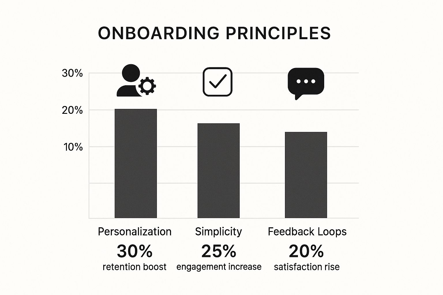
The data doesn’t lie—a tailored, straightforward, and responsive onboarding experience directly impacts the metrics that matter.
Interactive Product Tours
An interactive product tour is a guided walkthrough of the most important parts of your app. It’s not a passive video; it requires the user to click or interact to proceed. This simple requirement turns learning from a spectator sport into an active, hands-on experience.
These tours are a lifesaver for products with complex dashboards or unique workflows where a new user might otherwise feel completely lost. Imagine a sophisticated data analytics tool. A tour could walk someone through connecting a data source, building their first report, and sharing it—hitting every key activation milestone in a logical sequence.
But be careful. Nothing screams "I'm quitting" louder than a long, unskippable tour. Always, always include a "skip" or "opt-out" option and ruthlessly edit your tour to cover only the absolute essentials.
Contextual Tooltips and Hotspots
Tooltips are the snipers of the onboarding world. They’re small, precise messages that pop up when a user hovers over or clicks a specific button or icon. They're perfect for explaining a single function right at the moment of need.
Hotspots are their slightly more subtle cousins. You'll often see them as pulsing dots or gentle animations that draw a user's eye to a feature they haven't tried yet. They’re less in-your-face than a pop-up and brilliant for encouraging discovery without derailing the user’s current task.
Think about a design app like Figma. Instead of a massive tour explaining every single icon, a tooltip might appear the very first time a user’s mouse drifts over the "layers" panel, giving a quick, one-sentence explanation. This kind of "just-in-time" guidance is far more likely to stick.
The best onboarding doesn't feel like onboarding at all. It feels like the product is intelligently anticipating your questions and providing answers before you even have to ask.
Motivating Onboarding Checklists
Checklists tap into some powerful psychology. They take what might seem like a huge setup process and break it down into small, digestible tasks. Each checked-off item delivers a little hit of dopamine and a clear sense of progress. This is a game-changer for products that require a few setup steps before the user can really see the value.
A project management tool like Asana is a perfect use case. An initial checklist might look like this:
Create your first project
Invite one teammate
Assign your first task
Set a due date
By completing these four simple steps, the user has built a living, breathing project. They've reached their "Aha!" moment. Throw in a progress bar to visually reinforce how close they are to the finish line, and you've got a seriously motivating tool.
Onboarding Pattern Selection Guide
Choosing the right pattern is all about context. What works for a simple mobile app might fail miserably for a complex B2B SaaS platform. This table breaks down the most common patterns to help you decide which tool is right for the job.
UX Pattern | Best Used For | Potential Pitfall |
|---|---|---|
Product Tour | Showing a core workflow in a complex UI. | Can feel long and restrictive if not skippable. |
Checklist | Guiding users through multi-step setups. | Can feel like a chore if tasks aren't tied to value. |
Tooltip | Explaining a single, specific UI element. | Can become visual clutter if overused. |
Modal Window | Announcing critical information or a welcome message. | Highly disruptive; use very sparingly. |
Hotspot | Drawing attention to undiscovered features. | Can be ignored if too subtle or distracting if too aggressive. |
Ultimately, the goal is to create a seamless experience. These patterns are your building blocks, and picking the right ones ensures your users feel supported, not smothered.
Building a Reusable Component Library
To keep everything consistent and move faster, it's a smart move to build a reusable library of your onboarding components. This doesn’t have to be some massive, complex design system from day one. Your library can start small.
By creating standardized designs for your tooltips, modals, and checklist items, you ensure your onboarding UX design stays coherent, even as your product evolves. This approach saves a ton of design and development time down the road, prevents your UI from becoming a jumbled mess, and makes sure every user gets the same polished, on-brand experience. Your onboarding flow stops being a one-off project and becomes a scalable, predictable asset.
Making the Experience More Human and Personal
Let's be honest: nobody wants to feel like just another number. A generic, one-size-fits-all onboarding flow does exactly that. Personalization is how you flip the script, making new users feel seen, understood, and genuinely welcomed from the moment they sign up.
This isn't just about being friendly; it's smart business. Thoughtful, personalized experiences can boost retention by up to 40%, and a well-executed interactive tour can increase user activation by 50%. These numbers matter. In fact, 63% of users say a company's onboarding is a major factor in their decision to subscribe, proving this initial phase is a massive opportunity. You can dig into more of these user onboarding statistics to see just how much this first impression counts.
Ask the Right Questions Early
The quickest way to a personalized experience often starts with a single, smart question. Right after a user signs up, instead of dumping them into a generic dashboard, ask them what they're trying to accomplish. A simple welcome survey can do wonders for your onboarding UX design.
Imagine a marketing analytics tool. It could ask:
Are you a freelance marketer?
Do you work at an agency?
Are you part of an in-house marketing team?
Depending on the answer, the product can instantly surface the most relevant features. A freelancer might see client reporting tools first, while the in-house marketer gets guided toward team collaboration features. That tiny bit of upfront information makes the entire journey infinitely more valuable.
Design with a Human Touch
Automation is a lifesaver for scaling, but it shouldn't suck the soul out of your product. Your tone of voice, the microcopy on buttons, and even the little celebrations when a user ticks off a task—it all adds up.
Your goal is to create a welcoming space where users feel guided, not forced. The best onboarding experiences blend smart automation with a personality that feels helpful, friendly, and approachable.
Think about how you can inject a bit of warmth. Instead of a robotic "Task Complete," why not try something like, "Nice work! You're already getting the hang of this." These small details make the product feel less like a cold machine and more like a helpful partner.
Always Provide a Clear Escape Hatch
Look, sometimes even the most polished automated flow isn't what someone needs. A user might have a unique problem, a specific question, or just prefer talking to a real human. Don't make them hunt for a "contact us" link buried in the footer. That’s a fast track to frustration and churn.
Always give users a clear and easy-to-find escape hatch. This could be:
A persistent "Help" or chat bubble in the corner.
An option to "Book a Live Demo" right from the onboarding checklist.
A direct link to your knowledge base or live support within a tutorial.
Offering an out doesn't mean your automated onboarding failed. Quite the opposite. It shows you respect the user's time and are committed to their success, no matter which path they take. Often, just knowing that help is a click away gives users the confidence to keep exploring on their own.
Using AI for Smarter Onboarding Flows
The next wave of user onboarding is already here, and it’s being driven by AI. We're moving past the static, one-size-fits-all tutorials that used to be the norm. Instead, artificial intelligence is helping us create far more adaptive and intelligent experiences.
Imagine an onboarding flow that doesn't just show you features, but actually understands what you need and tailors its guidance in real time. This isn't some far-off concept; it's happening right now, making the whole process feel less like a rigid lecture and more like a conversation with a helpful expert.
From Static Tours to Dynamic Conversations
Traditional onboarding follows a fixed path. Every single user gets the same tooltips and the same checklist, no matter their skill level or what they came to do. AI completely shatters this model.
Instead of a one-way street where the app dictates the tour, AI opens up a two-way dialogue. This is a fundamental shift in onboarding UX design because it puts the user firmly in the driver's seat.
Here’s how AI is making this a reality:
Generative AI Assistants: These are a world away from old-school chatbots. Users can ask questions in their own words, state their goals, and get customized guidance on the spot.
Predictive Analytics: AI can analyze a user's first few clicks to spot who is struggling or likely to churn. This lets you intervene with targeted help before they get frustrated and leave.
Hyper-Personalization: By looking at user data and in-app actions, AI can segment users at an incredibly granular level, delivering a truly unique onboarding path for each person.
AI-Powered Assistants and Instant Support
One of the most powerful ways to use AI in onboarding is through generative AI assistants and intelligent chatbots. These tools offer instant, context-aware support, making sure users never feel stuck or abandoned in those critical first few minutes. It's an absolute game-changer for cutting down frustration and preventing early dropouts.
You can explore how AI streamlines onboarding experiences to see just how deeply this technology is being integrated. These assistants let users control their own learning pace and get personalized help simply by stating their goals.
The real magic of AI in onboarding is its ability to turn a monologue into a dialogue. It shifts the focus from, "Here's what our product can do," to, "What do you want to accomplish, and how can we help you get there faster?"
This shift is crucial. It makes the user feel heard and empowered, transforming the onboarding process from a necessary chore into a valuable, collaborative experience.
Practical Examples of AI in Action
So, how does this actually look in a real product? Let’s move past the theory.
Imagine someone signs up for a complex project management tool. Instead of being hit with a standard, 10-step product tour, they're greeted by an AI assistant.
Scenario 1: The Goal-Oriented User The user types, "I need to set up a content calendar for my marketing team." The AI instantly hides irrelevant features and guides them through creating a calendar view, setting up custom fields like "Publish Date" and "Status," and inviting their team members.
Scenario 2: The Confused User Another user is just clicking around aimlessly, opening and closing menus without actually completing any key tasks. The AI recognizes this pattern and proactively chimes in: "It looks like you might be exploring. Would you like a quick tour of our most popular features, or do you have a specific goal in mind?"
In both cases, the onboarding UX design is adaptive. It meets users exactly where they are, providing the right amount of help at the precise moment they need it. This kind of smart, real-time assistance doesn't just get users to their "aha!" moment faster; it builds a much stronger, more positive relationship from day one.
Common Onboarding Questions Answered
Even with the best-laid plans, a few tricky questions always pop up when you're in the trenches building an onboarding flow. Getting these right can be the difference between a user sticking around for years or churning out in the first five minutes.
Let's dive into some of the most common sticking points I see teams wrestle with. These aren't textbook answers; they're hard-won lessons from countless projects.
How Long Should Onboarding Be?
This is the million-dollar question, and the answer is always the same: as short as possible, but as long as necessary. I know, I know—not the concrete number you were hoping for. But there's no magic number of screens that works for every product.
A better way to think about it is in terms of value, not time. Your only job is to get that user to their first "Aha!" moment with zero wasted effort.
For a simple photo-editing app, that might just be two or three screens showing them how to apply their first filter.
For a complex project management tool, it could be a multi-day checklist that a user can chip away at as they get settled.
The real test is whether each step delivers a tangible win. Always give users an out—let them skip tutorials or save their progress. Respect their time, and they'll respect your product.
The length of your onboarding isn't measured in clicks or minutes. It's measured in how quickly you prove your product is worth their time. If a step doesn't directly help a user find that first bit of value, it needs to go.
What Is the Biggest Mistake in Onboarding UX Design?
Hands down, the biggest mistake is front-loading information. It’s so tempting. You're excited about your product and want to show off every cool thing it can do right away. But this almost always backfires.
Users get hit with a firehose of feature explanations, feel overwhelmed, and mentally check out.
The smarter play is contextual onboarding. Instead of a massive, one-time tour, you introduce tips and features at the precise moment they become useful.
For example, don't waste time explaining data export settings when someone first signs up. Instead, pop up a small, helpful tooltip the very first time they create a report. This "just-in-time" advice feels less like a lecture and more like a helpful nudge, making it far more likely to stick.
How Do I Measure Onboarding Success?
You can't fix what you can't see. If you aren't tracking the right metrics, you're just guessing about what works. To get the full story, you need to blend the "what" (quantitative data) with the "why" (qualitative feedback).
Here’s what you should be looking at.
The Hard Numbers (Quantitative Metrics)
Completion Rate: A simple but powerful one. What percentage of new users actually make it to the end of your flow?
Time to Value (TTV): How long does it take a new user to complete that key action that makes them go "Oh, I get it now!"?
Feature Adoption: Are people actually using the features you highlight during onboarding, or are they ignoring them?
Short-Term Retention: What do your retention rates look like for Day 1, Day 3, and Day 7? A good onboarding experience gives these numbers a serious boost.
The Human Side (Qualitative Insights)
User Feedback: Don't be afraid to ask. Simple, in-app surveys can give you direct insight into what users are thinking.
Session Recordings: Watching recordings of real users navigating your onboarding is pure gold. You'll see exactly where they get confused, frustrated, or lost.
When you put both quantitative and qualitative data together, you get a 360-degree view. It lets you stop making assumptions and start making data-backed improvements to your onboarding UX design.
Ready to create a visual experience that not only impresses but drives real results? At Happy Pizza Studio, we design for impact. From brand redesigns to motion graphics, we turn your vision into a powerful asset. Start your project with us today and see how great design can transform your business.


