
Brand color psychology is all about using color to consciously shape how people feel about your brand. Think of it as your silent salesperson—it makes a first impression in a fraction of a second, communicating your brand's personality before anyone reads a single word.
Why Brand Color Is Your Most Powerful First Impression

Color is a universal language, but it doesn't speak to our logical brain. It goes straight for our emotions. It works faster than text and hits deeper than logic, creating instant feelings that can either build trust or sow confusion. This means picking a brand color is far more than an aesthetic choice; it’s a core business strategy that carves out your identity in a busy marketplace.
This "visual language" sets the entire mood for every interaction a customer has with you. A bright, energetic yellow might scream affordability and fun. A deep, steady blue, on the other hand, communicates stability and professionalism. These connections aren't just random—they're the very heart of brand color psychology.
The Undeniable Impact of Color on Perception
The data doesn't lie. When it comes to how we perceive brands, color is king. Using a signature color consistently can boost brand recognition by as much as 80%.
Even more telling, studies show that in the first 90 seconds of seeing a product, anywhere from 62% to 90% of a person's judgment is based on color alone. That’s a huge slice of a customer's initial assessment coming down to just your palette.
This influence extends right into their wallets. A massive 85% of consumers say color is a primary reason they choose one product over another. Your color palette isn't just window dressing—it’s a powerful tool that helps you stand out and persuade.
Your brand’s colors are the first thing a potential customer processes. They are the foundation of your brand's story, setting expectations for quality, personality, and trustworthiness before any other marketing message lands.
Integrating Color into the User Experience
To really make your colors work for you, you need to see how they fit into the bigger picture. Your color choices are a critical part of the overall user experience (UX), shaping how people feel and behave when they interact with your website, app, or even your physical products.
For a deeper dive into this, it's worth understanding the full journey by mastering the UX design process steps, where user-centric decisions like color are prioritized from the start.
When you understand brand color psychology, you gain the power to:
Communicate Value Instantly: Signal whether you're about luxury, affordability, innovation, or reliability.
Build Emotional Connections: Create feelings of trust, excitement, or calm that resonate deeply with your ideal customer.
Stand Out from Competitors: Carve out a distinct visual identity in a crowded market, making your brand impossible to ignore.
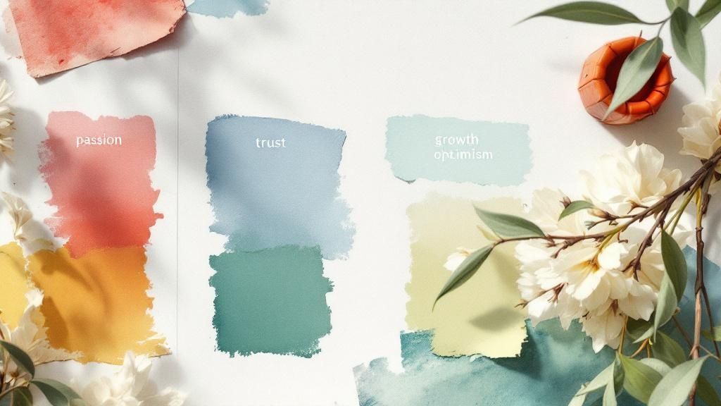
To help you get started, the table below offers a quick rundown of what different colors typically mean in the world of branding. Think of it as a launchpad for exploring how each hue could help tell your brand's unique story.
A Quick Guide to Color Meanings in Branding
Here's a snapshot of the emotional and psychological associations tied to common brand colors.
Color | Primary Associations | Common Industries |
|---|---|---|
Red | Excitement, Passion, Urgency, Energy | Food, Entertainment, Retail |
Blue | Trust, Stability, Professionalism, Calm | Tech, Finance, Healthcare |
Green | Growth, Health, Nature, Wealth | Health/Wellness, Finance, Environment |
Yellow | Optimism, Affordability, Fun, Warmth | Food, Retail, Travel |
Orange | Confidence, Friendliness, Creativity | Tech, Food, E-commerce |
Purple | Luxury, Wisdom, Creativity, Royalty | Beauty, Luxury Goods, Education |
Black | Sophistication, Power, Exclusivity | Fashion, Luxury, Tech |
White | Simplicity, Cleanliness, Modernity | Tech, Healthcare, Fashion |
This guide is a great starting point, but remember that context is everything. The true power lies in choosing colors that not only reflect your brand's personality but also resonate authentically with the audience you want to attract.
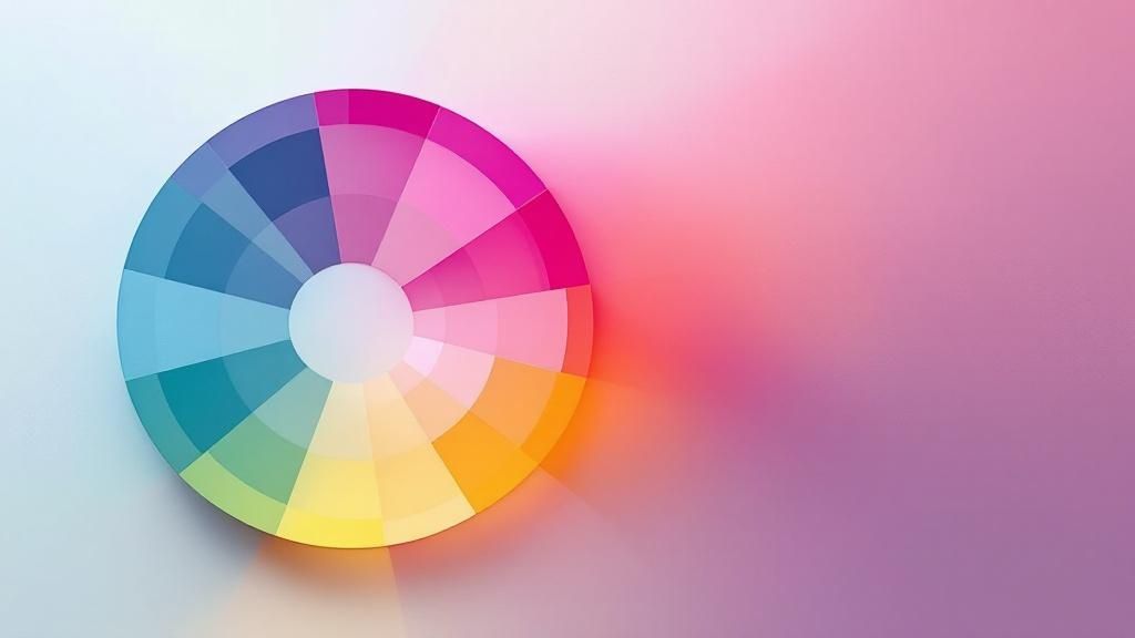
Decoding the Emotional Spectrum of Colors
While having a general guide to color meanings is a great starting point, the real magic happens when you start to understand the nuances. A single color isn’t a magic button that triggers the same emotion for everyone. Its message changes dramatically based on the brand, the industry, and who you’re talking to.
Think of it like a single note in a song. On its own, it’s just a sound. But as part of a chord, it helps create a feeling—happy, sad, tense, or relaxed. Colors work the same way.
Let's dig into the emotional spectrum of the most common branding colors, moving past simple definitions to see how they actually behave out in the wild. By unpacking their good, bad, and in-between associations, you can build a playbook for choosing colors with real intention.
Red: The Color of Passion and Urgency
Red is one of the most primal and powerful colors you can use. It’s not just a feeling; it has a physical effect, known to increase heart rate and create a sense of urgency. This makes it a go-to for grabbing attention, but it’s a color of extremes.
On one hand, red screams excitement, passion, and pure energy. Think about the bold red of the Netflix logo, which practically buzzes with the promise of "can't-miss" entertainment. Coca-Cola uses it to conjure up feelings of happiness, shared moments, and a jolt of energy. It’s a color that demands, “Look at me now!”
But context is everything.
Luxury and Power: Ferrari's iconic Rosso Corsa red isn't just about going fast; it’s about unbridled passion, elite performance, and exclusivity. It’s a color that commands respect.
Accessibility and Value: In complete contrast, Target's red feels friendly, accessible, and full of energy. It’s used to spotlight sales and drum up excitement around finding a great deal.
The big risk with red is its deep-rooted association with danger, anger, and aggression. Slapping too much red on your design, or using it in the wrong place (like for a wellness spa), can create the exact kind of stress and anxiety you want your customers to avoid.
Blue: The Color of Trust and Stability
Blue is the undisputed king of the corporate world, and it’s no mystery why. It’s the color of the sky and the deep sea—vast, steady, and reassuringly constant. Psychologically, blue projects trust, security, and competence.
This is exactly why you see it everywhere in industries where trust is the most valuable asset. Financial institutions like American Express and tech giants like Meta (Facebook) and LinkedIn all lean on blue to communicate reliability. They handle your money, your data, and your professional identity, and blue subconsciously tells you that you’re in safe hands.
A study on color appropriateness found that consumers are far more likely to trust a brand when its color "fits" the product or service being sold. Blue is a natural fit for services requiring high levels of dependability.
The specific shade of blue you choose also fine-tunes the message:
Light Blue: This hue often feels more open, tranquil, and friendly. Think of Twitter's (now X) original light blue, which was meant to feel conversational and approachable.
Dark Blue: This shade communicates a more serious professionalism, authority, and intelligence. It’s the preferred choice for law firms, financial advisors, and enterprise software companies.
The downside? Blue can sometimes feel cold, overly corporate, and a bit soulless. If your brand aims for a warm, personal connection, a palette dominated by blue might feel too distant without some warmer, friendlier colors to balance it out.
Green: The Color of Growth and Harmony
Green is hardwired in our brains to mean nature. It's the most direct visual cue for health, freshness, and environmental responsibility. When you see green, you instinctively think of growth, renewal, and balance.
Whole Foods has built its entire brand on this very association. Their green logo is an instant signal of their commitment to fresh, natural, and organic products. You’ll see the same thing with brands in sustainability and wellness, like Seventh Generation, which use green to broadcast their eco-friendly values.
But green has a fascinating double life. It’s also the color of money, strongly tied to finance and wealth. Financial advice brands like Fidelity and NerdWallet use green to suggest prosperity, financial growth, and economic well-being. This dual meaning makes green one of the most versatile colors in branding.
Just be careful. In some contexts, certain shades of green can bring up feelings of envy, inexperience, or even sickness, so choosing the right hue is critical.
Yellow and Orange: The Colors of Optimism and Friendliness
If you want to bottle up sunshine and energy, look no further than yellow and orange. These colors radiate happiness, optimism, and creativity, making them fantastic choices for brands that want to feel friendly and accessible.
Yellow is all about cheerfulness, warmth, and often, affordability. The McDonald's Golden Arches are a globally recognized symbol of a quick, happy meal. Snapchat uses a bright, bold yellow to create a feeling of fun, spontaneity, and in-the-moment joy.
Orange pulls the raw energy from red and mixes it with the sunny disposition of yellow. The result is a color that feels confident, enthusiastic, and creative. The Home Depot's vibrant orange is designed to inspire a can-do attitude and confidence in your DIY projects. The subtle orange smile in the Amazon logo is a clever nod to customer happiness and ease.
Here’s a quick look at how they stack up:
Color | Primary Feeling | Best For Brands That Are... | Example |
|---|---|---|---|
Yellow | Optimism & Fun | Affordable, fast, and cheerful | McDonald's, IKEA |
Orange | Confidence & Friendliness | Creative, energetic, and action-oriented | The Home Depot, Fanta |
The main challenge with these colors is that they can easily become overwhelming. A harsh, bright yellow can cause eye strain, and too much orange can sometimes come across as cheap or unsophisticated. They often work best as powerful, attention-grabbing accent colors.
Black and White: The Colors of Sophistication and Simplicity
While they aren’t colors in the traditional sense, black and white are the foundational pillars of branding. They are used to create feelings of luxury, modern simplicity, and timeless elegance.
Black is the ultimate shorthand for power, sophistication, and exclusivity. You see it used by luxury fashion houses like Chanel and Yves Saint Laurent to communicate a sense of timeless style. In the tech world, it often signals a premium, high-performance product.
White, on the other hand, represents simplicity, cleanliness, and modernity. Apple famously built its identity on a minimalist white aesthetic, suggesting that its products were clean, intuitive, and refreshingly easy to use. It creates negative space and a sense of clarity, letting the product itself be the star.
When used together, black and white create a classic, high-contrast look that is both bold and enduring. The only drawback is that for a brand personality that’s meant to be playful or down-to-earth, an exclusively black-and-white palette can feel too stark, serious, or unapproachable.
How Colors Influence Buying Decisions
This is where brand color psychology really hits the bottom line. The link between the colors you choose and the actions your customers take isn't just theoretical—it's direct and measurable. Your brand palette is far more than a pretty backdrop; it's an active player in the sales process, capable of nudging customers toward the checkout or giving them the confidence they need to make a big purchase.
Think of your website or your physical store as a silent conversation. Your colors set the tone long before you utter a single word. Are you trying to dial up the urgency for a flash sale? Or are you aiming to create a calm, reassuring space where a client can carefully consider a major investment? The colors you deploy are your first and most powerful tool for steering that conversation.
Creating Urgency and Spurring Action
When your goal is to get someone to act right now, certain colors are proven workhorses. Bright, high-energy hues work by creating a psychological jolt that cuts through the digital noise and encourages a snap decision.
This is exactly why you see fiery reds and vibrant oranges plastered all over "Buy Now" buttons, clearance sale signs, and limited-time offer banners. These colors tap into our primal, instinctual responses, creating a feeling that we need to act fast before the opportunity vanishes. They're the visual equivalent of a ticking clock.
In the retail world, this effect is incredibly well-documented. Colors like red, orange, black, and royal blue are known to be magnets for passionate, impulse-driven shoppers. In fact, call-to-action buttons colored red have been shown to boost sales by around 34%.
Building Trust for High-Value Sales
On the flip side, not every sale is about a quick impulse. For products or services that represent a major investment—think financial planning, high-end electronics, or B2B software—your goal is the exact opposite of urgency. Here, you need to build an atmosphere of trust, stability, and quiet confidence.
This is where cooler, more subdued colors like blue and green truly shine.
Blue projects competence, security, and reliability. It sends a message that customers can relax because they're in capable hands, making it a go-to choice for everything from banking websites to tech company landing pages.
Green conveys a sense of balance, safety, and well-being. For a high-ticket purchase, it can lower anxiety and make a customer feel much more secure in their decision.
Just imagine trying to sell a luxury car using the same bright, flashy colors as a fast-food joint. It would instantly feel cheap and untrustworthy. The calm, sophisticated palettes of luxury brands aren't an accident; they're a deliberate strategy to build the confidence a customer needs to commit to a major purchase.
Your palette is a powerful revenue-driving tool. The right color choice can be the difference between a customer who hesitates and one who confidently clicks "complete purchase."
Practical Applications in Digital and Physical Spaces
These principles of color psychology apply everywhere your customers find you, from the glossy finish of your product packaging to the pixel-perfect layout of your website. Sometimes, a simple color tweak in just the right spot can lead to a surprisingly significant lift in conversions.
To see this in action, it’s worth exploring real-world examples of how colors impact conversions on Shopify stores. These case studies show just how e-commerce businesses use color to guide users and, ultimately, make more sales.
Consider these actionable examples:
Website Buttons: Test different colors for your main call-to-action (CTA) buttons. Does an urgent red outperform a trustworthy blue for your specific offer? The only way to know for sure is to test it.
Packaging Design: On a crowded retail shelf, your product's packaging is its first handshake with a potential buyer. A vibrant, playful color might grab a younger demographic, while a minimalist black-and-white design signals sophistication and a premium price tag.
In-Store Experience: Retailers strategically use color to guide shoppers. Bright "Sale" signs draw the eye to discount racks, while calming colors in a fitting room can make customers feel more comfortable and less rushed in their decision.
At the end of the day, every color choice is a strategic one that shapes your customer's journey. By understanding how different colors trigger different behaviors, you can move beyond just picking a palette you like and start building one that actively works to grow your business.
Building Your Brand Palette from the Ground Up
Alright, let's get practical. Moving from the abstract world of color psychology to actually picking colors for your brand can feel like a huge leap. How do you take an idea like "trust" or "energy" and turn it into a concrete palette?
It’s all about following a structured process. This isn't about throwing your favorite colors at a wall to see what sticks; it's about building a strategic tool for your business. Think of yourself as an architect—every color choice has a purpose, from the foundation to the finishing touches.
Start with Your Brand Personality
Before you even glance at a color wheel, you have to know who your brand is at its core. What personality traits do you want to project? A great framework to get you started is Aaker’s five dimensions of brand personality.
Ask yourself, is your brand primarily:
Sincere? Down-to-earth, honest, and cheerful.
Exciting? Daring, spirited, and imaginative.
Competent? Reliable, intelligent, and successful.
Sophisticated? Charming and upper-class.
Rugged? Outdoorsy and tough.
Seriously, nail this down first. It's the single most important step. A “sincere” brand will naturally lean toward warm, earthy greens or friendly browns, while an “exciting” brand is going to feel right at home with a vibrant orange or an electric yellow. Your brand’s personality is the North Star for your entire color palette.
Analyze Your Audience and Competitors
Once you’ve defined your brand’s personality, it’s time to look outward. Your colors don’t exist in a bubble—they have to connect with your target audience and carve out a unique space among your competitors.
First, think about your customers. Sure, research shows that things like age and gender can influence color preference, but don't fall into tired stereotypes. Go deeper. What feeling do you want to spark in your ideal customer? Should they feel secure? Inspired? Empowered? Your colors should trigger that specific emotion.
Next, it’s time for a little competitive recon. Map out the primary and secondary colors your main rivals are using. You'll probably spot some patterns. The goal isn't to blend in, but to find your opening. If everyone in your industry is playing it safe with a corporate blue, maybe a bold purple or a confident orange is your ticket to getting noticed. This is the Isolation Effect in action—when you look different, you become more memorable.
This process flow shows how to connect all the dots, from audience feelings to the final palette.
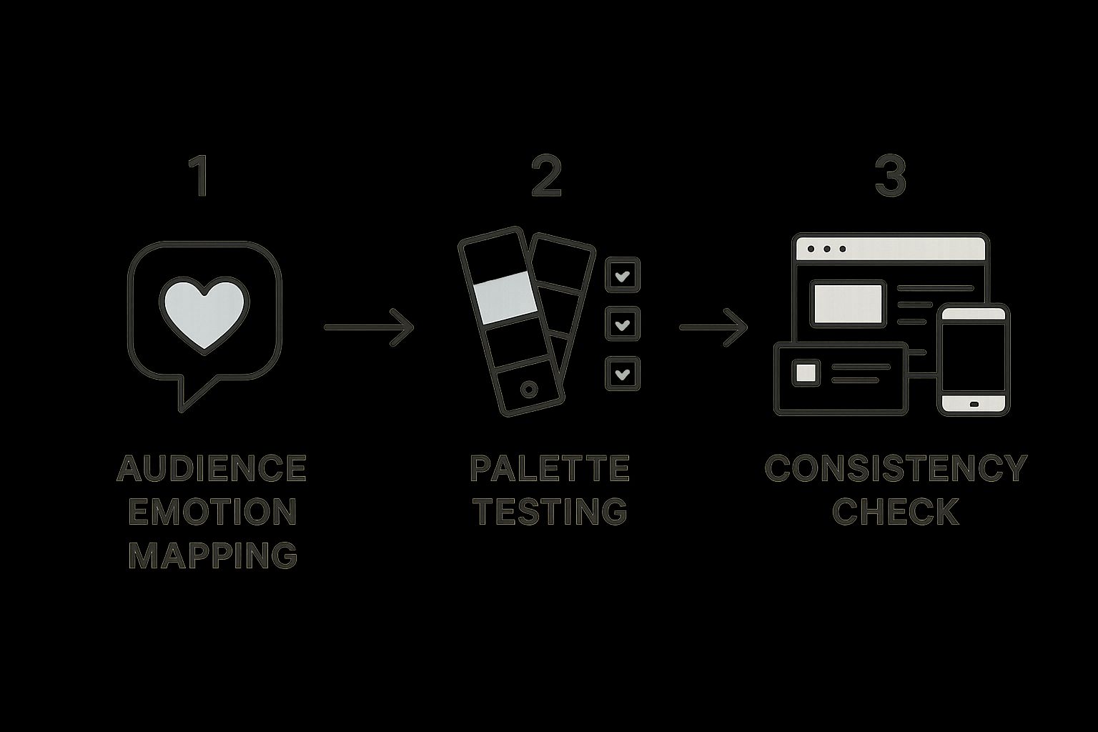
This visual roadmap drives home a crucial point: a great palette comes from truly understanding your audience, testing your choices, and making sure they work everywhere your brand lives.
Use the 60-30-10 Rule for Balance
So, you’ve got a few color ideas. How do you combine them without creating a visual mess? A common rookie mistake is to give every color equal importance, which just leads to chaos. The secret to avoiding this is a beautifully simple principle borrowed from interior design: the 60-30-10 rule.
Here’s how it works for branding:
60% Dominant Color: This is your primary brand color, the one you’ll use most. It sets the overall mood and will be all over your website, packaging, and marketing materials.
30% Secondary Color: This color supports your dominant hue. It’s there to create contrast and visual interest. Think subheadings, special callouts, or secondary backgrounds.
10% Accent Color: This is your "look at me!" color. Use it sparingly to draw the eye to the most important things, like call-to-action buttons, key icons, or can't-miss highlights.
This rule is a time-tested formula for creating a harmonious and professional look. It naturally guides the viewer's eye and stops your design from feeling either flat or overwhelming.
Imagine a tech company website. They might use a calming, stable blue for 60% of their design. A clean white or light gray could make up the 30%, creating breathing room and clarity. And for that final 10%? A pop of bright orange, used only for the "Sign Up" or "Request a Demo" buttons, making them absolutely impossible to ignore. That’s how a simple color set becomes a powerful system for communication.
Common Color Mistakes That Can Weaken Your Brand
Even the sharpest branding strategy can get tripped up by a few basic color mistakes. These slip-ups are more than just bad design; they can actively confuse your customers, shut out people with visual impairments, and water down your entire message.
Think of your color palette as a high-precision tool. Using it wrong is like trying to assemble a Swiss watch with a sledgehammer. Let's walk through the most common pitfalls so you know exactly what to avoid.
Overlooking Strategy for Personal Taste
This one is probably the most common blunder in the book: choosing colors simply because the founder likes them. Your favorite color might be a calming seafoam green, but if you're launching a high-octane energy drink, you've created an instant disconnect.
The feelings that seafoam green brings up—calm, quiet, gentle—are the polar opposite of the "get-up-and-go" vibe you need to sell. It just doesn't compute for the customer.
How to Fix It: Strategy always comes first. Period. Your color choices have to be anchored in your brand's core personality and the specific feeling you want your audience to have. Make your decisions based on solid brand color psychology, not just what looks good in your living room.
Creating Low-Contrast and Inaccessible Designs
Ever found yourself squinting at a website, trying to decipher light gray text on a slightly-less-light-gray background? That’s a classic low-contrast palette, a critical mistake that kills user experience and ignores accessibility.
When there isn't enough contrast between your text and its background, your message becomes difficult—or even impossible—for many people to read. This includes a huge portion of the population with visual impairments. It's not just sloppy design; it makes your brand look unprofessional and, frankly, like you don't care.
A brand that prioritizes inclusivity is seen as more trustworthy and professional. Ensuring your color palette meets accessibility standards isn't just a technical requirement—it's a reflection of your brand's values.
Ignoring Cultural Color Meanings
Here's something many brands learn the hard way: color is not a universal language. Its meaning can flip entirely from one culture to another.
Take the color white. In Western cultures, it's all about purity, weddings, and clean slates. But in many East Asian cultures, white is the traditional color of mourning and funerals. Imagine a Western wellness brand launching in Asia using a stark white palette to look "clean and simple." Without doing their homework, they could accidentally send a very somber and completely inappropriate message.
How to Fix It: Always do your cultural research. Before you lock in your brand palette, take the time to investigate the cultural meanings of your chosen colors in every market you plan to enter. This one step can save you from a major, and very public, misunderstanding.
Failing to Maintain Color Consistency
Finally, a huge mistake is letting your colors run wild across different materials. You can spend months crafting the perfect brand palette, but if it looks different on your website, your packaging, and your business cards, that hard work is wasted.
Inconsistency erodes brand recognition and looks unprofessional. For any brand that deals with physical products or printed materials, getting this right is non-negotiable. It’s why mastering color management in printing is such a critical skill for maintaining brand integrity.
Got Questions About Brand Color? We've Got Answers.
Here are some quick, clear answers to the most common questions we hear about using color psychology in branding. Think of this as your go-to guide for tackling those practical challenges and turning your color strategy into a real-world asset.
How Many Colors Should a Brand Have?
Most brands do best with a tight, focused palette of two to four colors. A fantastic rule of thumb here is the 60-30-10 rule. It's a simple recipe for creating visual balance and making sure your designs never feel cluttered or chaotic.
Here’s how it breaks down:
A dominant color (60%) sets the overall mood and acts as the foundation of your brand's look.
A secondary color (30%) is there to create contrast and keep things visually interesting.
An accent color (10%) is used for those small, high-impact elements like call-to-action buttons or key icons.
Following this principle gives you a professional, harmonious look that naturally guides your customer's eye without ever feeling overwhelming.
Do Color Meanings Change Across Cultures?
Yes, they absolutely do—and this is one of the most critical things to remember in brand color psychology. While some associations feel almost universal (like green for nature), others are deeply tied to cultural history and can have completely opposite meanings.
A classic example is the color white. In most Western cultures, it represents purity, simplicity, and is the traditional choice for weddings. In many Eastern cultures, however, white is the color of mourning and funerals.
It's a huge deal. Always do your homework on the specific cultural context of your target markets. This simple step can help you avoid a major, and potentially costly, cultural misstep.
Can a Brand Successfully Change Its Colors?
Changing your brand colors is definitely possible, but it has to be a careful, deliberate move. A color evolution can be a powerful way to signal a major rebrand, a shift in company values, or an effort to connect with a new audience.
The biggest risk? You could alienate loyal customers who have built a strong emotional connection to your original look. The transitions that work, like Instagram’s famous shift to a vibrant gradient, are always supported by strong marketing that explains the "why" behind the change. This helps bring your audience along for the ride and rebuilds that brand association with the new palette.
How Do I Test If My Brand Colors Are Effective?
The only way to really know if your colors are hitting the mark is to test them with your actual audience. The easiest place to start is with simple A/B testing on your digital assets. For instance, try two different colored call-to-action buttons on your website and see which one gets more clicks. It's a straightforward way to get real data.
You can also gather direct feedback by running surveys or focus groups. Just ask people in your target demographic how your color palette makes them feel. Finally, always, always prioritize accessibility. Use online contrast checkers to make absolutely sure your text is readable for everyone, including those with visual impairments.
Ready to create a visual identity that not only looks stunning but also drives real results? At Happy Pizza Studio, we specialize in designing powerful visual experiences that turn users into customers. Whether you need a full brand redesign or expert motion graphics, we’re here to help. Let's build a brand that works for you at happypizza.studio.


